506+ free React & Tailwind components
Heroes, pricing tables, industry sections, animated backgrounds, and ten complete site templates, MIT licensed, dark-mode ready, and installed straight into your codebase with the shadcn CLI. You own the code.
One-off setup: register the registry, then npx shadcn add @cleverui/<name>. See the installation guide.
Browse the library
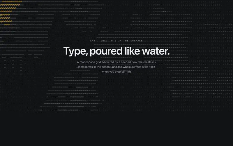
ASCII Liquid Field
A monospace glyph grid flowing like liquid, a seeded scalar field advects through a curl flow, crests ink in the accent, pointer drags stir it. Self-idling React + Tailwind canvas background.
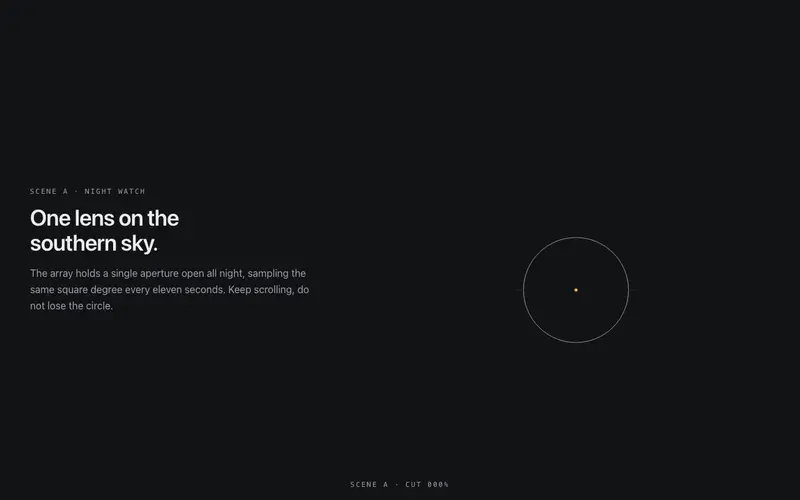
Cinematic Handover
A directed match-cut between two full-bleed React scenes, scroll scrubs a hairline figure that travels and grows from scene A into scene B's focal element. Reversible, Tailwind-themed.
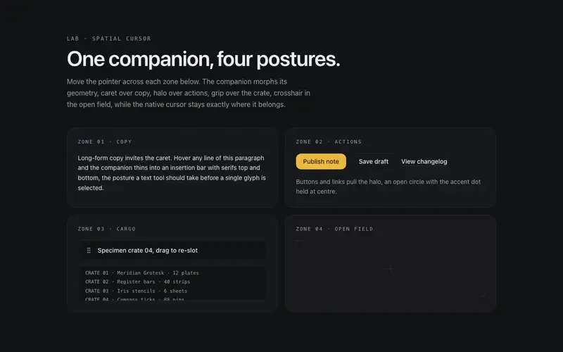
Context Morph Cursor
A page-level cursor companion for React, spring-morphs between caret, halo, grip, and crosshair postures from the element under the pointer. Never hides the native cursor. Tailwind tokens.
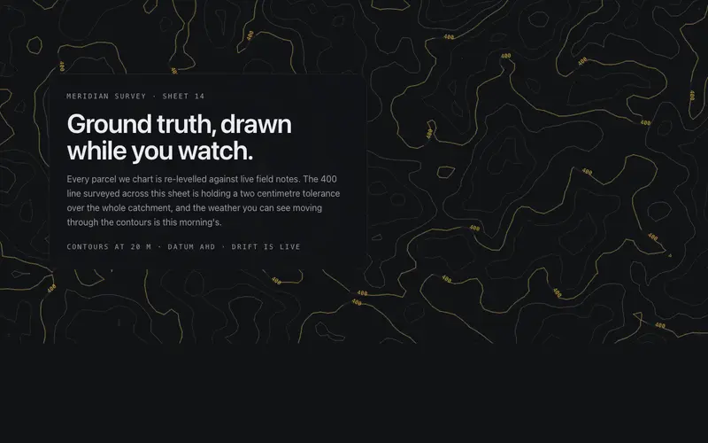
Contour Drift
A living topographic survey sheet: seeded simplex terrain drifts like weather under marching-squares contour hairlines, one surveyed band lit in primary, the cursor gently swelling the land.
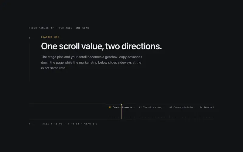
Dual Axis Chapters
A pinned React stage where one scroll value drives two geared axes, chapters advance vertically while a marker filmstrip slides in counterpoint, with a live mono ratio readout. Tailwind-themed.
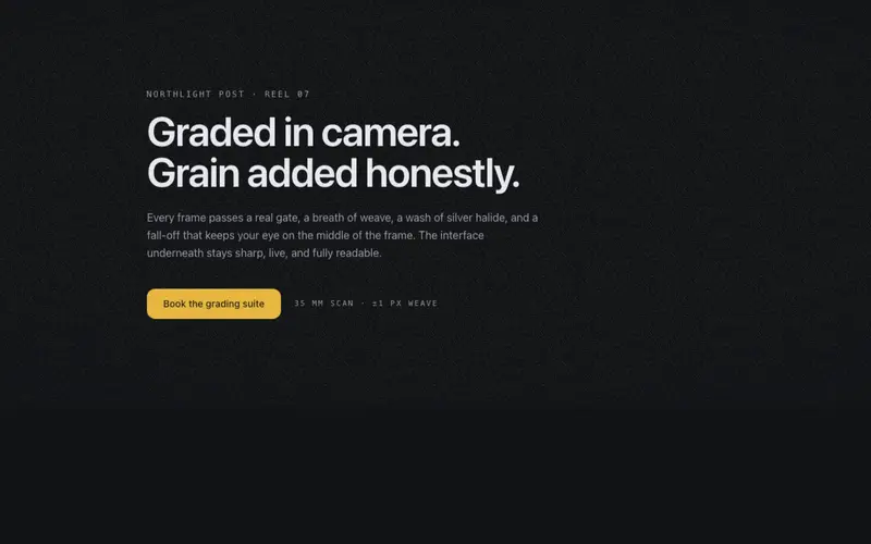
Film Grain Stack
A filmic wrapper for React content, seeded token-inked grain cycled under 3Hz, a token-derived vignette, and ±1px gate weave; grain stays ≤0.12 opacity so text contrast survives. Tailwind-themed.
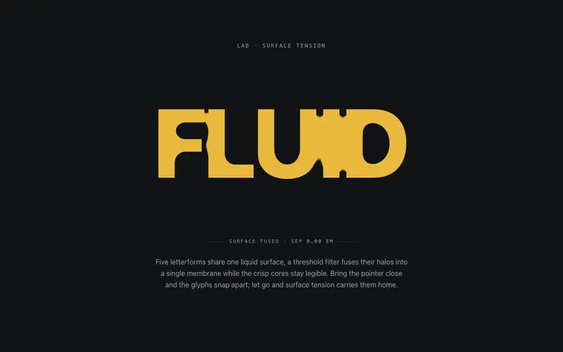
Gooey Type
SVG metaball letterforms for React, a threshold filter fuses heavy glyphs into one liquid membrane; pointer proximity snaps them apart and they re-fuse on release. Tailwind-themed, zero deps.
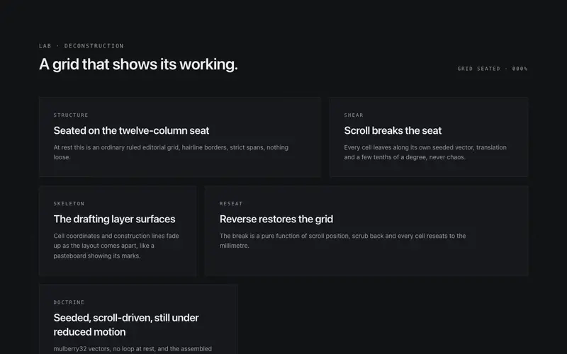
Grid Break
A deconstructing editorial grid for React, scroll shears each cell off its seat along seeded vectors as the drafting skeleton surfaces, then reseats in reverse. Tailwind-themed, zero dependencies.

Ink Dynamics
A real-time stable-fluids ink field for hero sections: the pointer stirs pigment that curls, swirls and slowly settles, token-inked over paper, with a designed still for reduced motion.

Kinetic Variable Hero
A hero headline set on a live variable-font weight field, the pointer blooms wght through the glyphs while scroll scrubs a crest across the line. React + Tailwind, zero dependencies.
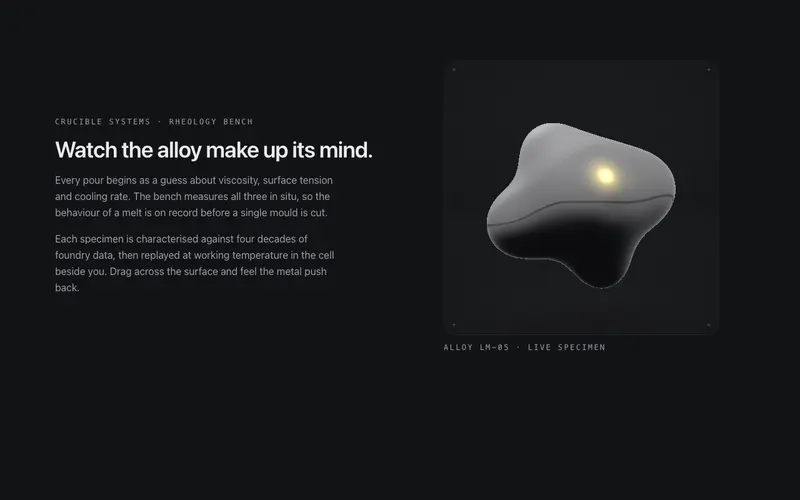
Liquid Metal
A contained WebGL specimen cell (ogl) of raymarched liquid chrome: metaballs breathe and orbit, the pointer dents the surface, and the studio environment is derived live from theme tokens.
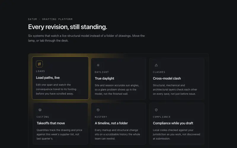
Lumen Cast
A cursor-driven lamp over a feature grid. Canvas 2D casts soft real-time shadows from every tile, near tiles lift toward the light, and keyboard focus steers the lamp for equal access.
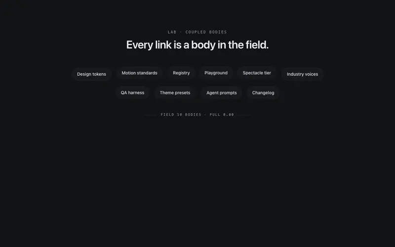
Magnetic Field
A multi-body magnetic link field for React, the pointer pulls chips, displaced bodies shoulder neighbours aside, springs carry the system home. Keyboard drives the same physics. Tailwind-themed.
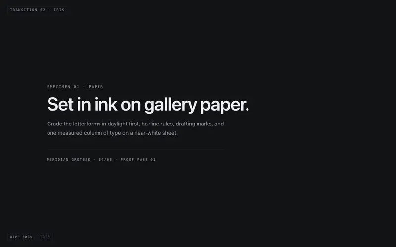
Mask Wipe Kit
A two-panel wipe stage for React, iris, blinds, split, or sweep mask geometry scrubbed by scroll or a progress prop, a primary keyline on the wipe front. Tailwind-themed, reduced-motion honest.
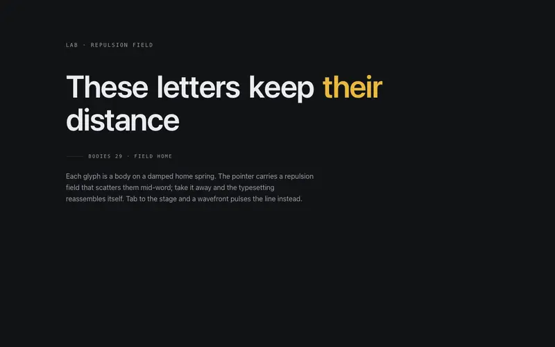
Physics Type
Cursor-repelled headline physics for React, every glyph is a body on a damped home spring fleeing an inverse-falloff pointer field; keyboard focus fires a designed ripple. Tailwind-themed.
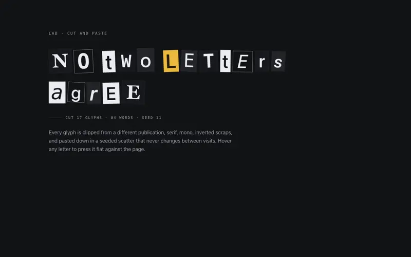
Ransom Type
A ransom-note headline for React, every letter is cut from a different publication with seeded serif/mono/inverted chip treatments and a staggered paste-down entrance. Tailwind tokens, AA per chip.
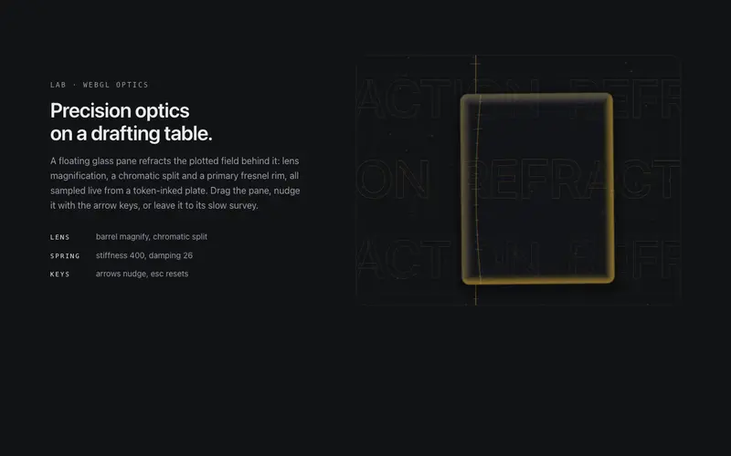
Refraction Pane
A floating glass pane (ogl) that refracts a token-inked drafting plate: lens distortion, chromatic split and a primary fresnel rim. Ambient drift, spring drag-return, keyboard operable.
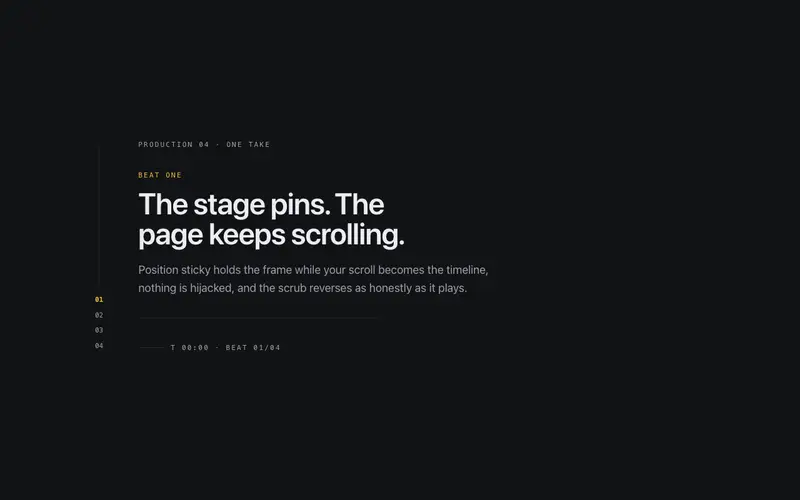
Scroll Director
A pinned narrative stage for React, scroll scrubs through choreographed beats on a sticky frame with a cue rail and running timecode, fully reversible and never scroll-jacked. Tailwind-themed.
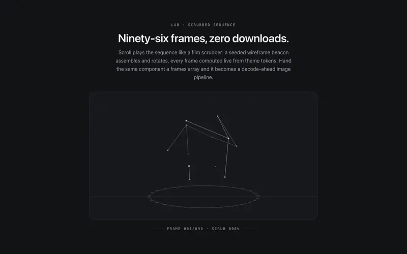
Scroll Sequence Kit
An honest scrubbed frame sequence for React, canvas plays a deterministic procedural wireframe, or consumer frame URLs through a decode-ahead pipeline, driven by native scroll. Tailwind-themed.
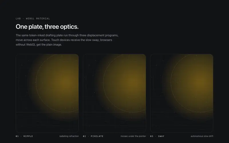
Shader Image
A WebGL image surface (ogl) for React, ripple, pixelate, or sway displacement on hover, a token-drawn plate by default, and honest fallbacks to a plain image. Tailwind-themed, self-idling.
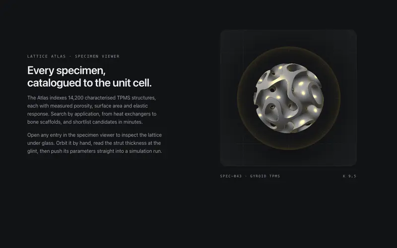
Specimen Orb
A contained WebGL specimen viewer: a gyroid TPMS lattice raymarched inside a glass orb, refracting the token bench with a primary glint. Slow ambient orbit, eased drag momentum, arrow keys rotate.
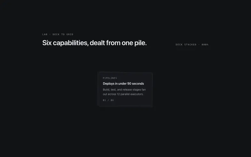
Sticky Grid Unfold
A pinned React deck that unfolds into a ruled grid on scroll, cards travel from a neat pile to their seats as outlines and skeleton lines draw in, fully reversible. Seeded, Tailwind-themed.
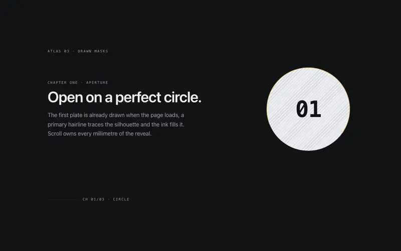
SVG Mask Chapters
Chapters revealed through drawn SVG mask shapes for React, a circle, keyhole arch, and diagonal band draw and fill as scroll scrubs a pinned stage. Tailwind tokens, reversible, reduced-motion safe.
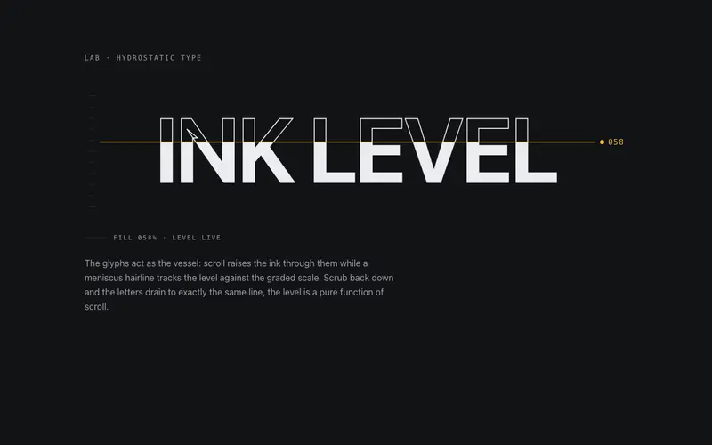
Text Fill Scrub
An outline headline that fills with ink as the section scrolls, a clipped level rises through SVG glyphs under a meniscus hairline. React + Tailwind tokens, zero dependencies.
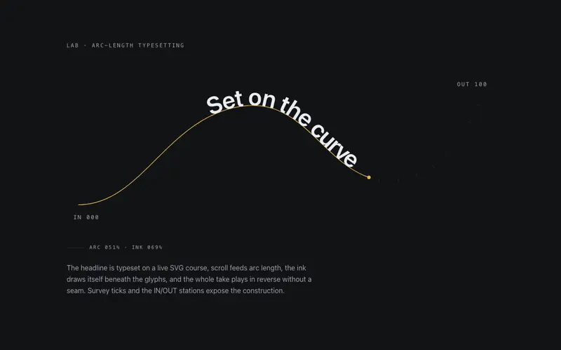
Text on Path Scrub
Headline type set on a drawn SVG course for React, scroll scrubs the glyphs along the arc while the ink draws itself in sync, fully reversible. Tailwind-themed, zero dependencies.
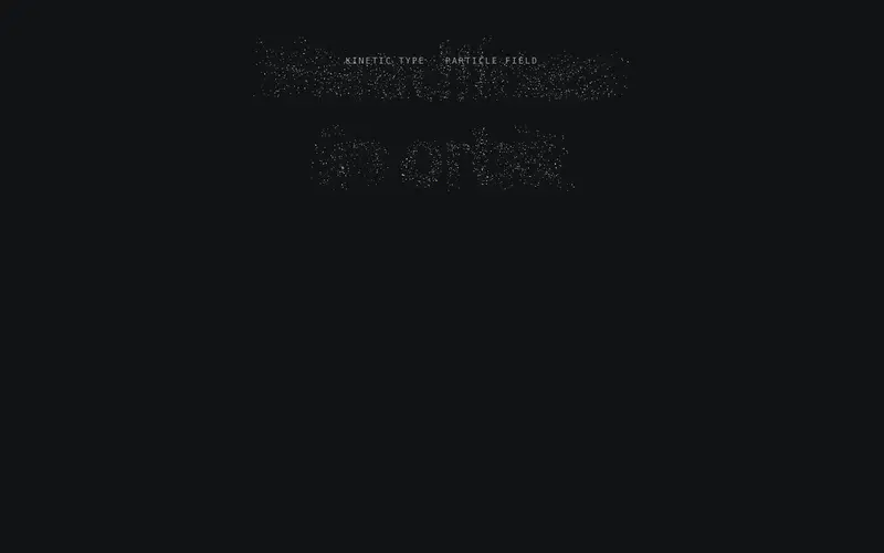
Type Constellation
Headline type as an ogl WebGL constellation: glyph-sampled points settle into letterforms, join with hairline links and part around the cursor, while the real heading stays in the DOM.
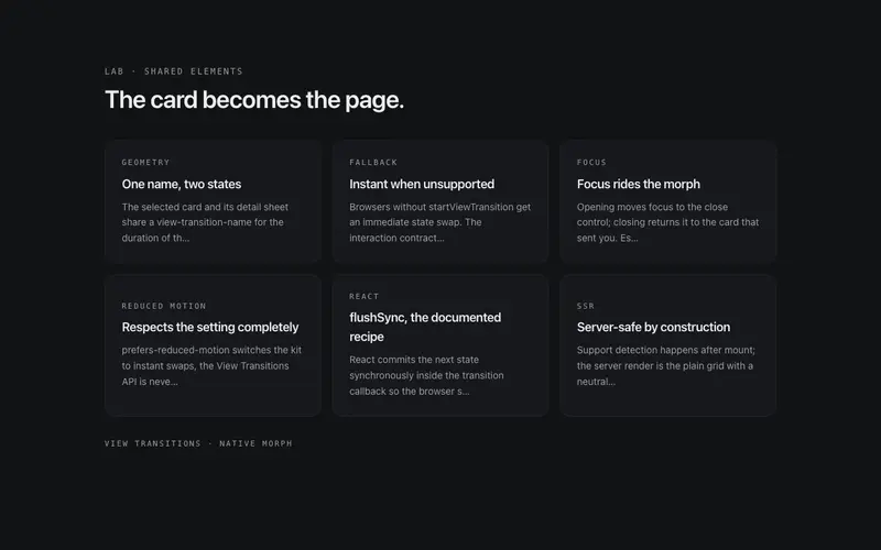
View Morph
A shared-element morph kit for React on the View Transitions API, cards morph into detail sheets and back, instant fallback where unsupported. Focus-managed, reduced-motion honest.
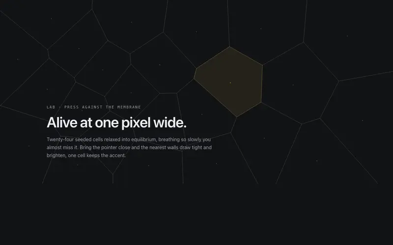
Voronoi Membrane
A living cell membrane for React, Lloyd-relaxed voronoi walls drawn as canvas hairlines breathe imperceptibly while pointer pressure tenses them; one seeded cell carries the Tailwind primary tint.
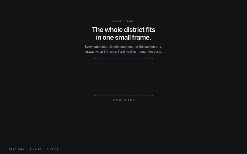
Zoom Portal
A React scroll dive through a hairline-framed portal, the frame scales past the camera while the scene inside counter-scales into the new stage. Native scroll, fully reversible, Tailwind-themed.
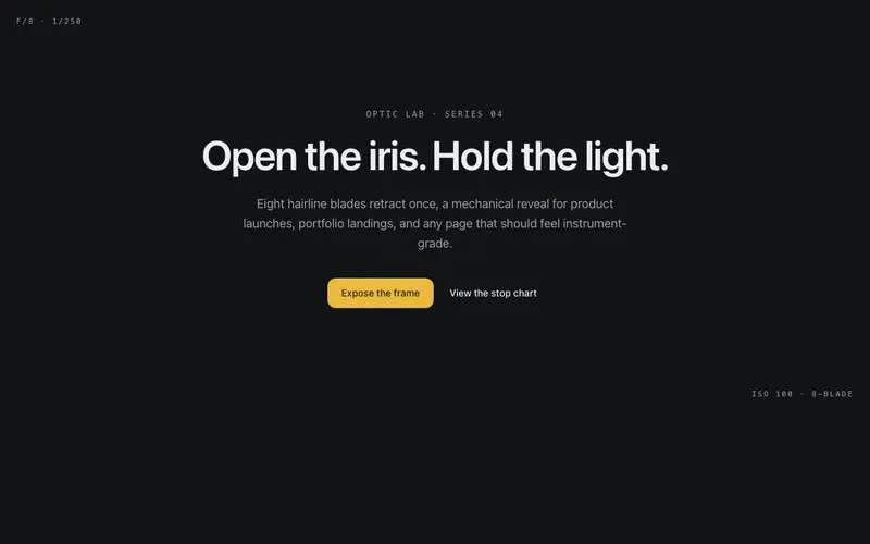
Aperture Hero
A camera iris of hairline blades opens once to reveal the hero, leaving a faint aperture ring behind the copy, an optical-instrument entrance for React and Tailwind sites.
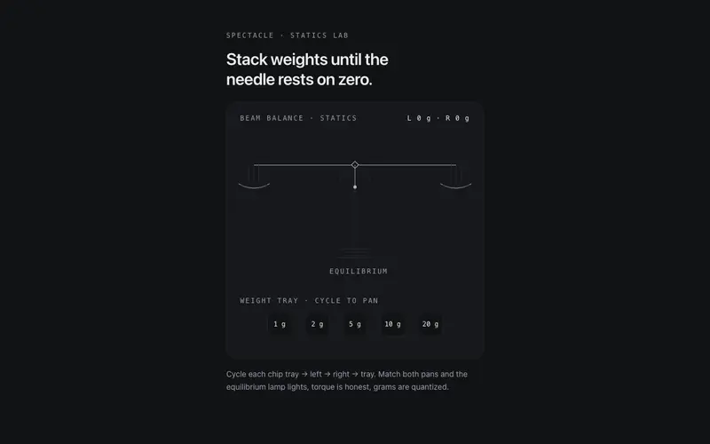
Beam Balance
A working two-pan beam balance for React, place mono weight chips on either pan, the beam tips with damped torque physics, and equilibrium earns the lamp. Tailwind tokens.
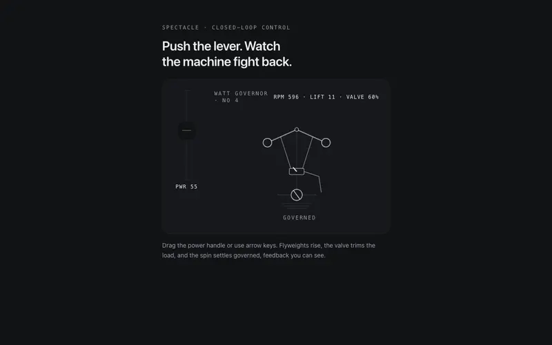
Centrifugal Governor
A working centrifugal governor for React, drive the power lever, flyweights rise and the valve trims the spin until it settles governed. ARIA slider semantics, Tailwind tokens.
Chladni Sand
Thousands of sand grains snap into Chladni resonance figures as the plate's mode changes, order out of noise. React canvas background themed entirely by Tailwind tokens.
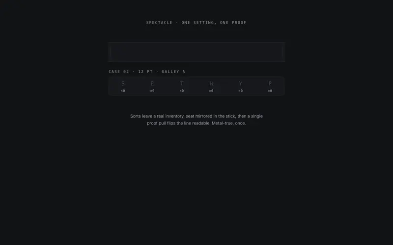
Compositor's Case
Type set from a visible case, sorts fly from their compartments, land mirrored in the composing stick, and one proof pull flips the React headline readable. Tailwind-token letterpress craft.
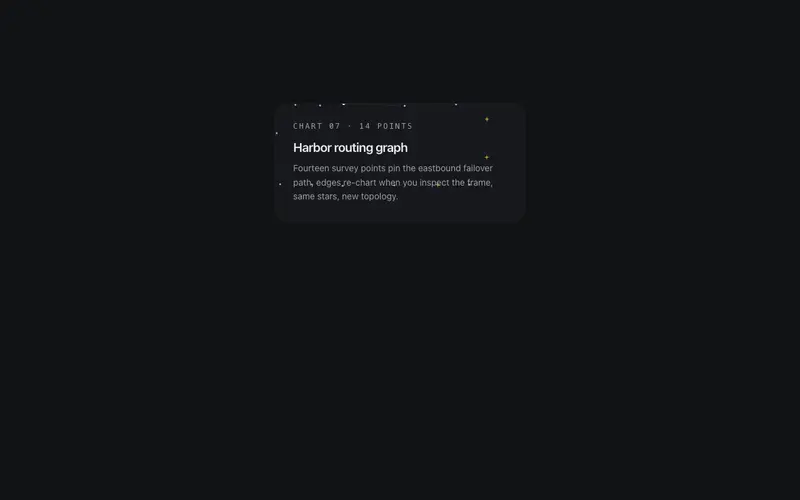
Constellation Card
A card whose border is a constellation, seeded stars joined by hairline segments that twinkle in slow sequence, then re-wire into a new star graph on hover. The frame is the show.
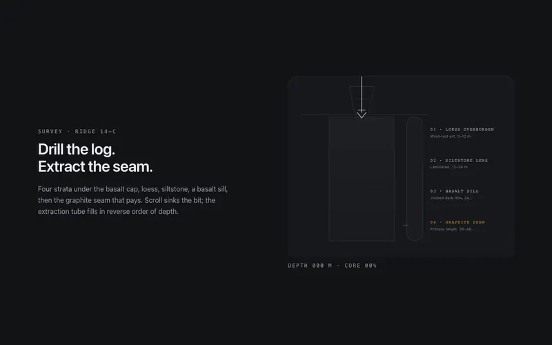
Core Sample
Scroll drills a core sample through labeled strata, the bit sinks, the extraction tube fills layer by layer, and a depth log counts to the primary seam. React and Tailwind tokens, no assets.
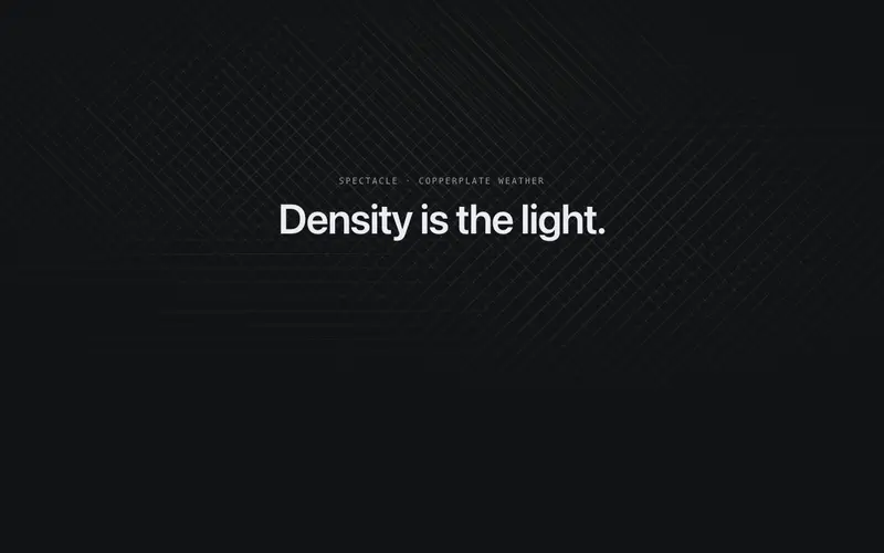
Crosshatch Drift
Engraver's cross-hatching as weather, drifting lobes of ruled shading build chiaroscuro where they overlap. CSS-only React background on Tailwind tokens, zero per-frame JavaScript.
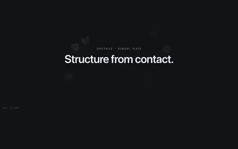
Dendrite Growth
Seeded random walkers freeze into branching mineral dendrites, an accretion frontier tipped in primary with a live particle counter. React canvas background on Tailwind tokens.
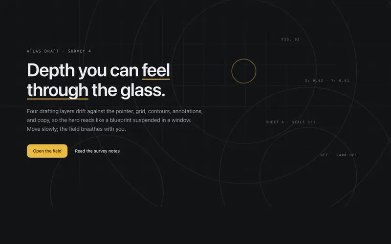
Depth Field Hero
A hero with true parallax depth, grid, contour, and content layers drift at different rates against the pointer, like looking into a drafting table through glass.
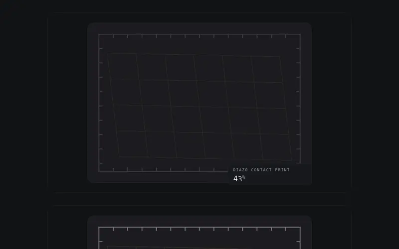
Diazo Develop
A blueprint develops as data arrives, latent linework surfaces in ink-density order, no sweep, bound to a 0-100 progress prop. React SVG preloader on Tailwind tokens with live percent.
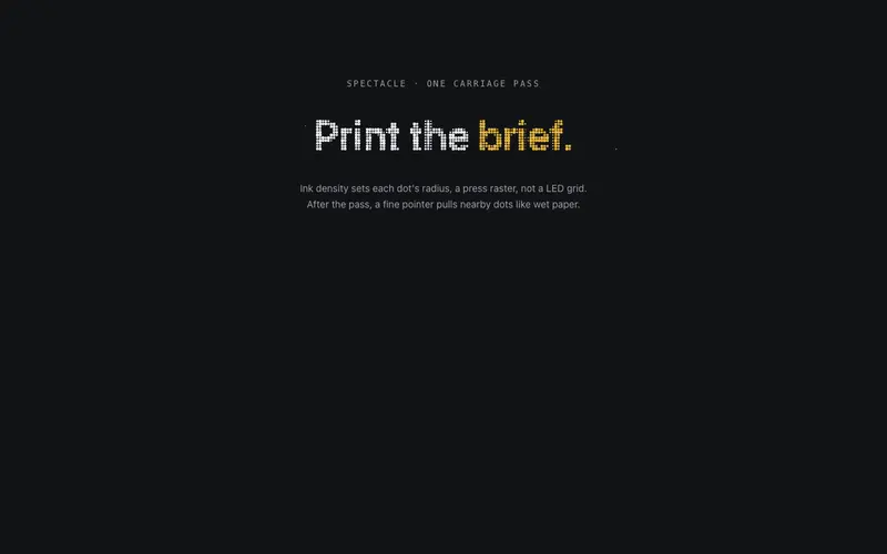
Dot Matrix Print
The headline prints as a dot-matrix raster, a carriage sweeps once and canvas dots sized by ink density pop in column by column. React and Tailwind tokens via probes; one accent word in primary.
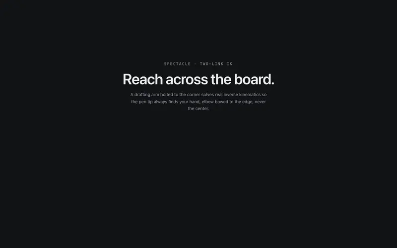
Drafting Arm
A drafting-machine arm bolted to the viewport corner reaches the pointer, two hairline links solved by real IK, joint discs, and spring lag. React page companion on Tailwind tokens.
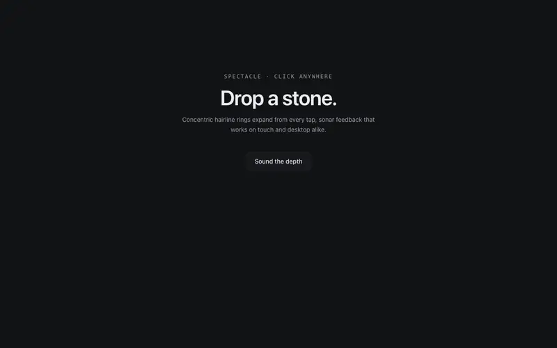
Echo Rings
Every click drops a stone in the page, concentric hairline rings ripple out from the point and dissolve, with a soft accent pulse at the center. Sonar for the UI.
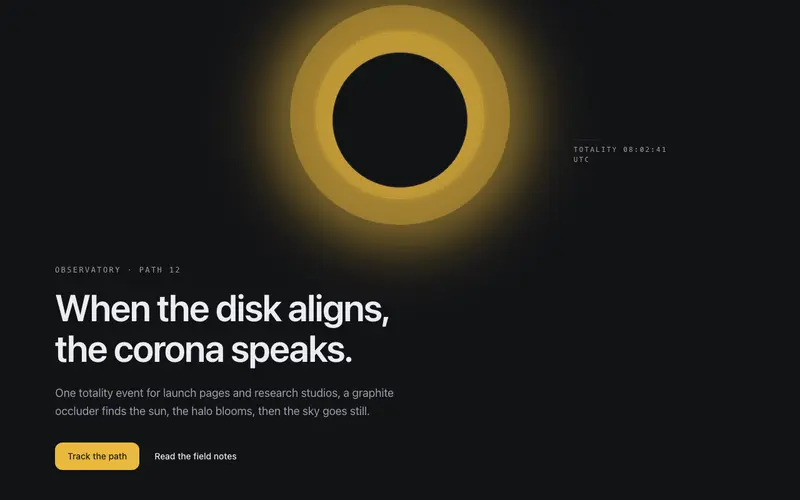
Eclipse Hero
A graphite disk slides into alignment and the corona blooms, a totality entrance where the headline surfaces in eclipse light. React hero section themed by Tailwind tokens.
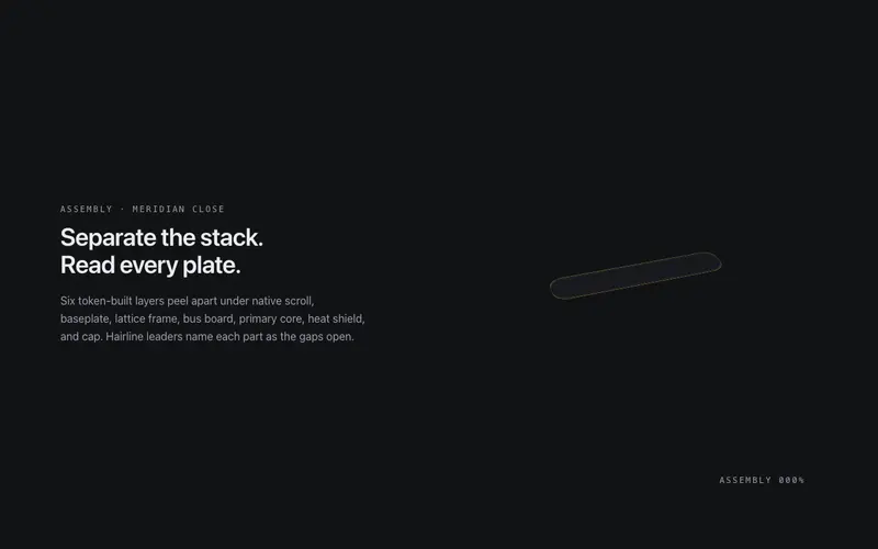
Exploded View
A pinned exploded-view scene for React, scroll separates a token-built 3D assembly into labeled plates with hairline leader lines, zero image assets. Native scroll, Tailwind-themed, poster-safe.
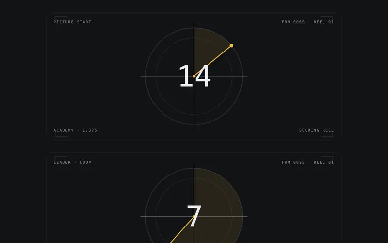
Film Leader
Cinema countdown leader as a React preloader, crosshair plate, radial clock wipe, and a giant mono numeral bound to a 0-100 progress prop. Tailwind tokens, designed reduced-motion still.
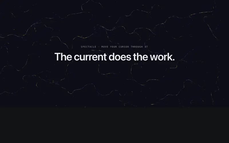
Flow Field
A storm of ink streams advected through an evolving flow field, one stream in seven burns in the accent, and a fine pointer bends the current around itself. Canvas, 60fps-budgeted.
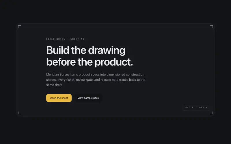
Frame Assembly Hero
The blueprint sheet builds itself, corner ticks fly in, frame hairlines draw, the title block stamps, then content settles into the finished drawing. Construction as choreography, once.
Every category
Lab
The Lab is where the library stops being modular and starts being cinematic. These are award-tier systems, the kind of scroll-driven, canvas-heavy work you see on Awwwards site-of-the-day winners: a scroll director that choreographs whole pages, image-sequence and SVG-mask chapter systems, kinetic variable-font heroes, shader-driven imagery, gooey and physics typography, view morphs and zoom portals. Each assumes you are building a page around it, not dropping it into a grid. Budget one Lab piece per page and let it carry the experience.
Backgrounds
A good background animation sets tone without stealing attention, and each of these draws from somewhere real: harmonographs, Chladni sand patterns, guilloché engraving, seismograph drums, star trails, topographic drift. They render on canvas or SVG, respect prefers-reduced-motion, pause off-screen, and sit behind your content with zero pointer interference. Use one per page, these are atmosphere, not decoration, and the restraint is what keeps them from reading as template noise.
Text effects
Typography-as-spectacle usually means one shimmering gradient headline. This category goes wider, twenty-seven effects drawn from print and process: letterpress-adjacent stencil cuts, split-flap departures boards, punch tape, dot-matrix printing, frottage rubbings, redline proofs, marker highlights, ink bleeds, and kinetic type walls, alongside precision tools like staggered reveals, blur focus, and weight emphasis. Each treats type as the subject, not the victim, and every one falls back to plain readable text without JavaScript or motion.
Scroll
Scroll is the one interaction every visitor already knows, and these sixteen components turn it into narrative structure: sticky scenes and chapter snaps for storytelling, an exploded view and gearworks for product anatomy, parallax strata and core samples for depth, a horizontal gallery, an image-sequence player, a progress thread, and quieter tools, reveal groups, depth fades, ink rollers, for pacing an ordinary page. Everything is driven by scroll position with reduced-motion fallbacks, so the story works even when the animation stands still.
Cursors
Custom cursors are the most polarising effect in web design, done lazily they are an irritant, done well they give a site a signature. These thirteen draw from instruments rather than blobs: a drafting arm, a plumb line, a measuring tape, registration marks, a galvanometer needle, a quill stroke. All of them keep the native cursor functional, deactivate on touch devices, and disable under prefers-reduced-motion, so the flourish never costs anyone the ability to click.
Loaders
A loading state is a small promise that the machine is working, and a generic spinner spends that moment saying nothing. These sixteen say something: a blueprint scanning itself, a plotter tracing, a kiln cone bending, a titration tinting, Morse pulses, vault dials, a film leader counting down. Each loops seamlessly, costs almost nothing to render, respects reduced motion, and carries proper status semantics so screen readers know the state too. Pick the one that fits your product's world.
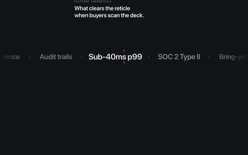
Marquees
The marquee earned its bad reputation honestly, then infinite-scroll logo strips rehabilitated it. These six keep the momentum and add control: a classic logo marquee with proper pause states, a focus-lens variant that magnifies what passes the centre, split lanes moving in opposition, a step rail that advances in discrete beats, a ticker tape for data-flavoured brands, and a velocity scroll that responds to the reader's own scrolling. All pause on hover and focus, and all respect reduced motion.
Interactive
These components make a page feel operated rather than merely read, and each mechanism is borrowed from a real instrument: a slide rule, a rotary tuner, a centrifugal governor, a pantograph, a logic gate bench, an orrery crank. Alongside the machines sit practical interactive patterns: a ledger accordion, comparison frame, flow stepper, dock tray, command hint bar, and physics-underline tabs. Everything is keyboard operable and honest about its state, interaction as substance, not garnish.
Heroes
The hero is the highest-stakes section you will ship, and this is the deepest category in the library, thirty-plus openings with genuinely different mechanics. Editorial structures (manifesto, letterpress, editorial index, question hero), product-led frames (product frame, split proof, metric wall, changelog), atmospheric builds (aurora, eclipse, ink bloom, glassworks), and engineered reveals (frame assembly, lock chamber, orrery, stage rig). Each one states who it is for, so you can match the opening to the argument your page is making.
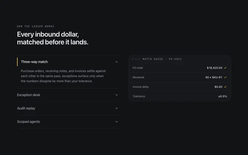
Features
The feature section is where products explain themselves, and the bento grid has become wallpaper. This set gives you sixteen alternative structures: a spec sheet for technical products, ledger lists and terminal rows for developer tools, a module tree for platforms, an orbit map for ecosystems, a pinned rail and accordion stage for progressive reveals, a platform matrix for comparison-shaped stories, and yes, a bento grid, but one with opinionated density rules. Choose the structure that matches your argument, not the trend.
Pricing
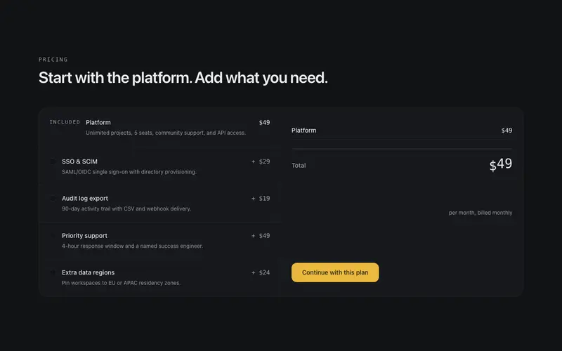
Pricing pages are trust exams, and the three-column table with a highlighted middle is only one possible answer. This set covers the others: a usage slider for consumption pricing, an add-on builder for modular services, a compare matrix for feature-heavy plans, plan rows for when columns patronise, a single-plan statement for products with the confidence to have one price, a transparent breakdown that itemises where money goes, a ledger quote for services, a trial timeline that shows what happens before billing, and glow tiers for the classic look done well.
Testimonials
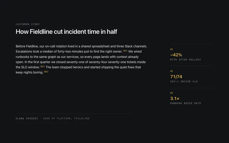
Testimonial sections fail when every quote looks equally generic. These twelve give social proof different registers: an annotated testimonial that highlights the load-bearing phrase, an interview format for long-form credibility, a before/after pairing for transformation stories, an audio strip and video cards for proof you can hear and see, a ledger for volume, a spotlight for the one quote that matters, plus marquee, wall, thread, roster, and logo-lockup treatments. Choose by how much trust your ask requires.
FAQ
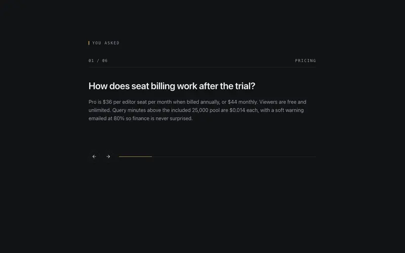
FAQ sections fail in two ways: ten questions crammed into one accordion, or answers so thin they answer nothing. These six components give the format room, a searchable inline FAQ for support-heavy products, a topic index for large question sets, a split-detail layout that keeps answers readable at length, a two-column grid for scanning, a carousel for space-constrained pages, and a classic disclosure list done with proper button semantics and smooth height animation. All of them pair naturally with FAQPage structured data.
CTA
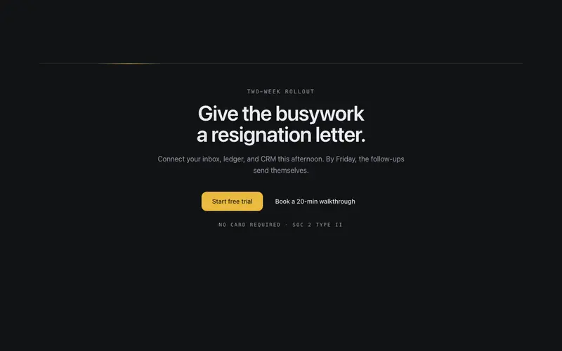
The call-to-action section is where hesitant visitors decide, and one size does not fit all decisions. This set gives you twelve distinct closes: a calendar-slot CTA for booking-driven businesses, a command-copy CTA for developer tools, a checklist close that summarises what they get, a quote request for services, a claim-your-handle pattern for products with usernames, split decisions for two-audience pages, and quieter inline and ticker variants for mid-page prompts. Match the CTA to the commitment you are asking for.
Stats
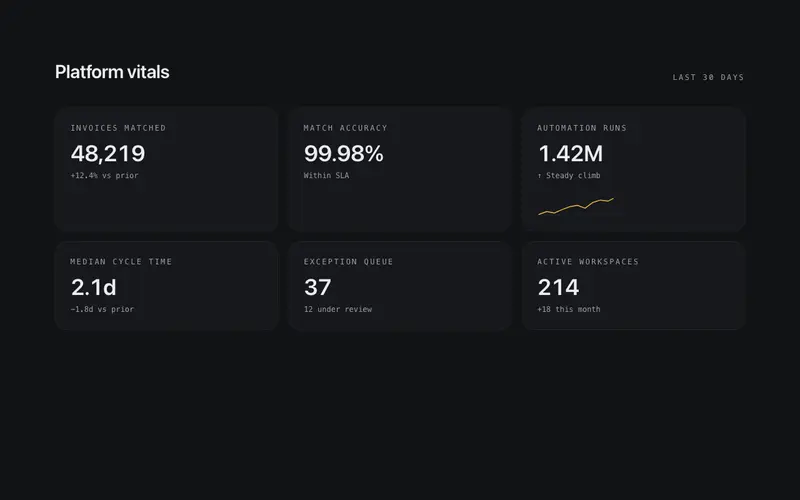
Every marketing site claims numbers; the credible ones present them like they have been audited. These eight give metrics that register: a stats band for headline figures, a bar list and composition bar for breakdowns, an activity grid in the GitHub contribution idiom, a compare layout for before/after arguments, a live board for operational theatre, prose-inline stats that sit inside sentences, and a stats story that sequences numbers into an argument. Tabular numerals and sourced-figure slots throughout, because a stat without a source is a vibe.
Contact
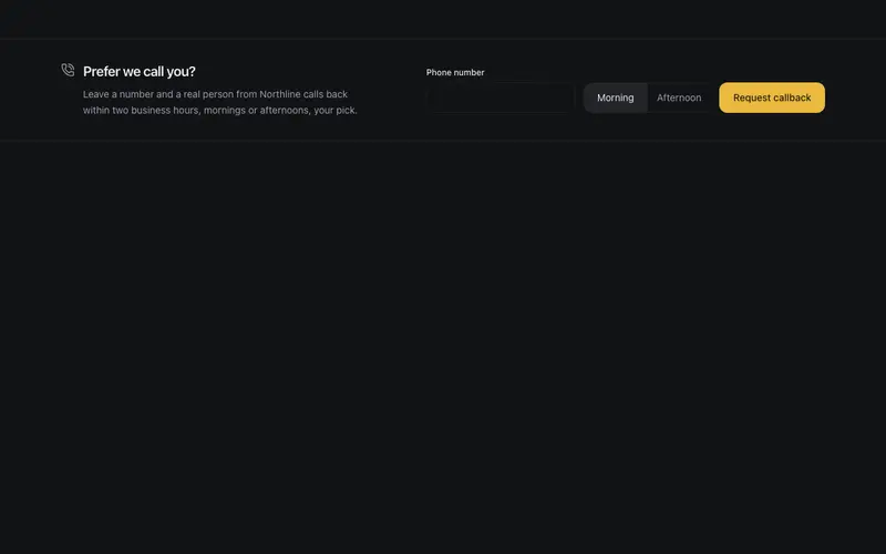
Most contact pages are a form nobody wants to fill in. These components offer better-fitting shapes: channel cards that route people to the right inbox, a split-map layout for physical businesses, a callback strip for phone-first customers, an email spotlight for the minimalists, and a project brief form for agencies that want qualified leads instead of "hi, how much for a website". Each one is honest about how you actually want to be contacted.
Banners
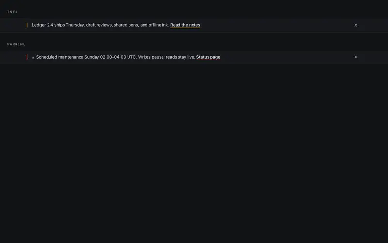
Banners are the highest-interruption element on a page, so each of these earns its pixels: a quiet cookie notice that does not hijack the viewport, a changelog toast for shipping teams, a countdown rail for launches, an update prompt for stale tabs, and a preview-mode strip for CMS drafts. All are dismissible, keyboard accessible, and sized to stay out of the way, announcement UI that respects the person reading.
Navbars
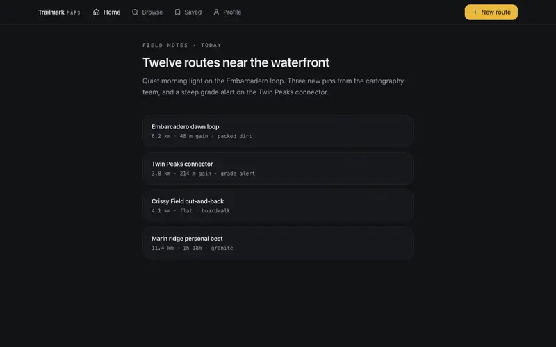
Navigation is a promise about how a site is organised, and one navbar cannot fit every promise. These twelve cover the real range: a glass navbar for marketing sites, a mega panel for deep catalogues, a command-center bar for keyboard-first products, bottom tabs for app-like mobile experiences, a sidebar hybrid for docs, a progress spine for long single pages, flow steps for wizards, and quieter pill, rail, and breadcrumb-morph patterns. Every one handles scroll behaviour, focus trapping, and mobile states properly.
Footers
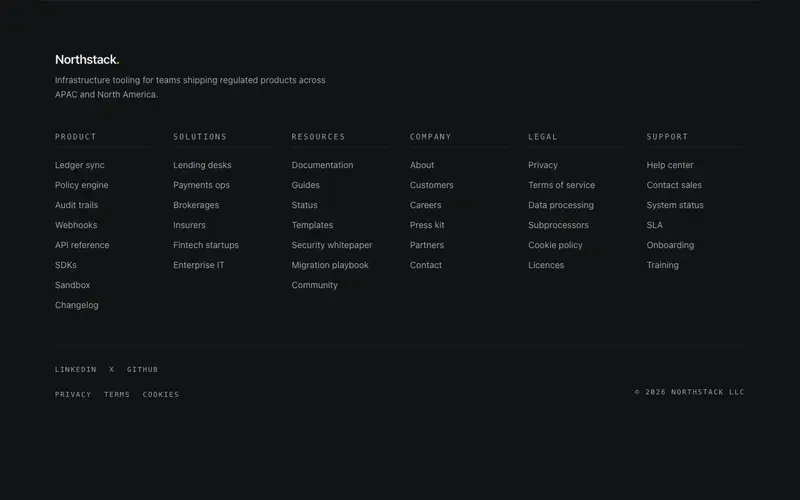
The footer is the most-ignored section on the page until you need it to carry weight, legal lines, sitemaps, newsletter capture, a final brand moment. These twelve range from a minimal rail and fine-print footer for focused products, through mega directories and accordion sitemaps for content-heavy sites, to statement pieces: a giant-type sign-off, a curtain reveal, a masthead treatment, an atlas footer for multi-location businesses, and a conversation footer that ends the page like a person would.
Logo clouds
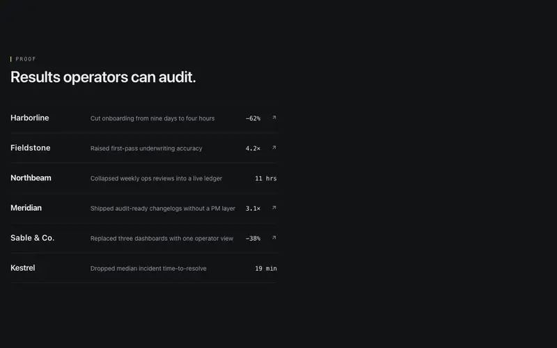
The logo wall is the laziest section on most sites, six grey SVGs and a "trusted by". These six components make client proof carry actual information: a sector filter that lets visitors find themselves, a case index that links logos to the work, a stat strip that pairs each logo with a number, a departures-board treatment with mechanical charm, prose-inline logos that sit inside a sentence, and a proof wall for when volume is the message. Logos plus context beats logos alone.
Team
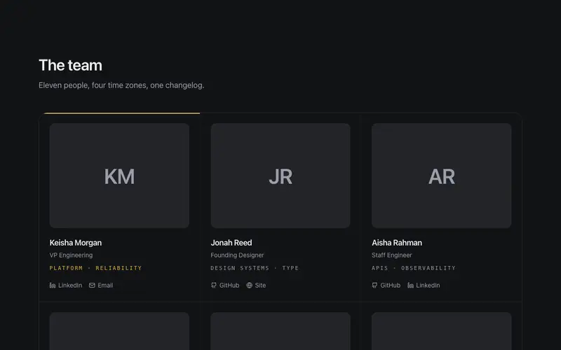
Team pages default to a grid of headshots that tells visitors nothing except that everyone owns a blazer. These six find better angles: directory rows that scale past a dozen people, an editorial grid with actual art direction, hover dossiers that reveal substance, a coverage matrix showing who handles what, a timezone strip for distributed teams, and a cohort timeline that tells the growth story. Pick the one that matches what your team page is actually for, trust, recruiting, or routing.
Blog
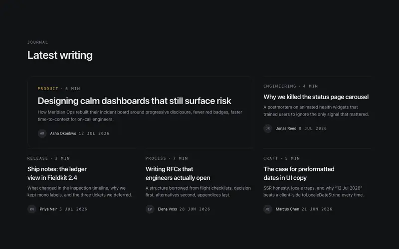
Long-form reading has well-earned conventions and these components respect them: an article header that establishes hierarchy without a hero image cliché, a sticky table-of-contents rail that tracks scroll position, pull quotes that break rhythm intentionally, an author bio card, prev/next navigation, and a card grid for the index page. Semantics come first, real heading structure, time elements, and nav landmarks, so your writing is as readable to crawlers and screen readers as it is to people.
Buttons
These are buttons for moments where a plain button is not enough: a confirm-hold button for destructive actions, an undo window that gives people five seconds of grace, a progress button that reports work inline, split and stepper buttons for compound actions, a hotkey button that advertises its shortcut, and magnetic and shine variants for hero CTAs. Every one keeps real button semantics, focus rings, disabled states, keyboard activation, under the animation.
Cards
The card is the most overused element on the modern web, so each of these justifies itself with a mechanic you cannot get from border-plus-shadow: spotlight tracking, depth tilt, iris apertures, frost wipes, ledger flips, liquid gauges, receipt tear-offs, stack shuffles. They are containers with intent, pick the mechanic that matches your content (a gauge card for a metric, a receipt card for an order, a dossier drawer for a profile) rather than decorating everything equally.
Numbers
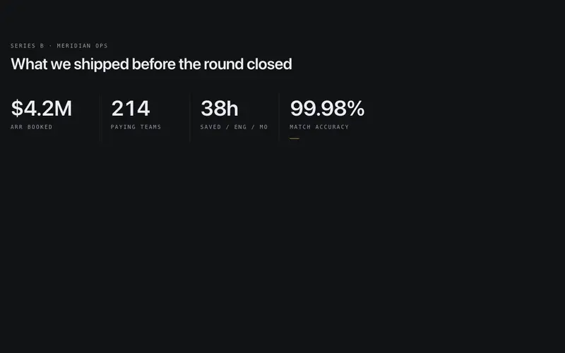
Numbers are the most trusted content on a page, which is why they deserve better than a paragraph font. These six give figures their own typography and motion: an odometer that rolls digit-by-digit, a ticker for live-ish values, a radial gauge and segment meter for bounded metrics, a milestone row for company stats, and a delta chip for changes with direction. All use tabular numerals so columns align, and all animate on first view then get out of the way.
Agency
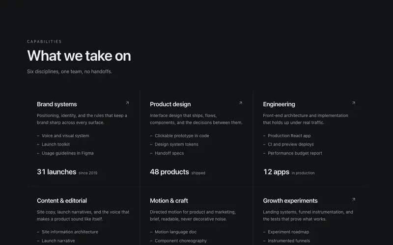
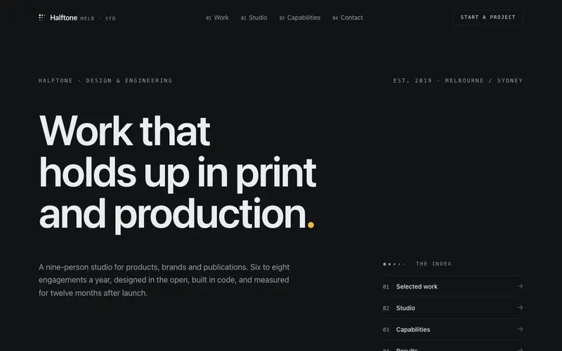
Agency sites live or die on how the work is presented, and most portfolio grids flatten every project into the same thumbnail soup. These components take the opposite approach: a selected-work index that reads like a table of contents, a case study spread with editorial pacing, a capability matrix that says what you actually do, and a process reveal that walks clients through how an engagement runs. Built for studios that want the site itself to be proof of craft.
AI
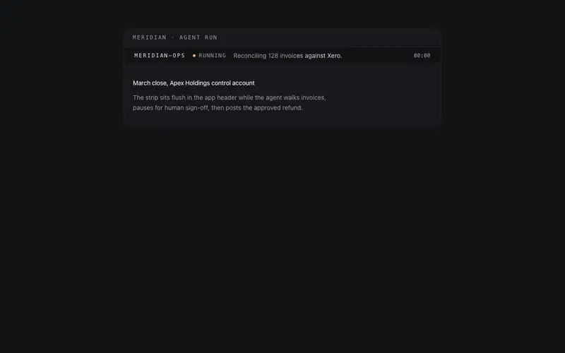
Interfaces for AI products have their own vocabulary, streaming states, tool calls, token costs, human-in-the-loop approvals, and generic UI kits have none of it. This set covers the real surface of an agent product: a prompt composer, reasoning disclosure, tool call timeline, sub-agent tree, context meter, run cost ticker, guardrail notices, and HITL approval cards. Each one is designed around what the state actually means, so your app explains itself instead of hiding behind spinners.
Automotive
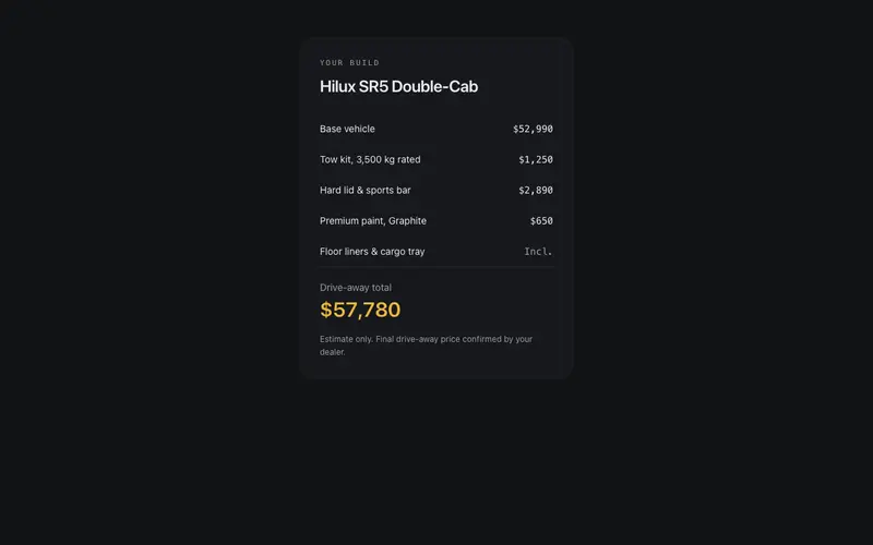
Car buyers arrive with three questions, what does it cost, what are the specs, and when can I get it serviced, and most dealer sites bury all three. These components answer them directly: a build-and-price summary, finance repayment panel, spec comparison table, vehicle inventory card, model lineup rail, and service booking strip. There is also a performance gauge cluster and a service history timeline for workshops that want to show their record rather than claim it.
Beauty
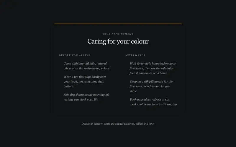
Salon and spa sites sell an experience, and the UI has to feel like the treatment: unhurried, tactile, quiet. This set includes a treatment menu with editorial pacing, ritual steps that walk through an appointment, a stylist gallery, a certification wall, before-and-after care, gift voucher and membership cards, and a booking CTA that closes softly instead of shouting. Written in the voice a good salon actually uses, the price list reads like a card at reception, not a SaaS table.
Ecommerce
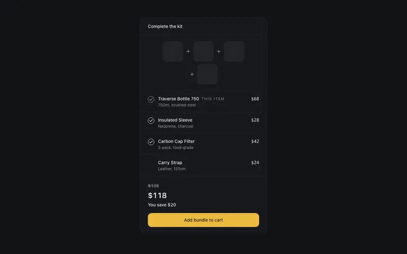
These are the merchandising moments around a store, framework-free: a product tile that handles badges and hover states properly, a bundle builder that does the discount maths visibly, a size-and-fit bar that cuts returns, a review summary panel with an honest distribution, order tracking steps, a shipping promise strip, a collection filter bar, and a drawerless cart summary. They plug into Shopify, Medusa, Swell, or a custom backend equally well because they are pure presentation over your data.
Education
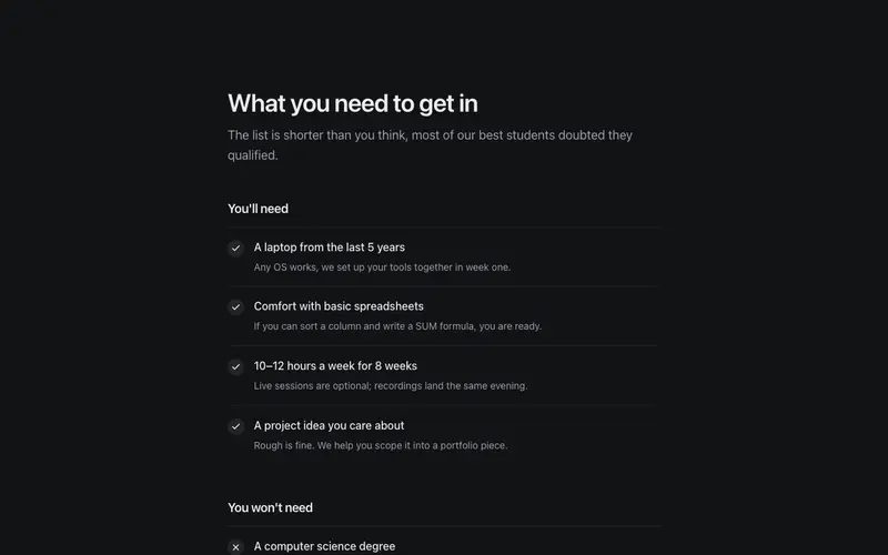
Whether you sell a cohort course or run a training organisation, the questions are the same: what will I learn, who teaches it, what does it cost, and will it work for me. This set answers each one, a curriculum outline, learning path map, instructor panel, tuition payment options, admission checklist, cohort countdown, student outcomes band, alumni story cards, a study-mode comparison, and a parents FAQ for providers whose buyer is not the student. Built for course sites that need to earn trust before the enrol button.
Events
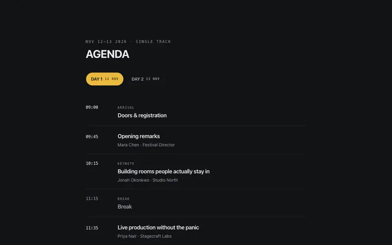
Conference sites have a hard job: sell tickets months out, then become a utility the week of the event. These components cover both phases, a countdown hero and ticket tiers for the selling phase; an agenda day picker, schedule tracks, workshop grid, lineup board, and venue strip for the attending phase. Speaker spotlights, sponsor tier walls, a CFP block, past editions, and a code of conduct round out the set. Everything handles the multi-day, multi-track reality without collapsing into a spreadsheet.
Finance
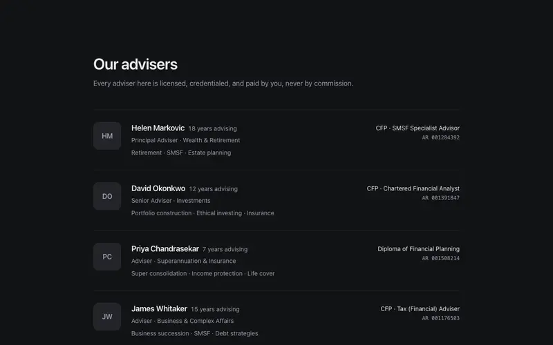
Financial services pages carry a compliance weight most UI kits ignore. These components are shaped for it: a rate comparison sheet with room for the disclaimers that regulators require, loan eligibility steps that set expectations before an application, a coverage explainer panel that translates policy language into plain English, and advisor credential rows that surface licence numbers and designations instead of stock-photo trust. Sober layouts, tabular numerals, and no dark patterns, the way money UI should read.
Fitness
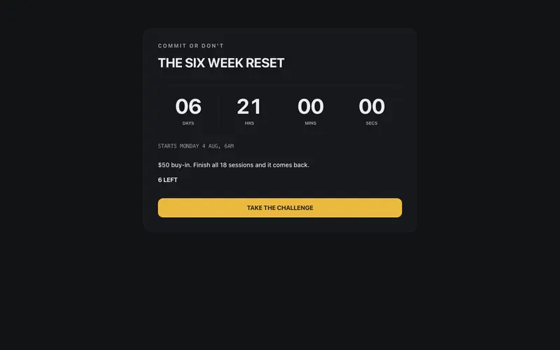
Gym websites usually chase aesthetics while members just want the timetable. This set serves both: a class timetable that works on a phone at 5:45am, membership tiers without pricing games, a coach roster and cred strip, program cards and a program comparison table, a training split board, a PR leaderboard, a transformation strip that handles before/after respectfully, a challenge countdown, and a trial pass CTA. Built for gyms, CrossFit boxes, and studios that win on community and coaching.
Health
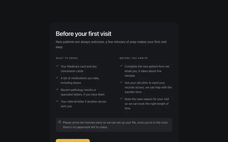
Patients arrive at a clinic website anxious, and most medical sites answer with stock photos and jargon. These components answer the actual questions: which appointment should I book, who will I see, what will it cost with rebates, what happens at my first visit, how do I get my results, and how do video consults work. There is a practitioner directory, clinic locations strip, patient info bar, and a gentle FAQ, all written in the reassuring, plain-English register that good practice managers insist on.
Legal
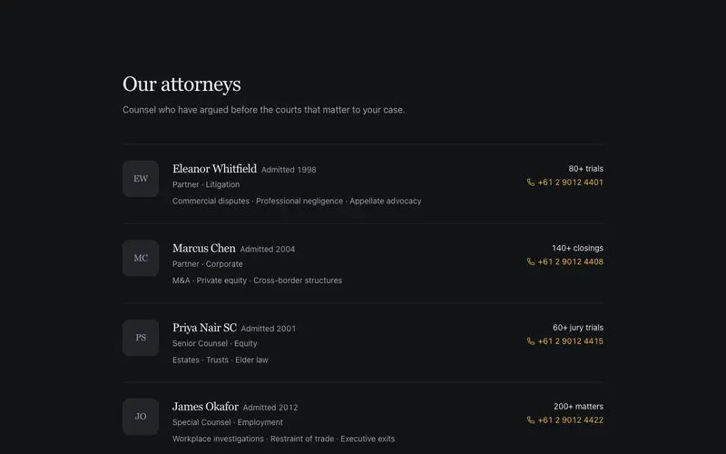
Legal clients hire confidence, and law firm websites too often perform it with marble columns and adjectives. These components argue with evidence instead: a case results band, representative matters list, attorney profile rows built around admissions and practice history, a practice areas grid, matter process steps that demystify an engagement, a fee structure sheet that answers the question everyone has, a consultation intake panel, and a plain-language glossary that translates the Latin. Gravitas through clarity, not decoration.
Non-profit
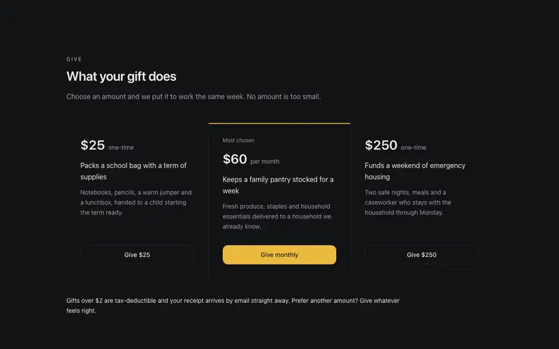
Donors give more when they can see where money goes, and volunteers show up when the ask is specific. These components are built on that evidence: a donation tier grid that translates amounts into concrete outcomes, a funds allocation band that shows the split honestly, an impact stat band with sourced numbers, and a volunteer roles panel that describes real commitments instead of a vague "get involved". Transparency as a design principle, because for charities it is the conversion strategy.
Real estate
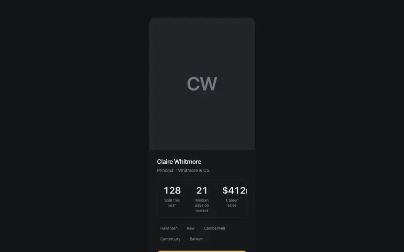
Vendors choosing an agent and buyers stalking listings want different things from the same site, and these components serve both. For buyers: listing cards, a gallery strip, feature sheets, open home schedules, and a property comparison table. For vendors: an appraisal CTA, a selling process timeline, auction results, a commission breakdown that answers the awkward question upfront, suburb report cards, and an off-market teaser. Agent profile cards round it out, because in real estate, the agent is the product.
Restaurants
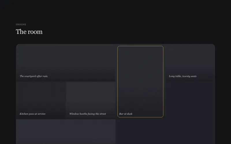
A restaurant website has two jobs, make you hungry and get you booked, and everything else is noise. These components do those jobs in a voice restaurateurs recognise: an editorial menu and tasting menu typeset like a printed card, a wine and cocktail list with proper structure, a specials board, an hours-and-status strip that answers "are they open now", a reservation bar, private dining inquiry, chef story strip, farm provenance index for kitchens that source seriously, press accolades, and an ambience mosaic that sells the room.
Trades
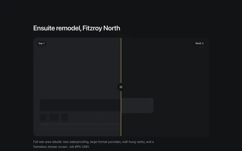
Homeowners hiring a tradie are asking three quiet questions: will you show up, will the price be fair, and can I trust you in my house. These twelve components answer them directly, a who-shows-up section with real faces, a credentials bar with licence numbers, a workmanship guarantee, a rate card and payment plans that kill quote anxiety, a job timeline and how-a-job-runs walkthrough, a before/after slider, brands-we-service strip, service area map, an emergency bar for after-hours work, and a quote banner that makes the ask easy.
Travel
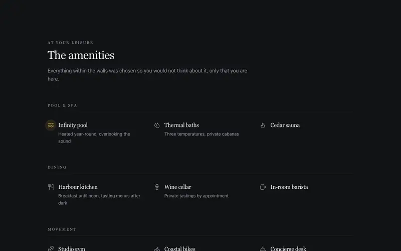
Travel is bought on imagination and booked on logistics, and these components handle both halves: an amenity constellation and room-and-suite cards that sell the stay, a guest book spread that lets past visitors do the persuading, destination tabs and a when-to-go strip for trip planning, an itinerary day flow for tours, a departures list with real dates and prices, and a booking window bar that creates honest urgency from actual availability. For hotels, tour operators, and destinations that want atmosphere with an engine underneath.
Templates
These ten templates are complete, bespoke websites, not component stacks with a logo swapped in. Each is designed for its industry (restaurant, gym, law firm, clinic, agency, real estate, nonprofit, SaaS, AI startup, ecommerce launch) with its own motif and pacing, and each exposes one typed content object: every word, price, image, and link on the page lives in a single exported constant. Change that object and the site becomes yours; the design decisions stay made. It is the fastest honest path from clone to launch.
Need a whole site, not a section?
Ten complete site templates, each one a single typed component you install with one command and drive with one content object.
Browse templates