Free React Logo Cloud Components
The logo wall is the laziest section on most sites, six grey SVGs and a "trusted by". These six components make client proof carry actual information: a sector filter that lets visitors find themselves, a case index that links logos to the work, a stat strip that pairs each logo with a number, a departures-board treatment with mechanical charm, prose-inline logos that sit inside a sentence, and a proof wall for when volume is the message. Logos plus context beats logos alone.
6 components · MIT licensed · installable with the shadcn CLI
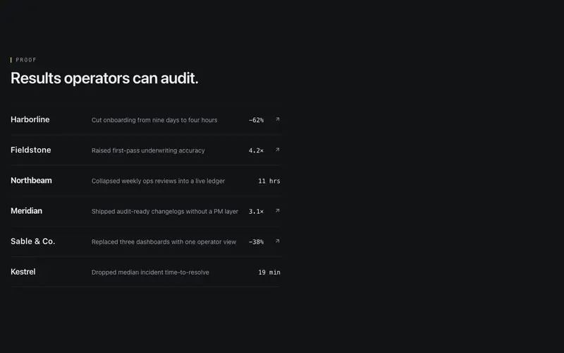
Logo Case Index
React logo cloud as an index ledger, each Tailwind-styled wordmark row pairs a customer with a one-line outcome and a tabular metric, optionally case-linked.
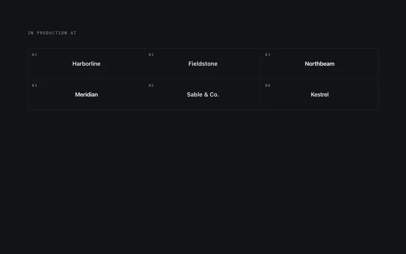
Logo Departures Board
Split-flap React logo board, a fixed Tailwind grid of typographic wordmarks where one cell flips at a time in reading order, rotating more brands than cells.
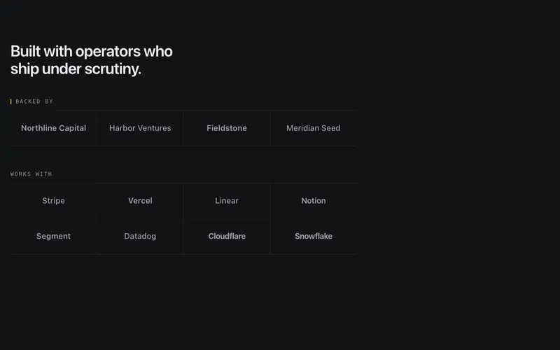
Logo Proof Wall
Static categorized logo wall, 'Backed by' and 'Works with' groups under mono labels and hairline rules, grayscale wordmarks with every company name in the accessibility tree.
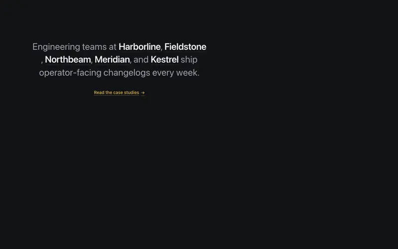
Logo Prose Inline
React social-proof paragraph with customer wordmarks set inline in the sentence, a Tailwind typographic lockup where every brand is real, readable text.
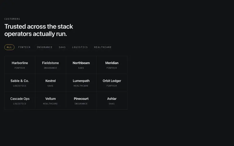
Logo Sector Filter
Interactive React logo wall with sector filter chips, picking an industry spotlights matching Tailwind wordmarks in place while the rest recede, never reflowing.
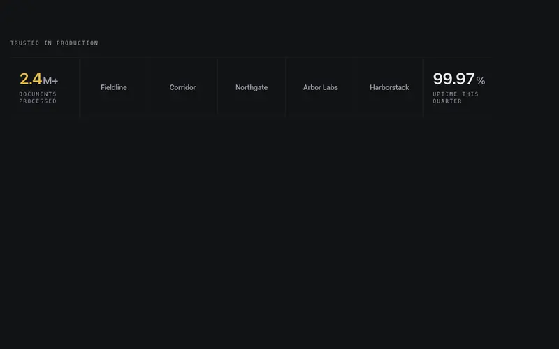
Logo Stat Strip
One hairline instrument band interleaving grayscale wordmarks with two counting proof stats, logos as the nouns, tabular numerals as the numbers, seam-divided.
Frequently asked questions
How many logos do I need for these components to work?
Fewer than you think. The prose-inline and stat strip variants work from three or four strong names; the proof wall and sector filter earn their keep past a dozen. Never pad with logos you cannot defend, one recognisable name beats six nobody knows.
What logo format should I supply?
Monochrome SVGs sized to a consistent visual weight, the components handle the sizing box and hover states. The demos show the normalisation pattern; colour logos are supported but monochrome keeps the wall from shouting.
Do I need permission to show client logos?
Usually yes, check your contracts for publicity clauses and ask when unsure. The case index variant is the easiest permission conversation because it links to work the client already approved publicly.