Free React Feature Section Components
The feature section is where products explain themselves, and the bento grid has become wallpaper. This set gives you sixteen alternative structures: a spec sheet for technical products, ledger lists and terminal rows for developer tools, a module tree for platforms, an orbit map for ecosystems, a pinned rail and accordion stage for progressive reveals, a platform matrix for comparison-shaped stories, and yes, a bento grid, but one with opinionated density rules. Choose the structure that matches your argument, not the trend.
16 components · MIT licensed · installable with the shadcn CLI
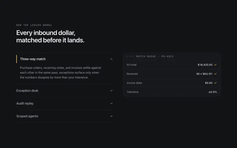
Accordion Stage
Feature accordion synced to a stage, expanding a row swaps the token-built preview beside it, one open at a time, height animated without jank.
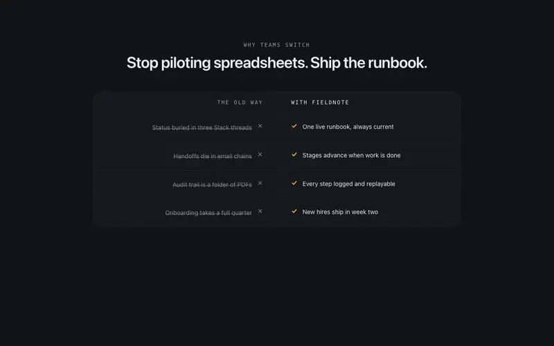
Before After Strip
A narrow strip pairing the old way against your product in two mirrored quiet columns, each pain struck through as its counterpart lands with a check.
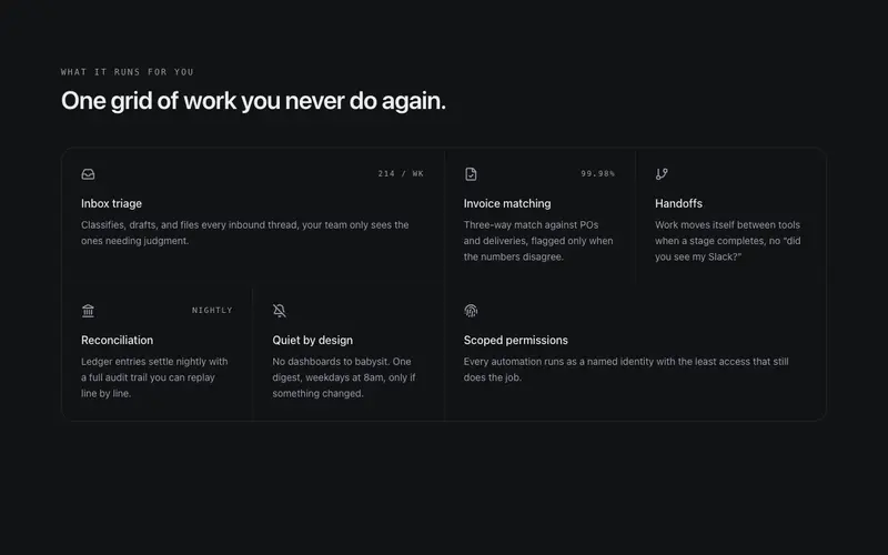
Bento Feature Grid
A bento grid drawn like a drafting table, tiles share single hairline seams instead of floating as glow cards. Staggered reveal, quiet hover shift, wide and tall spans.
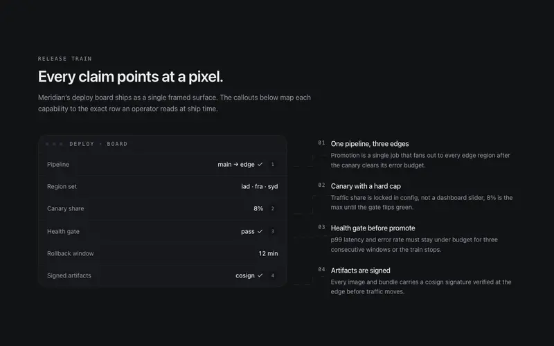
Callout Figure Features
Annotated product figure for React marketing pages, numbered leader lines tie a token-built Tailwind mock to margin notes, so every feature claim points at the pixel it explains.
Inventory Wall Features
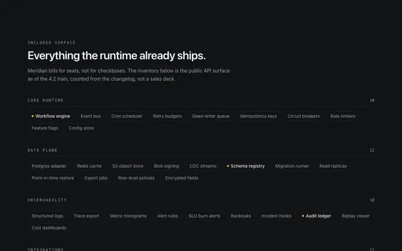
The everything-included wall for React landing pages, dozens of small capability chips grouped under mono Tailwind labels with counts, breadth made visible in one ruled sweep.
Layer Stack Features
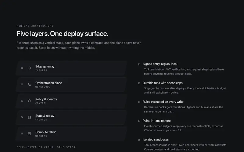
Architecture layer stack for React product pages, skewed Tailwind planes pile the system into a flat axonometric diagram, each layer wired to a margin note.
Ledger List Features
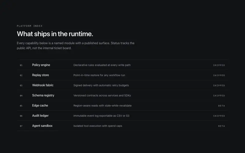
Features as a ruled ledger, mono index, name, and one-line value statement per row with a right-aligned shipped/beta status. Dense, scannable, no grid.
Metrics Fusion Features
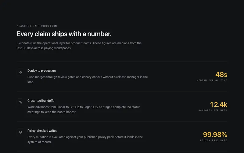
Feature rows fused with proof, every capability carries its own counting mini-stat in tabular figures, so the claim and its evidence share one line.
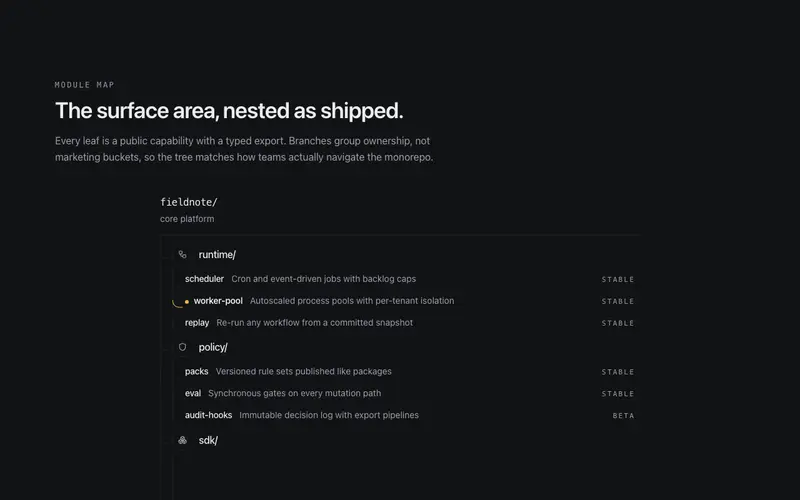
Module Tree Features
Product surface mapped as a module tree, hairline branch elbows and nested lists give React and Tailwind sites a file-tree of capabilities with real one-liners.
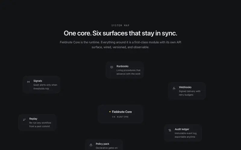
Orbit Map Features
A central product node with feature satellites wired by hairline SVG edges that draw themselves in, every node is real content, the architecture made visible.

Pinned Rail Features
Sticky narrative column on the left while feature cards scroll past on the right, the copy holds the argument as the evidence flows. Scrollytelling without the framework.
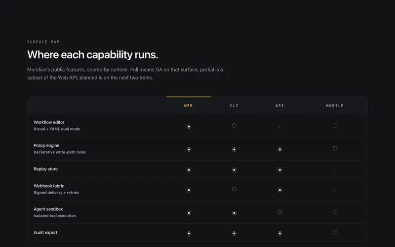
Platform Matrix Features
Feature availability matrix for React product sites, capabilities as rows, platforms as columns, tri-state Tailwind-token cells for shipped, partial, and planned. Docs-grade truth.
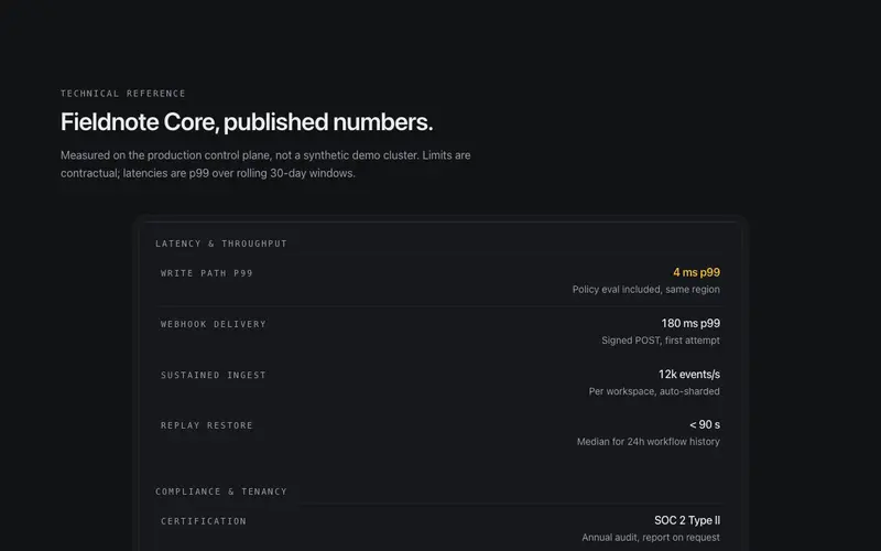
Spec Sheet Features
Product capabilities as an engineering datasheet, sectioned definition-list specs inside a double-ruled drafting frame with a mono title block, in React and Tailwind.
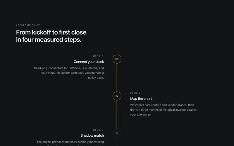
Steps Path
A numbered process where a hairline path literally draws the route between steps as you scroll, order made visible, each milestone settling in turn.
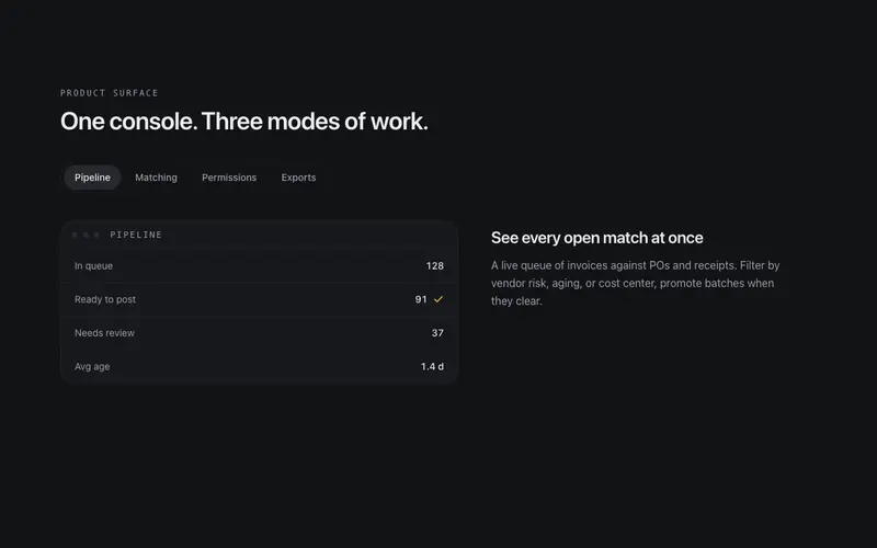
Tabbed Feature Stage
Feature tabs with a live stage, switching tabs morphs a token-built product panel between states, with the active tab carried by a sliding thumb.
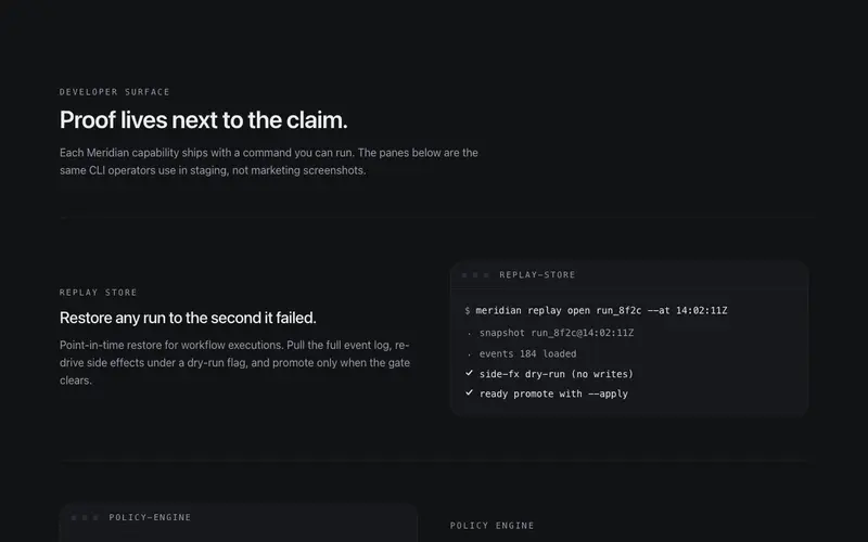
Terminal Rows Features
Alternating feature rows for developer tools built with React and Tailwind, each capability argued in copy and proven beside a token-built terminal pane with typed command and output.
Frequently asked questions
How do I pick the right feature layout for my product?
Ask what shape your argument has. A few deep capabilities suit the tabbed stage or accordion stage; many small features suit the inventory wall or bento grid; a technical audience trusts the spec sheet or terminal rows. The category page notes the intended use of each.
Can I mix multiple feature components on one page?
Yes, and long landing pages usually should, a bento overview followed by a deeper tabbed stage is a proven rhythm. Keep one scroll-animated variant per page so the motion stays special.
Do the animated variants work without JavaScript?
Content renders server-side and remains readable before hydration; animations are progressive enhancement. Under prefers-reduced-motion, reveals collapse to simple fades or static layouts.