Free React Footer Components
The footer is the most-ignored section on the page until you need it to carry weight, legal lines, sitemaps, newsletter capture, a final brand moment. These twelve range from a minimal rail and fine-print footer for focused products, through mega directories and accordion sitemaps for content-heavy sites, to statement pieces: a giant-type sign-off, a curtain reveal, a masthead treatment, an atlas footer for multi-location businesses, and a conversation footer that ends the page like a person would.
12 components · MIT licensed · installable with the shadcn CLI
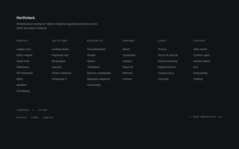
Accordion Sitemap Footer
A deep sitemap footer that stays honest on phones, open Tailwind link columns at desktop collapse into true disclosure accordions below lg, React button semantics intact.
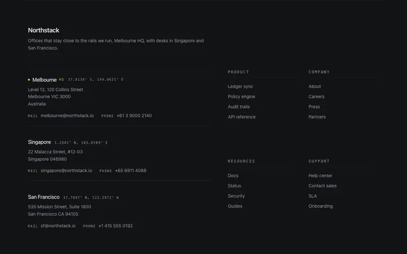
Atlas Footer
A global-presence footer for React sites, offices with mono coordinates, addresses, and dl contact pairs beside Tailwind directory columns, closed by a quiet legal rail.
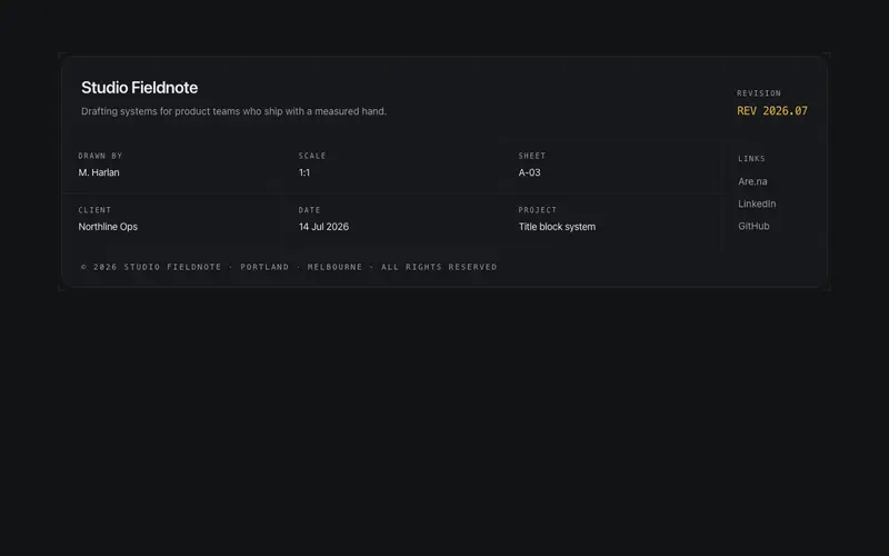
Blueprint Block Footer
The footer as an engineering drawing's title block, a hairline grid of zones for brand, revision, field pairs, socials, and legal. The drafting identity literalized.
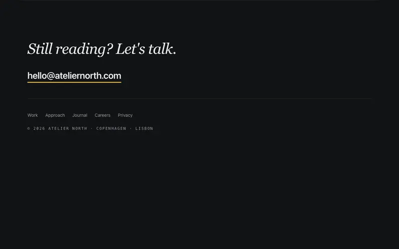
Conversation Footer
A footer that opens a conversation, a serif "Still reading? Let's talk." line with an oversized email link as the hero, quiet links beneath. The footer as an invitation.
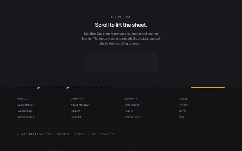
Curtain Reveal Footer
The page lifts like a curtain to reveal the footer waiting underneath, a fixed backstage layer with CTA, links, and meta, exposed by the scroll itself.
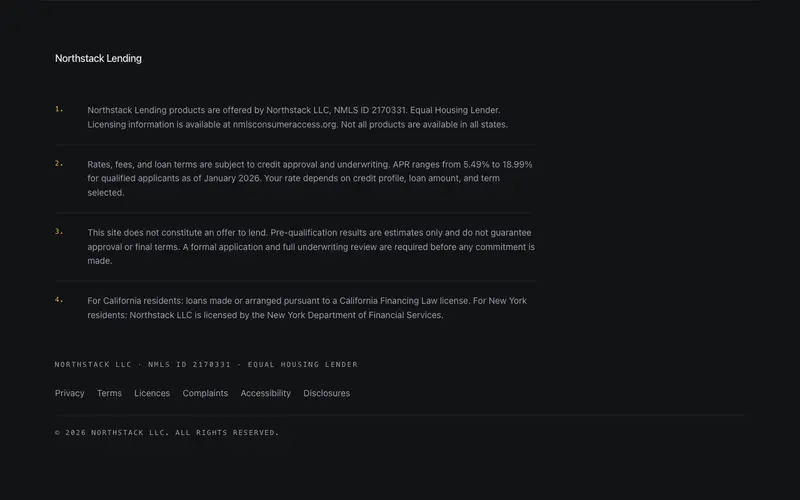
Fine Print Footer
A disclosure-first footer for regulated products, numbered fine-print notes set in readable React and Tailwind type, a licence line, quiet links, and a mono copyright rail.
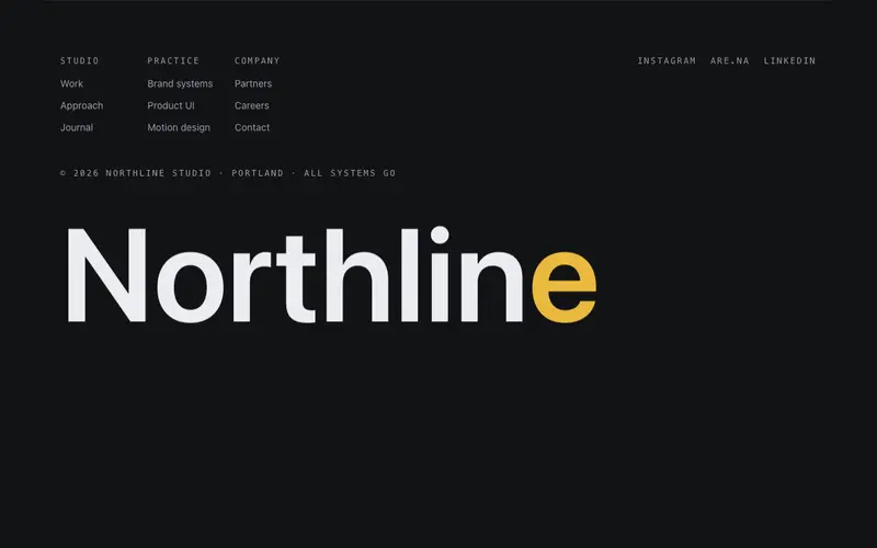
Giant Type Footer
The footer as a signature, an oversized brand word rises from the page bottom as you arrive, above a quiet mono meta row. The last impression treated like the first.
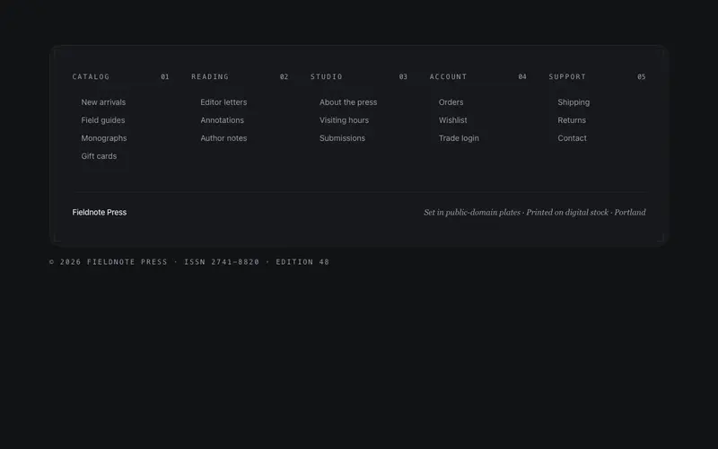
Index Sheet Footer
A footer set like a book's index, dense, beautifully-ordered link columns with mono folio numbers, a hairline frame, and a colophon line. For sites with real depth.
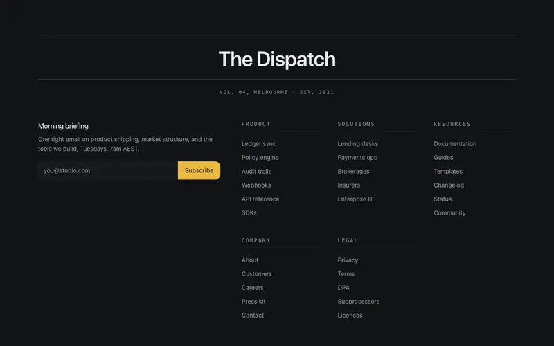
Masthead Footer
A broadsheet masthead footer for React sites, nameplate between double rules, mono edition line, a real Tailwind newsletter form leading the sections, and a quiet legal rail.
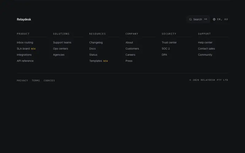
Mega Directory Footer
A directory footer for big sites, multi-column grouped links under a utility row with a search affordance and locale display, closed by a legal rail. Dense but ruled.

Minimal Rail Footer
One honest line, brand, three quiet links, and a mono copyright on a single hairline rail. The smallest footer that still looks drawn, entrance-only motion.
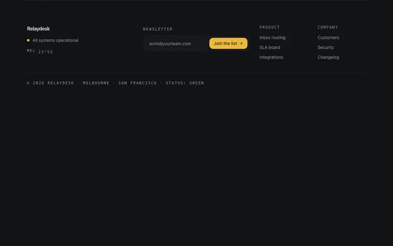
Signal Footer
A working footer, live status lamp, local time readout, newsletter field, and quiet links. The footer as an instrument panel that proves someone is home.
Frequently asked questions
How do I choose between a minimal and a mega footer?
Count your real destinations. Under ten links, a minimal rail or fine-print footer keeps things honest; a marketing site with docs, legal, and product areas earns the mega directory or accordion sitemap. Do not pad a footer to look established.
Do the animated footers (curtain reveal, giant type) affect scroll performance?
No, the reveals are transform-based and observer-triggered once, near the end of the page where nothing competes for frame budget. Reduced-motion preferences collapse them to static layouts.
Can I add newsletter signup to any footer?
Most variants include an optional signup slot with an onSubmit callback; the conversation and masthead footers make it a centrepiece. Wire the callback to your email platform, no vendor is baked in.