Free React Interactive Components
These components make a page feel operated rather than merely read, and each mechanism is borrowed from a real instrument: a slide rule, a rotary tuner, a centrifugal governor, a pantograph, a logic gate bench, an orrery crank. Alongside the machines sit practical interactive patterns: a ledger accordion, comparison frame, flow stepper, dock tray, command hint bar, and physics-underline tabs. Everything is keyboard operable and honest about its state, interaction as substance, not garnish.
20 components · MIT licensed · installable with the shadcn CLI
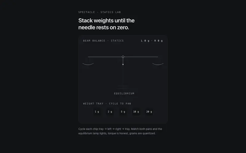
Beam Balance
A working two-pan beam balance for React, place mono weight chips on either pan, the beam tips with damped torque physics, and equilibrium earns the lamp. Tailwind tokens.
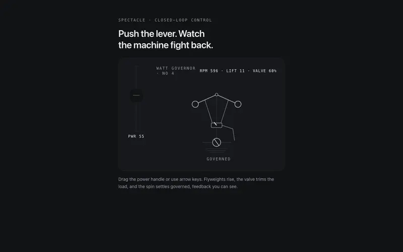
Centrifugal Governor
A working centrifugal governor for React, drive the power lever, flyweights rise and the valve trims the spin until it settles governed. ARIA slider semantics, Tailwind tokens.
Keystroke Cascade
A type-anything React toy, every keystroke drops a physical glyph tile onto a canvas stage to bounce and stack; Enter opens the floor. Keyboard-native, Tailwind-tokened spectacle.
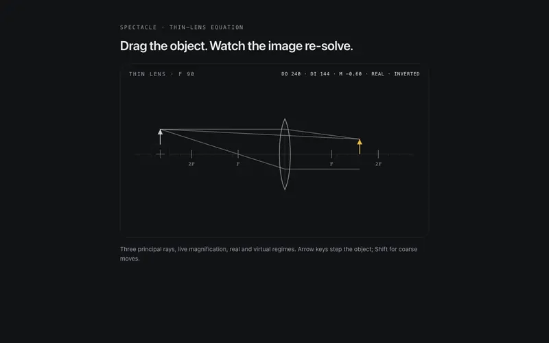
Lens Lab
A playable thin-lens ray lab for React, drag the object along the axis and principal rays, image, and magnification re-solve live. ARIA slider semantics, Tailwind token ink.
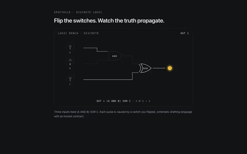
Logic Gate Bench
A live logic schematic for React, flip real toggle switches and watch pulses race hairline traces through gates to the output lamp. aria-pressed switches, Tailwind tokens.
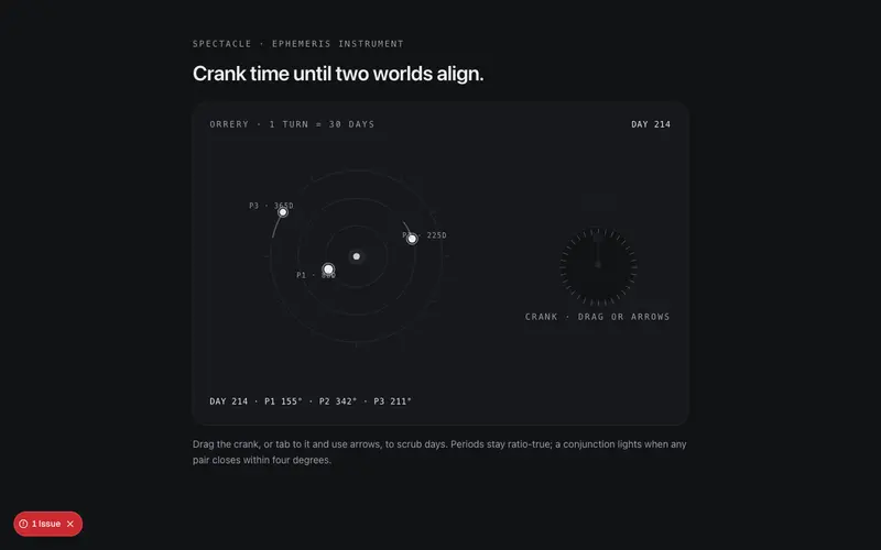
Orrery Crank
A hand-cranked orrery for React, turn the crank and geared planets advance at true period ratios while you hunt conjunctions on a mono day readout. ARIA slider, Tailwind tokens.
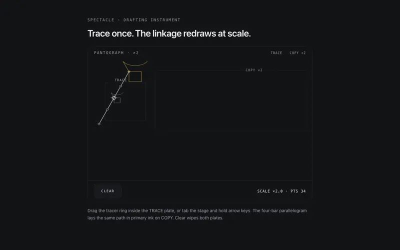
Pantograph Copier
A working pantograph for React, trace in the source plate and a four-bar linkage redraws your stroke at scale in primary ink. Keyboard steerable, touch native, Tailwind tokens.
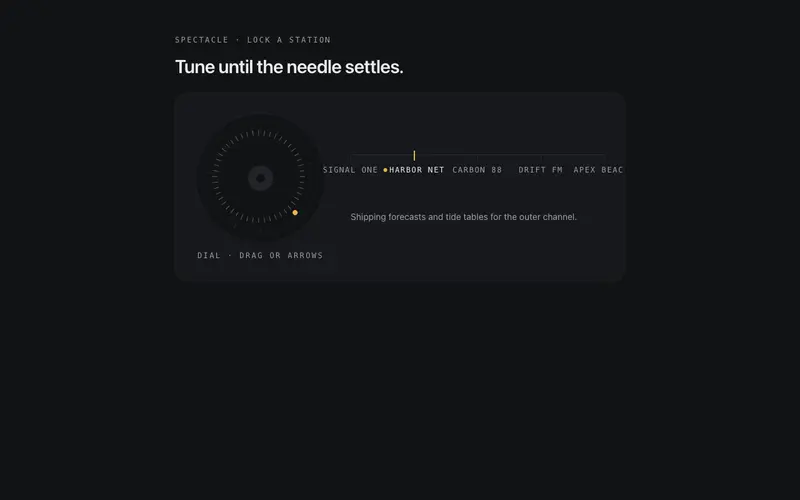
Rotary Tuner
A draggable rotary tuner for React, real angular drag with inertia and detents drives a geared needle while station labels resolve from static. ARIA slider semantics, Tailwind tokens.
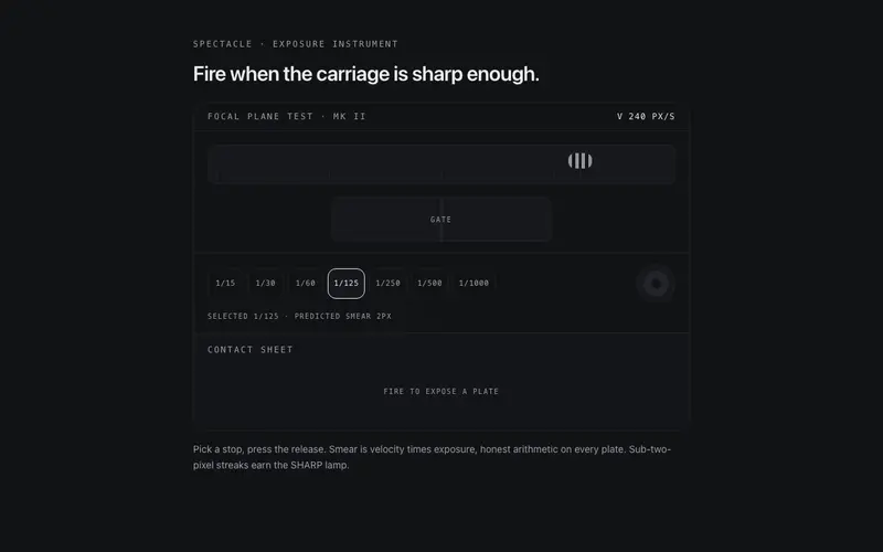
Shutter Timing Bench
A focal-plane shutter bench for React, pick a speed, fire at a moving target and every plate keeps honest motion smear on a contact sheet. Tailwind tokens, keyboard native.
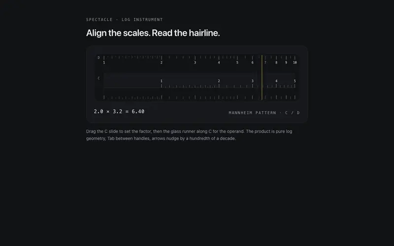
Slide Rule
A working slide rule for React, drag the slide and the glass runner across true log scales and read the product off the hairline. Two real ARIA sliders, Tailwind token ink.
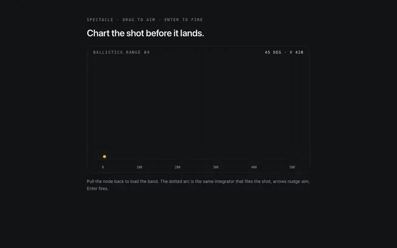
Slingshot Plotter
A slingshot ballistics range for React, drag to aim with a live predicted arc, fire, and every shot etches its trajectory with plotted coordinates. Keyboard aimable, Tailwind tokens.
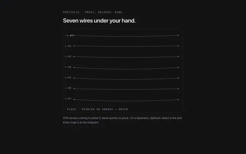
String Pluck Field
A playable field of hairline strings for React, they bend around the pointer and ring with damped harmonic decay when plucked by cursor, tap, or keyboard. Tailwind token strokes.
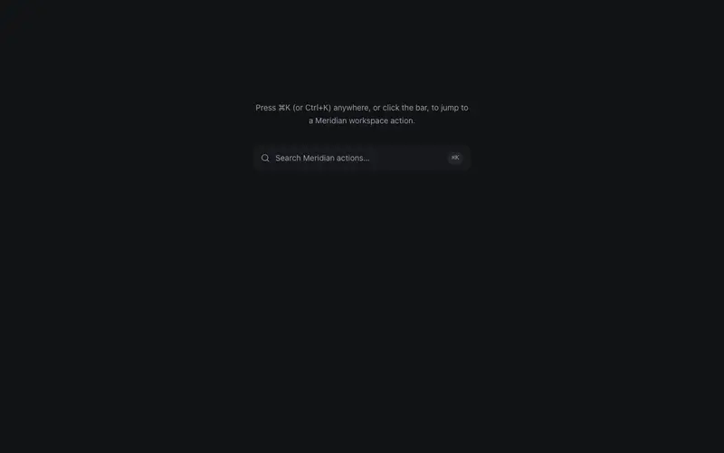
Command Hint Bar
A command-K hint bar that opens a compact command sheet, static list from props with a filter input, arrow-key selection, and Escape, real keyboard semantics without the cmdk weight.
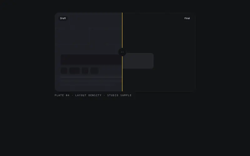
Compare Frame
Neutral labeled compare slider for any two children, a clipped divider with true keyboard slider semantics, framed like a plate in a technical catalog.
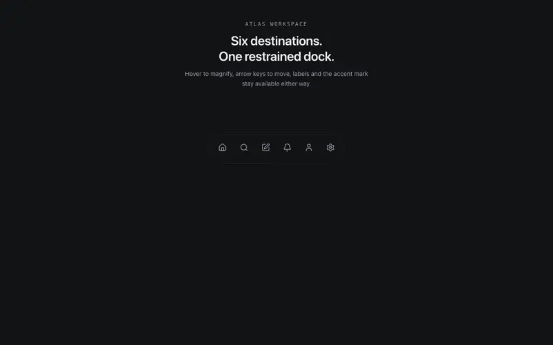
Dock Tray
Bottom utility dock of icon buttons with restrained proximity magnification, springy, capped at 1.4x, mono label tooltips, and arrow-key navigation that never needs the zoom.
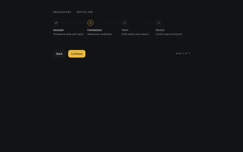
Flow Stepper
Controlled multi-step progress stepper, numbered nodes on a hairline spine, completed ticks that draw in, a current node that pulses exactly once, and real links when steps navigate.
Hover Peek Link
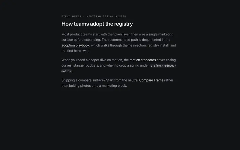
Inline link that floats a structural preview card on hover or focus, title, description, and meta from props, with intent delay, close grace, and viewport-edge flip.
Ledger Accordion
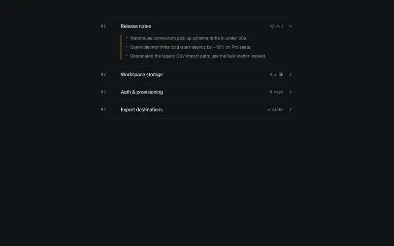
A standalone accordion in the ruled-ledger voice, mono indices, right-aligned mono meta figures, hairline rows, and a primary keyline beside the open region. A content container, not a FAQ.
Physics Underline Tabs
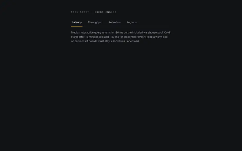
The classic underline tabs with real physics, the active bar travels on an underdamped spring with velocity-linked squash and one visible overshoot, over correct APG tablist semantics.
Toggle Reveal Pane
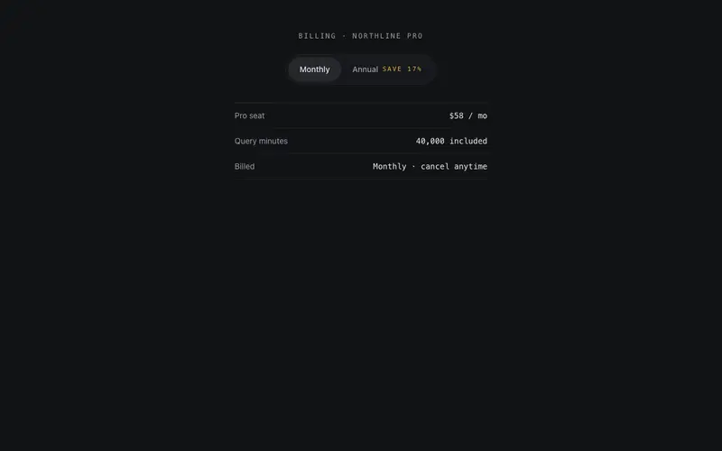
A labelled two-option toggle that swaps panes with a height-aware morph, monthly/annual, personal/business, using aria-pressed buttons and a crossfade that never jumps the layout.
Frequently asked questions
Are the instrument-style components (slide rule, tuner, governor) actually functional?
Yes, they compute and display real values, driven by pointer, keyboard, or props. They shine as explanatory interludes and playful section breaks; for a plain settings form, use conventional inputs and save these for moments worth savouring.
Do the interactive components work with keyboards and assistive tech?
Every draggable or crankable mechanism has keyboard equivalents (arrow keys, home/end) and proper roles or aria-valuenow where a slider or tab semantic applies. Focus states are visible throughout.
What is the difference between this category and the lab category?
Interactive components are production-ready patterns with playful mechanics; lab components are award-tier showpieces, scroll-driven systems and experimental typography that assume a bespoke page built around them. Start here for product UIs, there for campaign pages.