Constellation Card
A card whose border is a constellation, seeded stars joined by hairline segments that twinkle in slow sequence, then re-wire into a new star graph on hover. The frame is the show.
Preview & code
Installation
pnpm dlx shadcn@latest add @cleverui/card-constellationRequires the @cleverui registry in your components.json, a one-off, two-line setup.
Usage
API reference
CardConstellation accepts the following props.
…plus everything from Omit< React.HTMLAttributes<HTMLElement>, 'onDrag' | 'onDragStart' | 'onDragEnd' | 'onAnimationStart' | 'title' >: className, event handlers, aria attributes and the rest pass straight through.
Related components
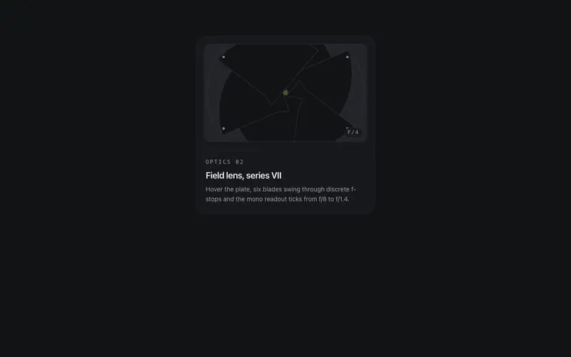
Iris Aperture Card
A React card with a working camera iris, token-surface blades pivot through real f-stops to unveil the pane on hover, under a live mono aperture readout. Tailwind tokens, mechanical spectacle.
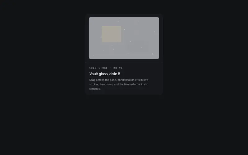
Frost Wipe Card
A condensation card for React, the pane mists over with canvas breath, your pointer squeegees it clear, droplets run, and it slowly re-fogs. Tailwind token colors throughout.
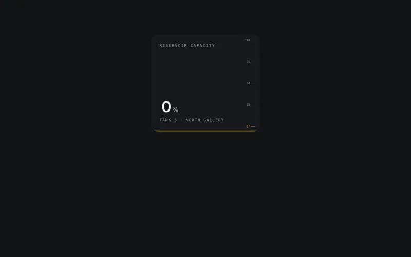
Liquid Gauge Card
A React metric card filled with token-tinted liquid, pointer motion sloshes the spring-driven meniscus while the fill height plots the real value. Tailwind-only material gauge.
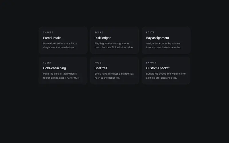
Magnetic Cluster
A cluster of small cards with social physics, hover one and its neighbors lean two to three degrees toward it on springs, deferring to the focus. The group reacts as a field.
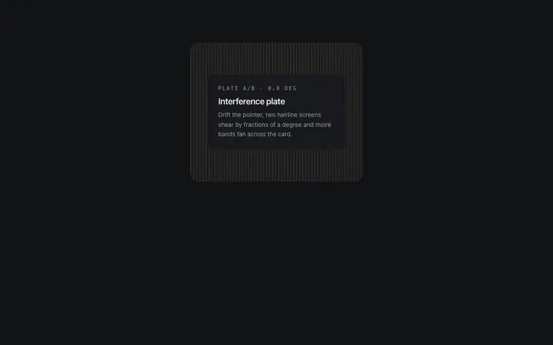
Moire Veil Card
A React card veiled by two hairline plates whose misalignment breeds moiré bands, pointer drift shears the top plate so interference sweeps the surface. Pure Tailwind tokens.
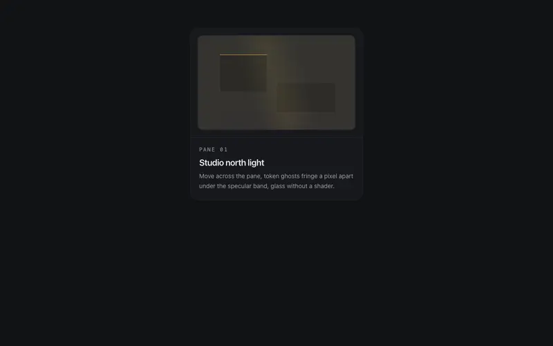
Refraction Card
Content behind a simulated glass pane, token-built backdrop ghosts split a pixel apart against the pointer, fringing like dispersion under a gliding specular band. Glass without WebGL.
Frequently asked questions
How do I install the Constellation Card component?
Register the @cleverui registry in your components.json ("@cleverui": "https://cleverops.com.au/r/{name}.json"), then run `npx shadcn@latest add @cleverui/card-constellation`. The shadcn CLI copies the source into your project, you own the code from that point. You can also copy the source directly from this page.
What dependencies does Constellation Card require?
Constellation Card uses motion on top of React and Tailwind CSS. You don't need to install it manually, the shadcn CLI resolves and installs npm dependencies automatically when you add the component.
Can I theme Constellation Card to match my brand?
Yes. The component is styled entirely with Tailwind utilities over standard design tokens (primary, background, muted, border), so it inherits your existing shadcn/ui theme automatically. Change your CSS variables and the component follows, no source edits needed for palette, radius, or fonts.
Want this built for you?
CleverUI is built by the Clever Ops web team. If you'd rather ship a hand-coded, fast, custom website than assemble one, we build them for Australian businesses every week.
Explore web development services