Free React Navbar Components
Navigation is a promise about how a site is organised, and one navbar cannot fit every promise. These twelve cover the real range: a glass navbar for marketing sites, a mega panel for deep catalogues, a command-center bar for keyboard-first products, bottom tabs for app-like mobile experiences, a sidebar hybrid for docs, a progress spine for long single pages, flow steps for wizards, and quieter pill, rail, and breadcrumb-morph patterns. Every one handles scroll behaviour, focus trapping, and mobile states properly.
12 components · MIT licensed · installable with the shadcn CLI
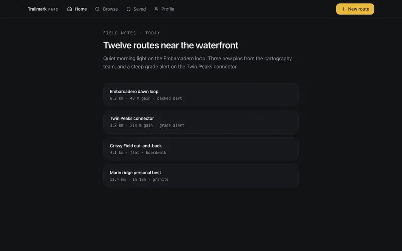
Bottom Tabs Navbar
App-style React navigation, a thumb-reach bottom tab bar with a raised primary action on mobile that becomes a top Tailwind glass bar on desktop; one landmark, safe-area aware.
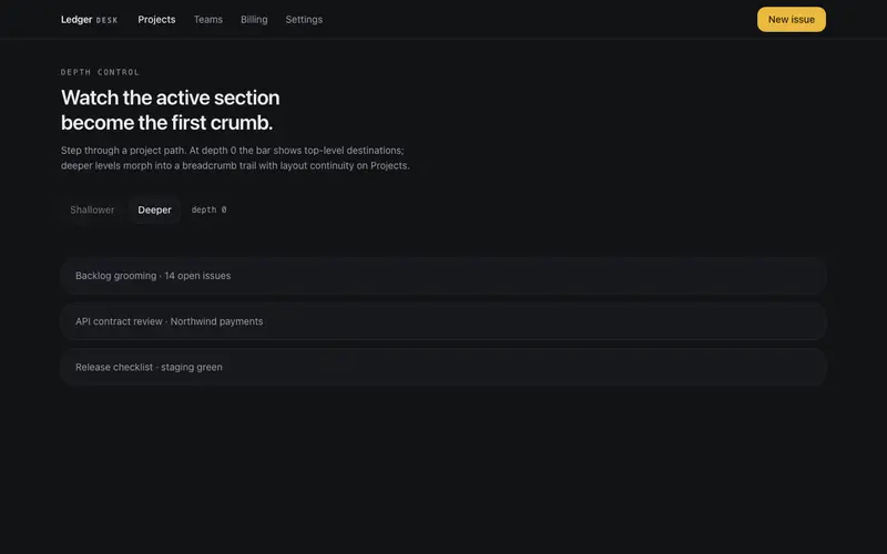
Breadcrumb Morph Navbar
An app navbar that morphs between top-level links and a breadcrumb trail as a depth prop changes, the active link travels into crumb position with layoutId continuity.
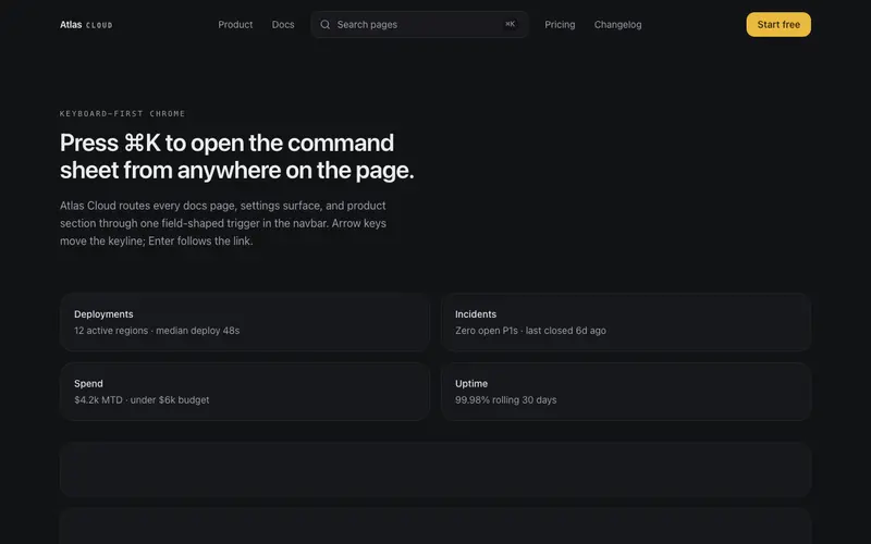
Command Center Navbar
A navbar whose centerpiece is a Cmd-K search button opening a compact command sheet, grouped destinations, arrow-key selection, quiet links flanking a keyboard-first affordance.
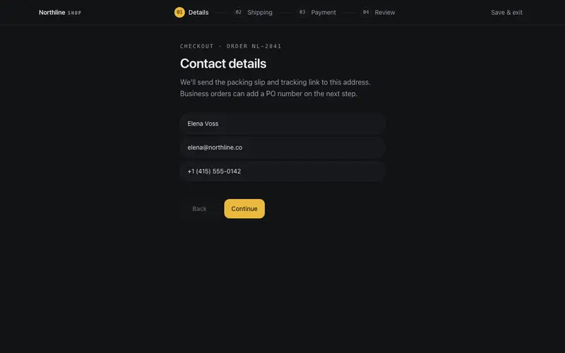
Flow Steps Navbar
Checkout-flow navbar for React, a numbered step trail with aria-current and honest revisit links, condensing to a mono counter and Tailwind hairline progress fill on mobile.
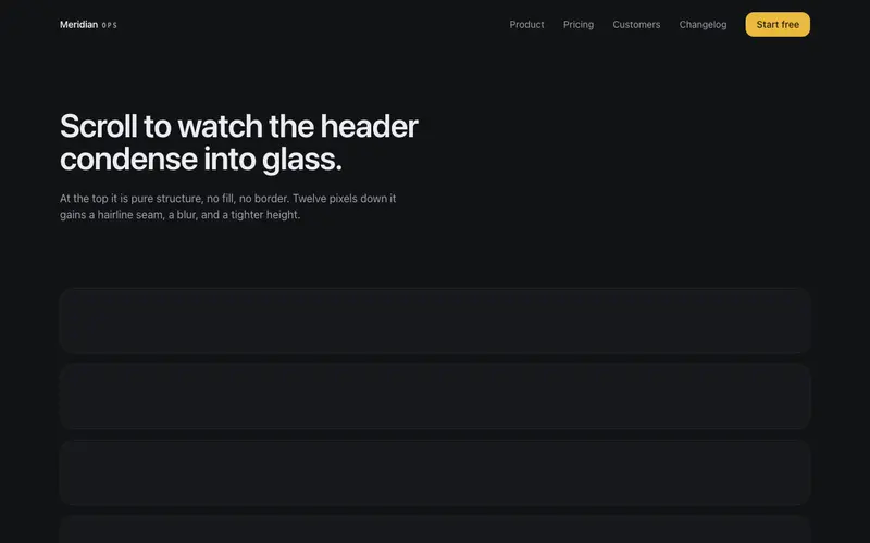
Glass Navbar
Header that starts as pure structure over the hero and condenses into glass on scroll, blur, hairline seam, tighter height. Accessible staggered mobile menu with Escape handling.
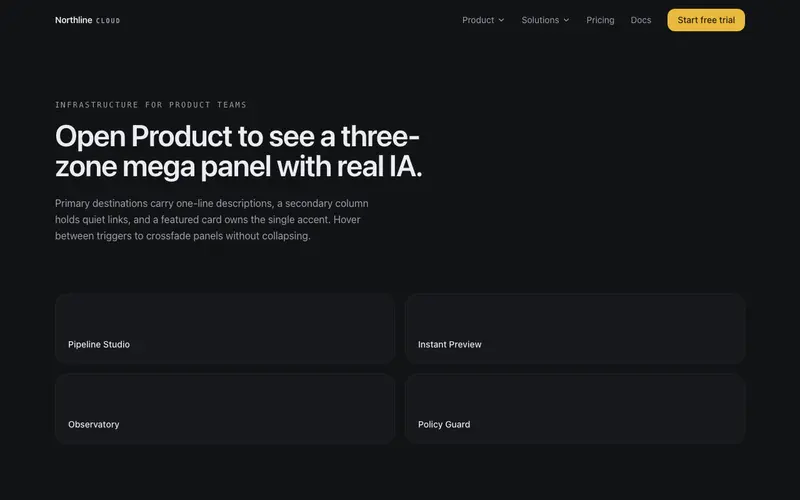
Mega Panel Navbar
Navbar whose product menu opens a three-zone mega panel, primary destinations with descriptions, a quiet secondary column, and a featured card. Real IA, not a link dump.
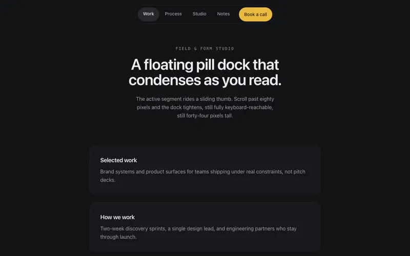
Pill Dock Navbar
A floating pill nav that hangs centered under the top edge, the active link carries a sliding thumb, and the whole dock condenses on scroll. App-like, not corporate.
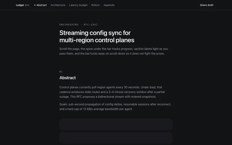
Progress Spine Navbar
A reading navbar for long pages, a hairline progress spine under the bar fills as you scroll, section labels light up as you pass them, and the bar keeps out of the way.
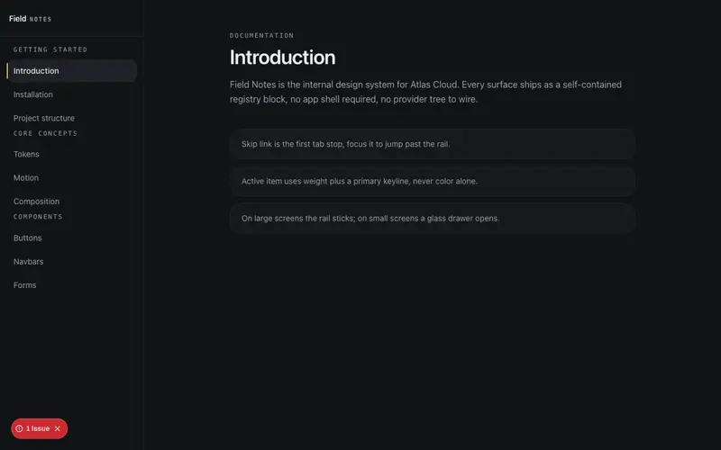
Sidebar Hybrid Navbar
Docs-style responsive navigation, a glass top bar with a drawer on mobile becomes a left rail of grouped sections with an active keyline on lg. Skip link built in.
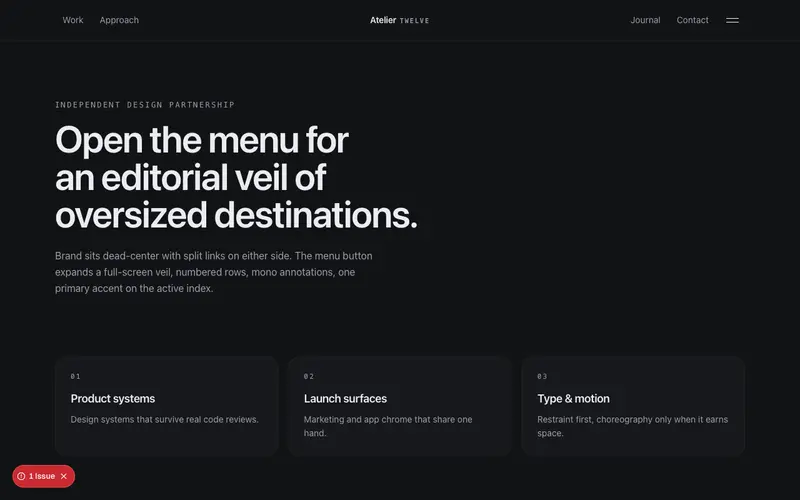
Split Veil Navbar
Centered-brand navbar with split links, whose menu button draws a full-screen veil, oversized destinations stagger in over a dimmed page, agency-style.
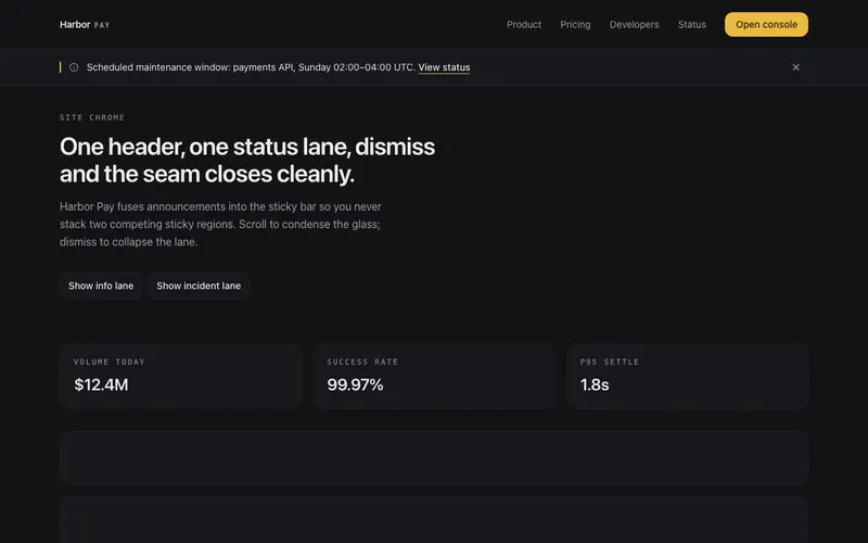
Status Banner Navbar
A navbar with an integrated status lane under its hairline seam, one line, a link and a dismiss; dismissing collapses the lane smoothly while the header holds steady.
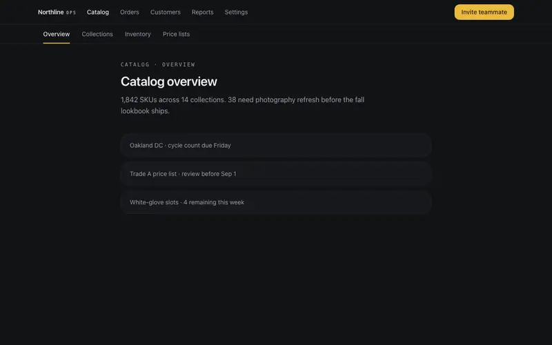
Tab Rail Navbar
Two-deck React navbar, primary sections over a persistent contextual sub-link rail with a sliding Tailwind underline; the mobile rail scrolls its own overflow with edge fades.
Frequently asked questions
Which navbar suits a marketing site versus a web app?
Marketing sites usually want the glass navbar or split veil, persistent, light, CTA-forward. Apps lean command center or sidebar hybrid, where wayfinding and keyboard access matter more than brand. Bottom tabs are the mobile-app answer when your product is used on phones.
Do the navbars handle mobile menus and focus trapping?
Yes, each has a purpose-built mobile state (sheet, drawer, or tabs) with focus trapped while open, Escape to close, and scroll locking. These details are exactly where hand-rolled navbars usually fail audits.
Can I use my routing library's active states?
Links are render-prop friendly, pass your framework's Link component and active logic (Next.js usePathname, React Router NavLink) and the navbar styles the active item. Nothing assumes a specific router.