Type Constellation
Headline type as an ogl WebGL constellation: glyph-sampled points settle into letterforms, join with hairline links and part around the cursor, while the real heading stays in the DOM.
Preview & code
Installation
pnpm dlx shadcn@latest add @cleverui/type-constellationRequires the @cleverui registry in your components.json, a one-off, two-line setup.
Usage
API reference
TypeConstellation accepts the following props.
…plus everything from React.HTMLAttributes<HTMLElement>: className, event handlers, aria attributes and the rest pass straight through.
Related components
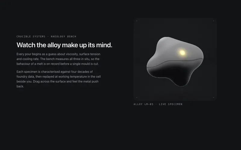
Liquid Metal
A contained WebGL specimen cell (ogl) of raymarched liquid chrome: metaballs breathe and orbit, the pointer dents the surface, and the studio environment is derived live from theme tokens.
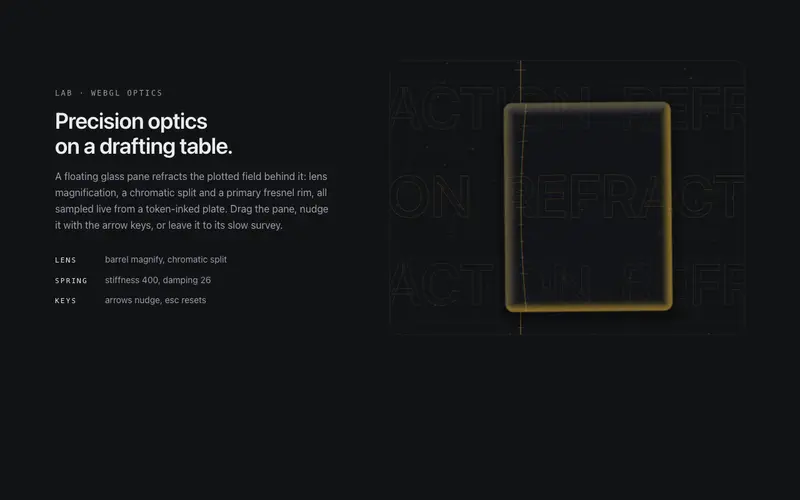
Refraction Pane
A floating glass pane (ogl) that refracts a token-inked drafting plate: lens distortion, chromatic split and a primary fresnel rim. Ambient drift, spring drag-return, keyboard operable.
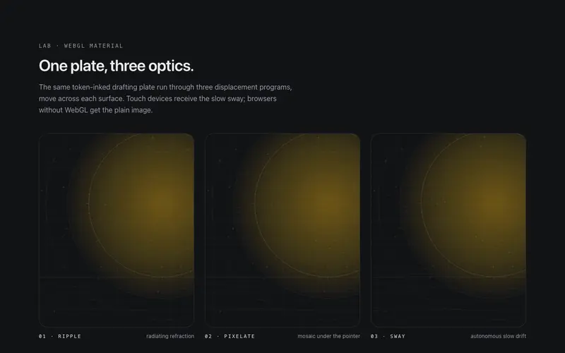
Shader Image
A WebGL image surface (ogl) for React, ripple, pixelate, or sway displacement on hover, a token-drawn plate by default, and honest fallbacks to a plain image. Tailwind-themed, self-idling.
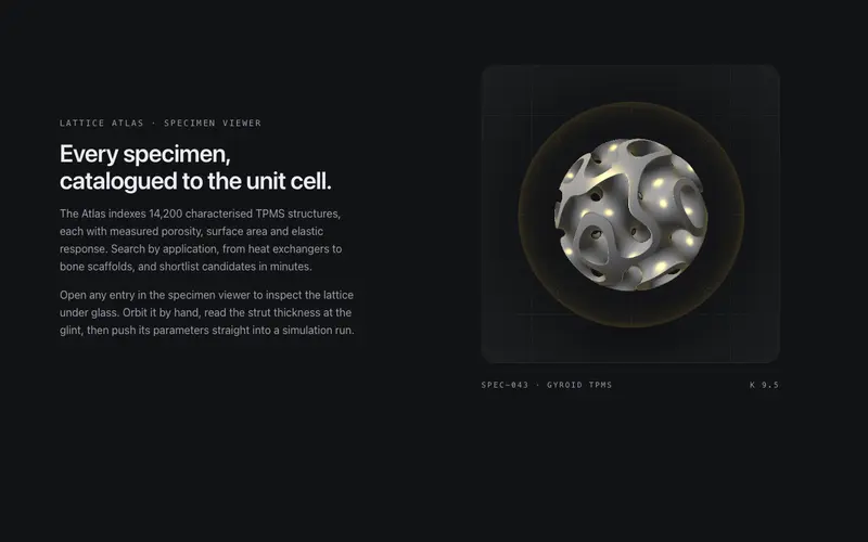
Specimen Orb
A contained WebGL specimen viewer: a gyroid TPMS lattice raymarched inside a glass orb, refracting the token bench with a primary glint. Slow ambient orbit, eased drag momentum, arrow keys rotate.
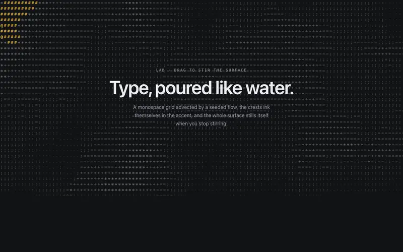
ASCII Liquid Field
A monospace glyph grid flowing like liquid, a seeded scalar field advects through a curl flow, crests ink in the accent, pointer drags stir it. Self-idling React + Tailwind canvas background.
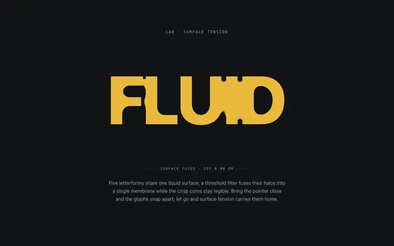
Gooey Type
SVG metaball letterforms for React, a threshold filter fuses heavy glyphs into one liquid membrane; pointer proximity snaps them apart and they re-fuse on release. Tailwind-themed, zero deps.
Frequently asked questions
How do I install the Type Constellation component?
Register the @cleverui registry in your components.json ("@cleverui": "https://cleverops.com.au/r/{name}.json"), then run `npx shadcn@latest add @cleverui/type-constellation`. The shadcn CLI copies the source into your project, you own the code from that point. You can also copy the source directly from this page.
What dependencies does Type Constellation require?
Type Constellation uses motion and ogl on top of React and Tailwind CSS. You don't need to install them manually, the shadcn CLI resolves and installs npm dependencies automatically when you add the component.
Can I theme Type Constellation to match my brand?
Yes. The component is styled entirely with Tailwind utilities over standard design tokens (primary, background, muted, border), so it inherits your existing shadcn/ui theme automatically. Change your CSS variables and the component follows, no source edits needed for palette, radius, or fonts.
Want this built for you?
CleverUI is built by the Clever Ops web team. If you'd rather ship a hand-coded, fast, custom website than assemble one, we build them for Australian businesses every week.
Explore web development services