SVG Mask Chapters
Chapters revealed through drawn SVG mask shapes for React, a circle, keyhole arch, and diagonal band draw and fill as scroll scrubs a pinned stage. Tailwind tokens, reversible, reduced-motion safe.
Preview & code
Installation
pnpm dlx shadcn@latest add @cleverui/svg-mask-chaptersRequires the @cleverui registry in your components.json, a one-off, two-line setup.
Usage
API reference
SvgMaskChapters accepts the following props.
…plus everything from React.HTMLAttributes<HTMLElement>: className, event handlers, aria attributes and the rest pass straight through.
Referenced types
Related components
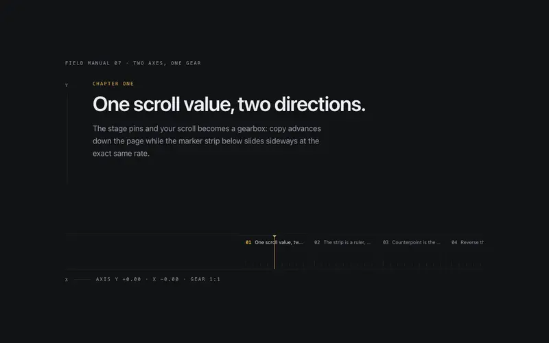
Dual Axis Chapters
A pinned React stage where one scroll value drives two geared axes, chapters advance vertically while a marker filmstrip slides in counterpoint, with a live mono ratio readout. Tailwind-themed.
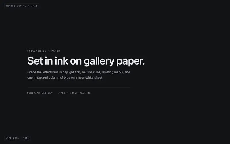
Mask Wipe Kit
A two-panel wipe stage for React, iris, blinds, split, or sweep mask geometry scrubbed by scroll or a progress prop, a primary keyline on the wipe front. Tailwind-themed, reduced-motion honest.
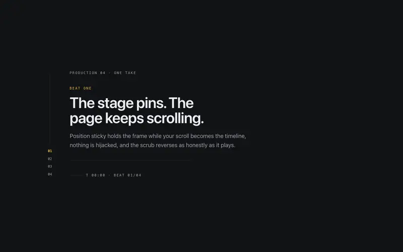
Scroll Director
A pinned narrative stage for React, scroll scrubs through choreographed beats on a sticky frame with a cue rail and running timecode, fully reversible and never scroll-jacked. Tailwind-themed.
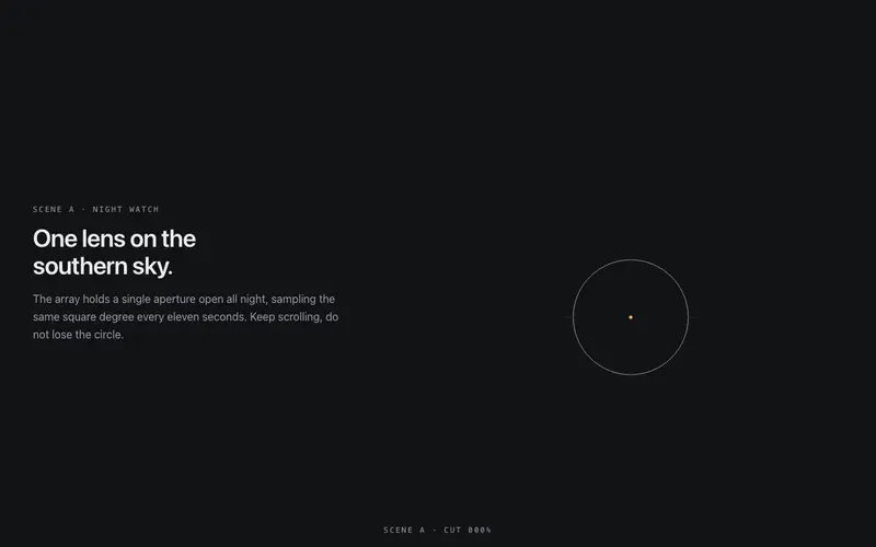
Cinematic Handover
A directed match-cut between two full-bleed React scenes, scroll scrubs a hairline figure that travels and grows from scene A into scene B's focal element. Reversible, Tailwind-themed.

Sticky Grid Unfold
A pinned React deck that unfolds into a ruled grid on scroll, cards travel from a neat pile to their seats as outlines and skeleton lines draw in, fully reversible. Seeded, Tailwind-themed.
Text Fill Scrub
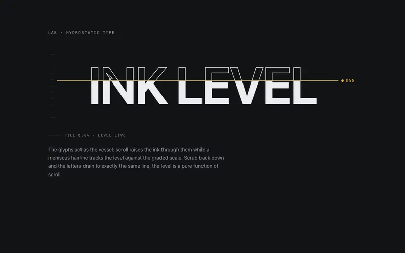
An outline headline that fills with ink as the section scrolls, a clipped level rises through SVG glyphs under a meniscus hairline. React + Tailwind tokens, zero dependencies.
Frequently asked questions
How do I install the SVG Mask Chapters component?
Register the @cleverui registry in your components.json ("@cleverui": "https://cleverops.com.au/r/{name}.json"), then run `npx shadcn@latest add @cleverui/svg-mask-chapters`. The shadcn CLI copies the source into your project, you own the code from that point. You can also copy the source directly from this page.
What dependencies does SVG Mask Chapters require?
SVG Mask Chapters has no npm dependencies beyond React and Tailwind CSS itself, so there is nothing extra to install or keep updated.
Can I theme SVG Mask Chapters to match my brand?
Yes. The component is styled entirely with Tailwind utilities over standard design tokens (primary, background, muted, border), so it inherits your existing shadcn/ui theme automatically. Change your CSS variables and the component follows, no source edits needed for palette, radius, or fonts.
Want this built for you?
CleverUI is built by the Clever Ops web team. If you'd rather ship a hand-coded, fast, custom website than assemble one, we build them for Australian businesses every week.
Explore web development services