Free React Team Section Components
Team pages default to a grid of headshots that tells visitors nothing except that everyone owns a blazer. These six find better angles: directory rows that scale past a dozen people, an editorial grid with actual art direction, hover dossiers that reveal substance, a coverage matrix showing who handles what, a timezone strip for distributed teams, and a cohort timeline that tells the growth story. Pick the one that matches what your team page is actually for, trust, recruiting, or routing.
6 components · MIT licensed · installable with the shadcn CLI
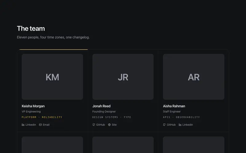
Editorial Team Grid
Industry-neutral team grid, initials-panel portraits, mono focus-area lines, and link icons with real visible labels; one principal card carries a hairline primary keyline.

Team Cohort Timeline
React team timeline grouping members into year-joined cohorts along a hairline spine, mono year markers and Tailwind-ruled rows tell the growth story.
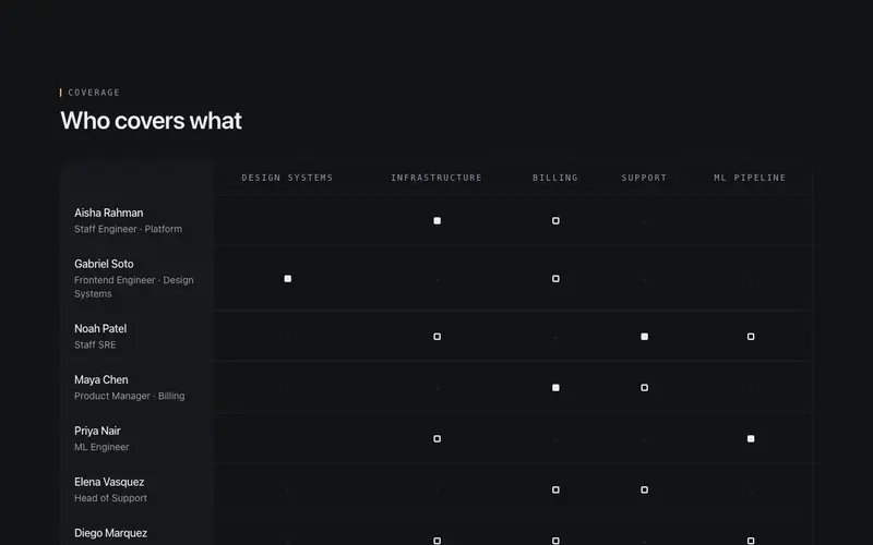
Team Coverage Matrix
Accessible React team matrix mapping people to focus areas, real table semantics and a Tailwind hairline grid, with ink marks showing who covers and leads what.
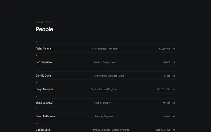
Team Directory Rows
Dense industry-neutral directory rows under alphabetical mono group headers, name, role, and location column ruled by hairlines; scales from ten people to two hundred.
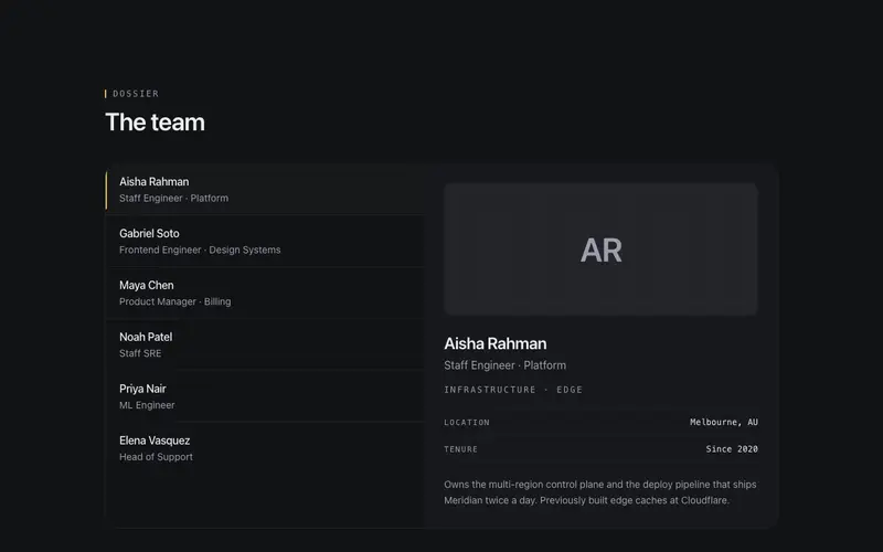
Team Hover Dossier
Master-detail React team section, hover or focus a roster name to swap a monogram dossier panel; Tailwind hairlines, tabs semantics, no photos needed.
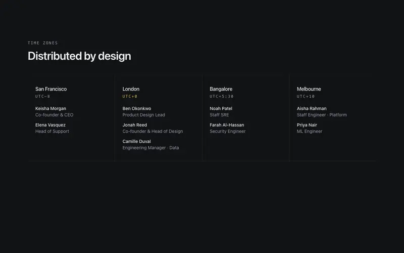
Team Timezone Strip
Distributed React team strip grouping members under city and UTC-offset mono headers, a Tailwind hairline band for remote-team pages, no headshots or WebGL.
Frequently asked questions
Which team component works for a large organisation?
The directory rows, they stay scannable past fifty people, support grouping by team, and skip the photo-grid problem where faces shrink to postage stamps. The coverage matrix complements it when visitors need to find the right person, not browse everyone.
What if some team members do not want photos online?
Every variant handles photo-optional gracefully, initials tiles or role-based abstract marks slot in per person. The hover dossier and directory rows carry substance in text, so a mixed roster still looks intentional.
Should a small team even have a team page?
For services businesses, yes, people hire people. A three-person studio suits the editorial grid or hover dossiers, which make small numbers feel like a strength (senior people, no juniors) rather than a gap.