Free React Button Components
These are buttons for moments where a plain button is not enough: a confirm-hold button for destructive actions, an undo window that gives people five seconds of grace, a progress button that reports work inline, split and stepper buttons for compound actions, a hotkey button that advertises its shortcut, and magnetic and shine variants for hero CTAs. Every one keeps real button semantics, focus rings, disabled states, keyboard activation, under the animation.
9 components · MIT licensed · installable with the shadcn CLI
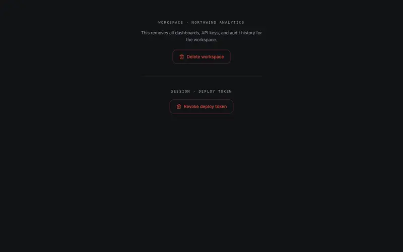
Confirm Hold Button
Press-and-hold confirmation for destructive actions, a radial destructive fill charges while held and fires only past the threshold; releasing early cancels. Holding Space counts exactly the same.
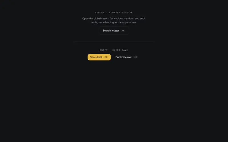
Hotkey Button
A React button that binds a real keyboard shortcut, mac-aware kbd chip, aria-keyshortcuts, a typing-context guard, and a remote-press flash when the hotkey fires it.
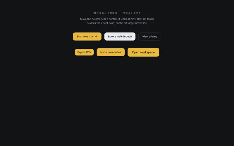
Magnetic Button
Magnetic button done with restraint, at most 8px of pull inside an 80px radius, spring return on leave, and the effect disabled on touch and reduced motion so the hit target stays honest.
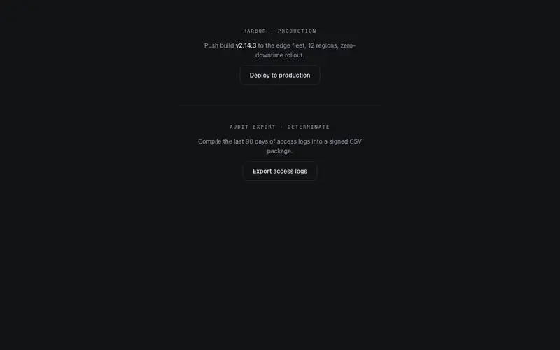
Progress Button
A button that becomes its own progress state, idle, a hairline sweep tracing the border while working, a drawn check on success. Controlled state prop with honest aria-busy announcements.
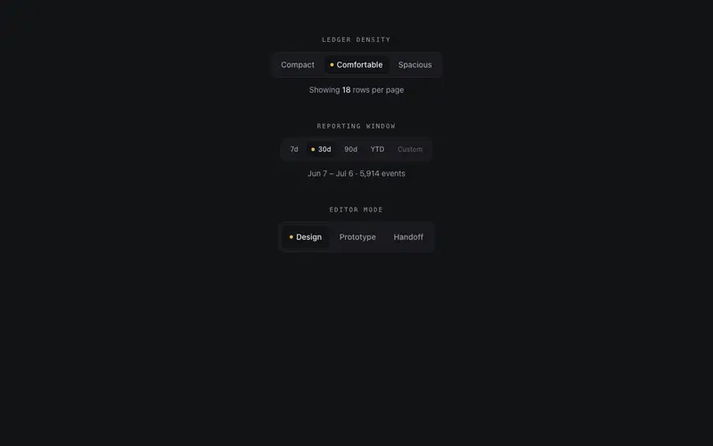
Segmented Button Group
Segmented control drawn like an instrument panel, one hairline frame, a sprung layoutId thumb under the active segment, an indicator lamp, roving tabindex with arrow keys, and cva sizes.
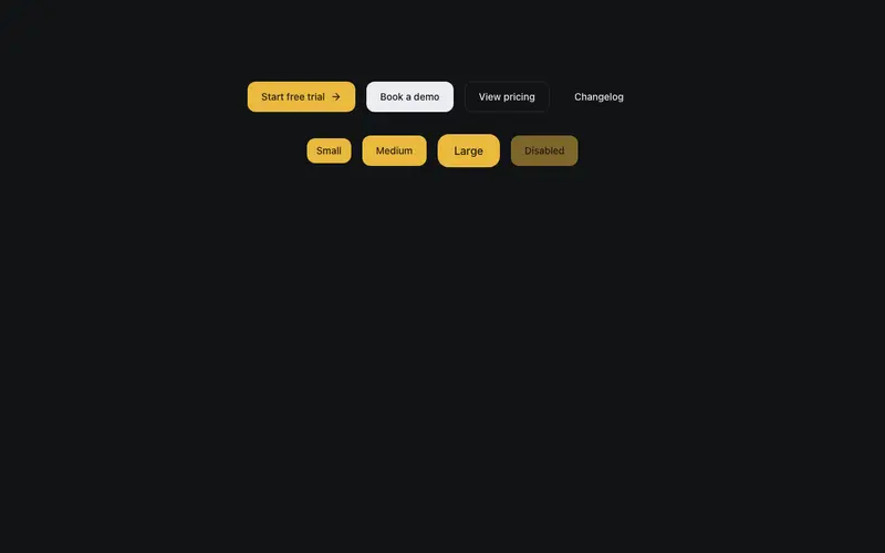
Shine Button
Button whose filled variants carry a single sheen sweep on hover, light passing over a surface. Four variants, three sizes, press feedback, full keyboard focus treatment.
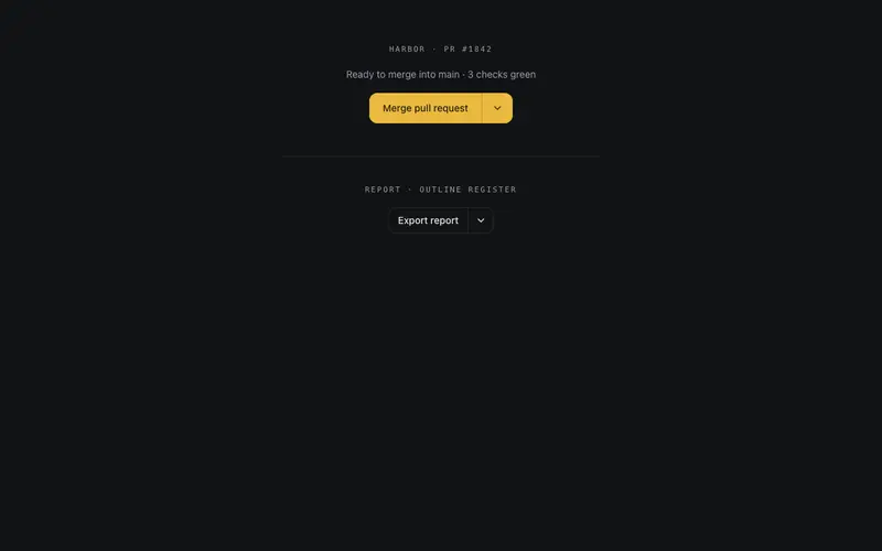
Split Button
A self-contained split button for React, filled primary action, hairline-divided menu toggle, and real role=menu keyboard semantics with zero Radix or portal dependencies.
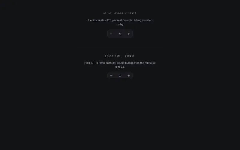
Stepper Button
A quantity stepper built with React and Tailwind, real spinbutton semantics, held auto-repeat with stated acceleration, direction-aware rolling digits, honest min/max clamping.
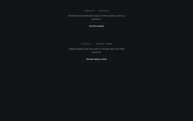
Undo Window Button
An undo-window button for React, the click commits only after a countdown, with a depleting hairline timer, mono seconds, and an Undo recall that never drops focus.
Frequently asked questions
Why use a confirm-hold button instead of a confirmation dialog?
Hold-to-confirm keeps the person in flow, no modal context switch, while still preventing accidental destructive clicks. It suits actions like delete or send-to-all. For irreversible, high-stakes operations, pair it with the undo window button for a grace period.
Do the animated buttons work with keyboards and screen readers?
Yes. Each variant is a real button element with visible focus states, aria attributes for progress and state, and keyboard equivalents, hold-to-confirm accepts Enter-hold, and the hotkey button registers its advertised shortcut.
Can I use these with my existing shadcn/ui button?
They coexist cleanly, CleverUI buttons follow the same token conventions (primary, ring, radius) as shadcn/ui, so they inherit your theme. Use your standard button for routine actions and these where the interaction earns the extra weight.