Split Proof Hero
Split hero with a vertical proof rail, stacked metric and quote cards slide in beside the headline and drift subtly on scroll. Evidence instead of an illustration.
Preview & code
Installation
pnpm dlx shadcn@latest add @cleverui/hero-split-proofRequires the @cleverui registry in your components.json, a one-off, two-line setup.
Usage
API reference
HeroSplitProof accepts the following props.
…plus everything from React.HTMLAttributes<HTMLElement>: className, event handlers, aria attributes and the rest pass straight through.
Referenced types
Related components

Aurora Hero
Hero section with a drafting-grid backdrop, slow accent-tinted aurora, and a staggered editorial reveal. Left-aligned, themeable, reduced-motion safe.

Blueprint Hero
Hero where the headline is annotated like a technical drawing, SVG dimension lines and mono measurement labels draw themselves around the display type.
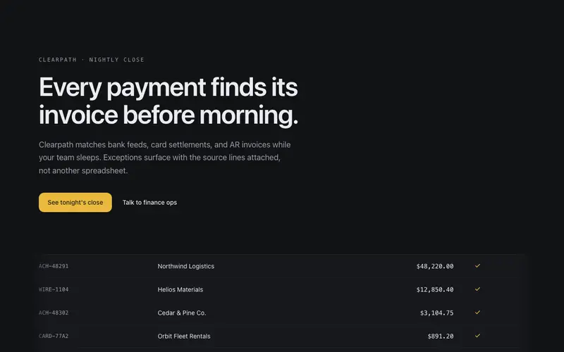
Ledger Hero
Editorial hero over a live ledger strip, transaction rows tick in and reconcile beneath the headline, numbers settling one by one. The product working, as atmosphere.
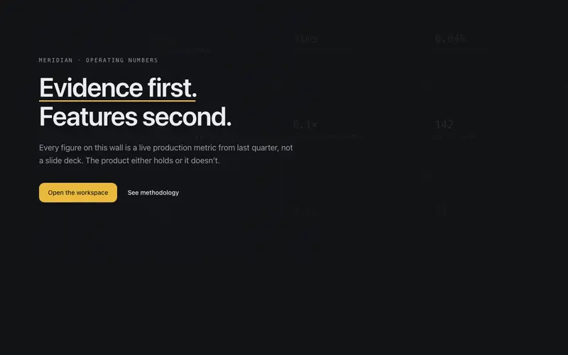
Metric Wall Hero
Hero whose backdrop is a faint wall of the product's own numbers, a mono grid of stats at whisper alpha with one column resolving to full ink, the headline set over the evidence.
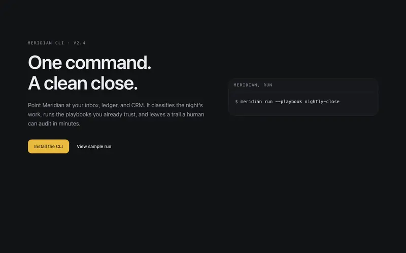
Terminal Hero
Split hero where a terminal card runs your product's happy path, typed command, streamed result rows, settled status line. Copy left, proof-of-work right.

Aperture Hero
A camera iris of hairline blades opens once to reveal the hero, leaving a faint aperture ring behind the copy, an optical-instrument entrance for React and Tailwind sites.
Frequently asked questions
How do I install the Split Proof Hero component?
Register the @cleverui registry in your components.json ("@cleverui": "https://cleverops.com.au/r/{name}.json"), then run `npx shadcn@latest add @cleverui/hero-split-proof`. The shadcn CLI copies the source into your project, you own the code from that point. You can also copy the source directly from this page.
What dependencies does Split Proof Hero require?
Split Proof Hero uses motion on top of React and Tailwind CSS. You don't need to install it manually, the shadcn CLI resolves and installs npm dependencies automatically when you add the component.
Can I theme Split Proof Hero to match my brand?
Yes. The component is styled entirely with Tailwind utilities over standard design tokens (primary, background, muted, border), so it inherits your existing shadcn/ui theme automatically. Change your CSS variables and the component follows, no source edits needed for palette, radius, or fonts.
Want this built for you?
CleverUI is built by the Clever Ops web team. If you'd rather ship a hand-coded, fast, custom website than assemble one, we build them for Australian businesses every week.
Explore web development services