Intent Prompt Hero
Hero built around a single prompt field, the placeholder cycles through real use-cases as ghost text, and the submit action is the page's one accent. Conversion by invitation.
Preview & code
Installation
pnpm dlx shadcn@latest add @cleverui/hero-intent-promptRequires the @cleverui registry in your components.json, a one-off, two-line setup.
Usage
API reference
HeroIntentPrompt accepts the following props.
…plus everything from Omit<React.HTMLAttributes<HTMLElement>, 'onSubmit'>: className, event handlers, aria attributes and the rest pass straight through.
Related components
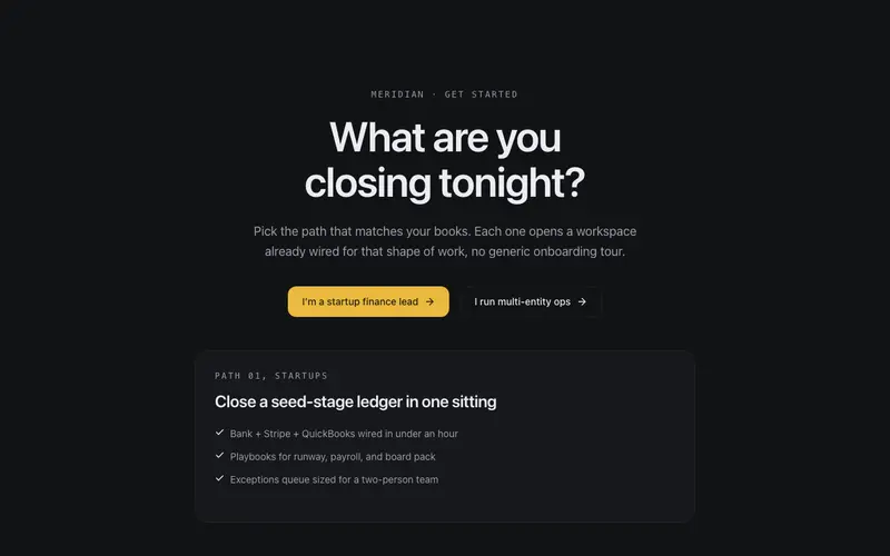
Question Hero
Conversion hero that opens with a question, two answer-path buttons preview their destinations in a mirrored panel below on hover or focus. The page begins by listening.
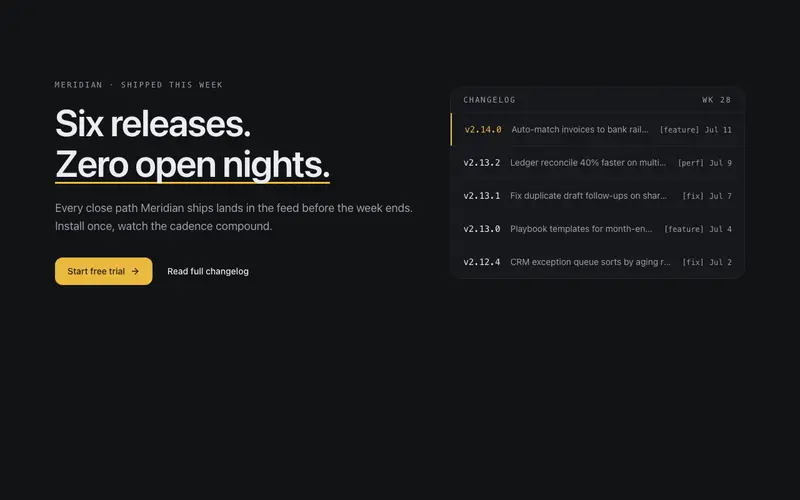
Changelog Hero
What-shipped-this-week hero for dev tools, headline beside a live-feeling release feed panel of mono version tags and dated rows, one release highlighted. Momentum as the pitch.
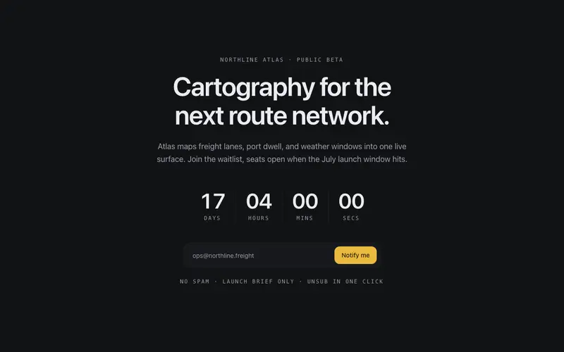
Countdown Launch Hero
Launch-window hero, a tabular countdown ticks toward the date under restrained display type, with a notify field as the single action. Anticipation without carnival.
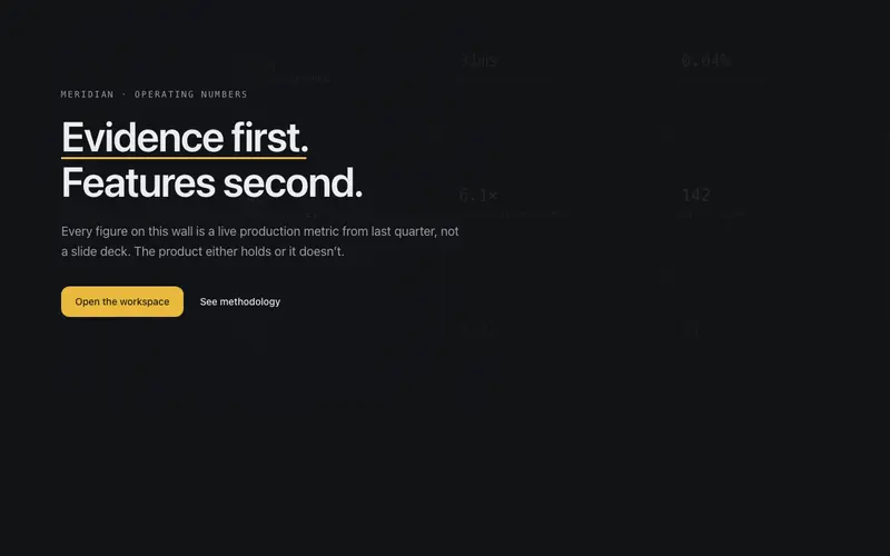
Metric Wall Hero
Hero whose backdrop is a faint wall of the product's own numbers, a mono grid of stats at whisper alpha with one column resolving to full ink, the headline set over the evidence.
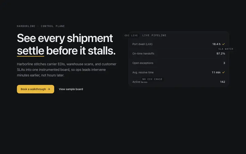
Product Frame Hero
Split hero where the product shot is a drafted frame, a structural UI mock built from tokens that tilts gently toward the pointer, with floating annotation chips.
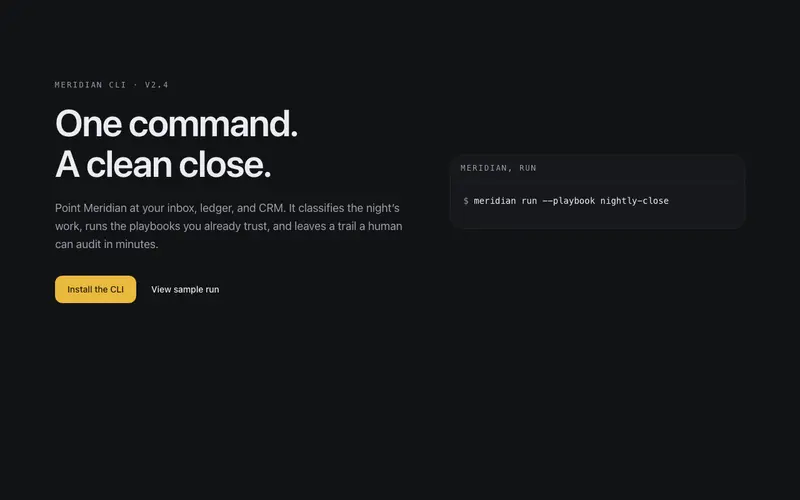
Terminal Hero
Split hero where a terminal card runs your product's happy path, typed command, streamed result rows, settled status line. Copy left, proof-of-work right.
Frequently asked questions
How do I install the Intent Prompt Hero component?
Register the @cleverui registry in your components.json ("@cleverui": "https://cleverops.com.au/r/{name}.json"), then run `npx shadcn@latest add @cleverui/hero-intent-prompt`. The shadcn CLI copies the source into your project, you own the code from that point. You can also copy the source directly from this page.
What dependencies does Intent Prompt Hero require?
Intent Prompt Hero uses motion and lucide-react on top of React and Tailwind CSS. You don't need to install them manually, the shadcn CLI resolves and installs npm dependencies automatically when you add the component.
Can I theme Intent Prompt Hero to match my brand?
Yes. The component is styled entirely with Tailwind utilities over standard design tokens (primary, background, muted, border), so it inherits your existing shadcn/ui theme automatically. Change your CSS variables and the component follows, no source edits needed for palette, radius, or fonts.
Want this built for you?
CleverUI is built by the Clever Ops web team. If you'd rather ship a hand-coded, fast, custom website than assemble one, we build them for Australian businesses every week.
Explore web development services