Glyph Storm Hero
A storm of stray characters blows across the viewport and condenses into the headline, canvas dust becomes DOM type, then the wind dies completely.
Preview & code
Installation
pnpm dlx shadcn@latest add @cleverui/hero-glyph-stormRequires the @cleverui registry in your components.json, a one-off, two-line setup.
Usage
API reference
HeroGlyphStorm accepts the following props.
…plus everything from React.HTMLAttributes<HTMLElement>: className, event handlers, aria attributes and the rest pass straight through.
Related components
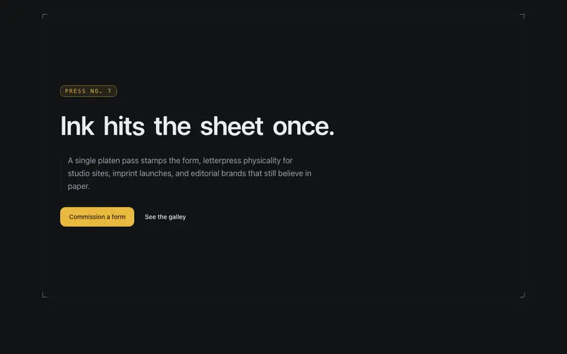
Letterpress Hero
A platen bar sweeps once and the headline stamps into the sheet with ink squash, sealed by a primary maker's chop, a letterpress entrance for React and Tailwind landing pages.

Signal Scan Hero
A scan band sweeps down the hero once, developing content in its wake as phosphor persistence, an instrument read-out entrance that decays to stillness and provably self-terminates.

Survey Sweep Hero
A surveyor's sweep line rotates once around the hero's datum point, measuring content in as it passes, each element lands with a coordinate stamp, then the instrument goes quiet.

Aperture Hero
A camera iris of hairline blades opens once to reveal the hero, leaving a faint aperture ring behind the copy, an optical-instrument entrance for React and Tailwind sites.

Depth Field Hero
A hero with true parallax depth, grid, contour, and content layers drift at different rates against the pointer, like looking into a drafting table through glass.
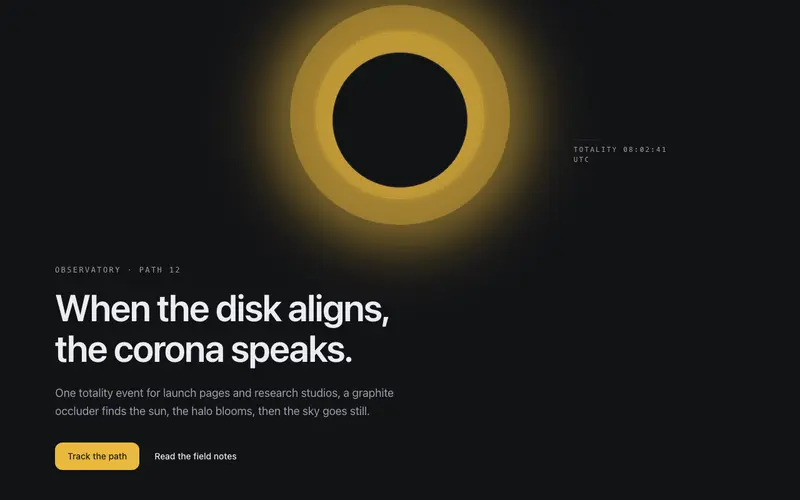
Eclipse Hero
A graphite disk slides into alignment and the corona blooms, a totality entrance where the headline surfaces in eclipse light. React hero section themed by Tailwind tokens.
Frequently asked questions
How do I install the Glyph Storm Hero component?
Register the @cleverui registry in your components.json ("@cleverui": "https://cleverops.com.au/r/{name}.json"), then run `npx shadcn@latest add @cleverui/hero-glyph-storm`. The shadcn CLI copies the source into your project, you own the code from that point. You can also copy the source directly from this page.
What dependencies does Glyph Storm Hero require?
Glyph Storm Hero uses motion on top of React and Tailwind CSS. You don't need to install it manually, the shadcn CLI resolves and installs npm dependencies automatically when you add the component.
Can I theme Glyph Storm Hero to match my brand?
Yes. The component is styled entirely with Tailwind utilities over standard design tokens (primary, background, muted, border), so it inherits your existing shadcn/ui theme automatically. Change your CSS variables and the component follows, no source edits needed for palette, radius, or fonts.
Want this built for you?
CleverUI is built by the Clever Ops web team. If you'd rather ship a hand-coded, fast, custom website than assemble one, we build them for Australian businesses every week.
Explore web development services