Split Slide
Multi-line text where alternating lines slide out of their masks from opposite edges with a skew that straightens on landing, editorial title-card energy.
Preview & code
Installation
pnpm dlx shadcn@latest add @cleverui/text-split-slideRequires the @cleverui registry in your components.json, a one-off, two-line setup.
Usage
API reference
TextSplitSlide accepts the following props.
…plus everything from React.HTMLAttributes<HTMLElement>: className, event handlers, aria attributes and the rest pass straight through.
Related components
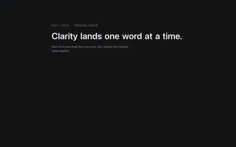
Blur Focus
Words rack into focus one after another, a camera pulling the sentence sharp. Blur, opacity and a breath of letter-spacing resolve in reading order.

Staggered Text Reveal
Words or characters rise out of their own line-mask on scroll, text is revealed, not faded. Semantic tag control, once-only trigger, reduced-motion fallback.

Weight Emphasis
A sentence that makes its point through mass, up to three emphasis words set heavier in primary ink, revealed last in the stagger. Rhythm through weight, not color spam.
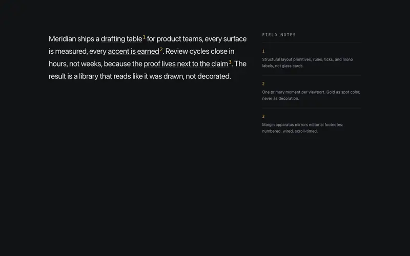
Annotate Callouts
Inline annotation system, marked phrases carry numbered mono superscripts wired to margin notes that reveal as each mark scrolls into view. Editorial footnotes, live on the page.

Baseline Wave
A wave travels the baseline once, characters lift and settle as it passes, like a breeze crossing the line. One pass, then stillness.
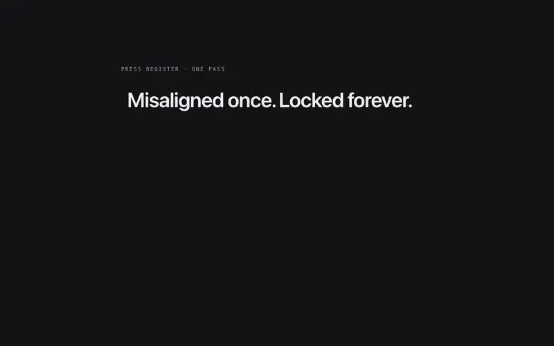
Line Echo
A display line trailed by two faint offset echoes of itself that converge into one crisp line on view, print misregistration settling into register. One pass, then stillness.
Frequently asked questions
How do I install the Split Slide component?
Register the @cleverui registry in your components.json ("@cleverui": "https://cleverops.com.au/r/{name}.json"), then run `npx shadcn@latest add @cleverui/text-split-slide`. The shadcn CLI copies the source into your project, you own the code from that point. You can also copy the source directly from this page.
What dependencies does Split Slide require?
Split Slide uses motion on top of React and Tailwind CSS. You don't need to install it manually, the shadcn CLI resolves and installs npm dependencies automatically when you add the component.
Can I theme Split Slide to match my brand?
Yes. The component is styled entirely with Tailwind utilities over standard design tokens (primary, background, muted, border), so it inherits your existing shadcn/ui theme automatically. Change your CSS variables and the component follows, no source edits needed for palette, radius, or fonts.
Want this built for you?
CleverUI is built by the Clever Ops web team. If you'd rather ship a hand-coded, fast, custom website than assemble one, we build them for Australian businesses every week.
Explore web development services