Kinetic Type Wall
Editorial kinetic type wall for React, outline echoes of the headline drift in alternating directions while one inked row carries the accent word. Tailwind-token themed; hover eases it to a halt.
Preview & code
Installation
pnpm dlx shadcn@latest add @cleverui/text-kinetic-wallRequires the @cleverui registry in your components.json, a one-off, two-line setup.
Usage
API reference
TextKineticWall accepts the following props.
…plus everything from React.HTMLAttributes<HTMLElement>: className, event handlers, aria attributes and the rest pass straight through.
Related components
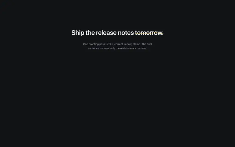
Redline Proof
A live redline pass over the sentence, strikethroughs draw, corrections drop in, a REV stamp lands, and the final React headline settles clean. Tailwind-token primary ink.
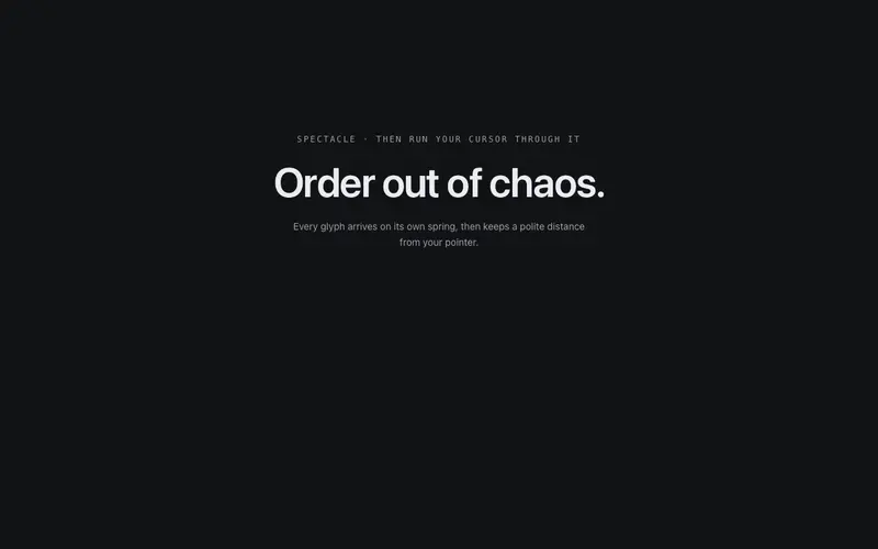
Scatter Assemble Text
The headline arrives as debris, glyphs scattered with spin and scale fly home on individual springs, then shy away from the pointer once assembled. Pure DOM transforms.
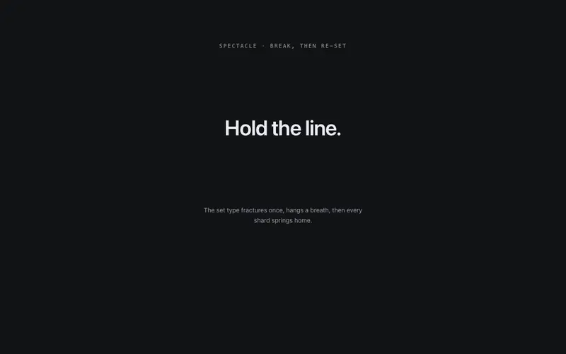
Shatter Settle
The set headline fractures into glyph shards, rotation, drift, depth, then every shard flies home and the line re-sets to perfect type. It departs and returns, exactly once.
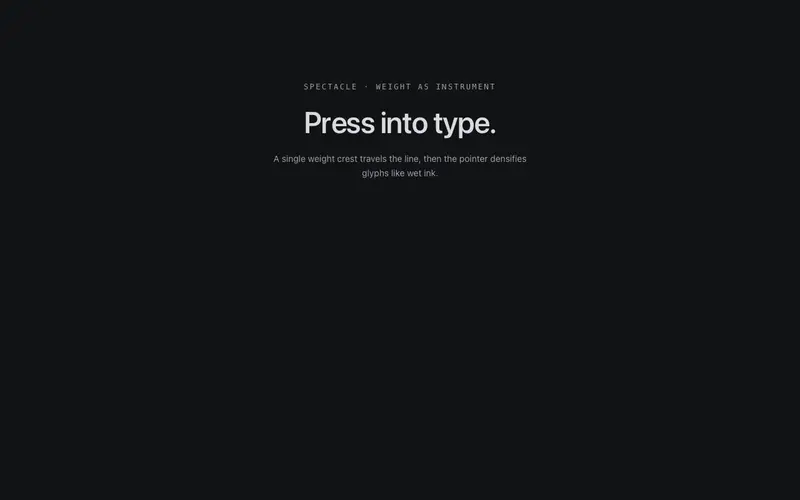
Variable Pulse
A weight wave travels the headline via variable-font axes, glyphs swell and relax as it passes, and the pointer presses local weight into the line like pressure on wet type.
Annotate Callouts
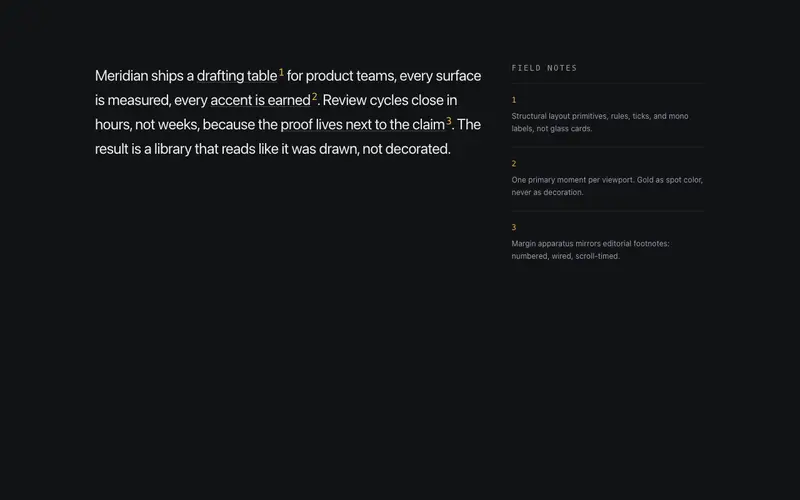
Inline annotation system, marked phrases carry numbered mono superscripts wired to margin notes that reveal as each mark scrolls into view. Editorial footnotes, live on the page.

Baseline Wave
A wave travels the baseline once, characters lift and settle as it passes, like a breeze crossing the line. One pass, then stillness.
Frequently asked questions
How do I install the Kinetic Type Wall component?
Register the @cleverui registry in your components.json ("@cleverui": "https://cleverops.com.au/r/{name}.json"), then run `npx shadcn@latest add @cleverui/text-kinetic-wall`. The shadcn CLI copies the source into your project, you own the code from that point. You can also copy the source directly from this page.
What dependencies does Kinetic Type Wall require?
Kinetic Type Wall uses motion on top of React and Tailwind CSS. You don't need to install it manually, the shadcn CLI resolves and installs npm dependencies automatically when you add the component.
Can I theme Kinetic Type Wall to match my brand?
Yes. The component is styled entirely with Tailwind utilities over standard design tokens (primary, background, muted, border), so it inherits your existing shadcn/ui theme automatically. Change your CSS variables and the component follows, no source edits needed for palette, radius, or fonts.
Want this built for you?
CleverUI is built by the Clever Ops web team. If you'd rather ship a hand-coded, fast, custom website than assemble one, we build them for Australian businesses every week.
Explore web development services