Orbit Caption
A mono micro-caption orbits the headline on an elliptical SVG path, slow as a survey satellite, hover or focus eases the orbit to a halt so the caption can be read.
Preview & code
Installation
pnpm dlx shadcn@latest add @cleverui/text-orbit-captionRequires the @cleverui registry in your components.json, a one-off, two-line setup.
Usage
API reference
TextOrbitCaption accepts the following props.
…plus everything from React.HTMLAttributes<HTMLElement>: className, event handlers, aria attributes and the rest pass straight through.
Related components
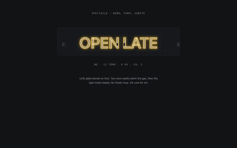
Neon Bend
The tube bends first, unlit glass traces the headline stroke by stroke, gas ignites in a slow warm-up, and the React neon sign settles steady in Tailwind-token primary glow with an ink core.
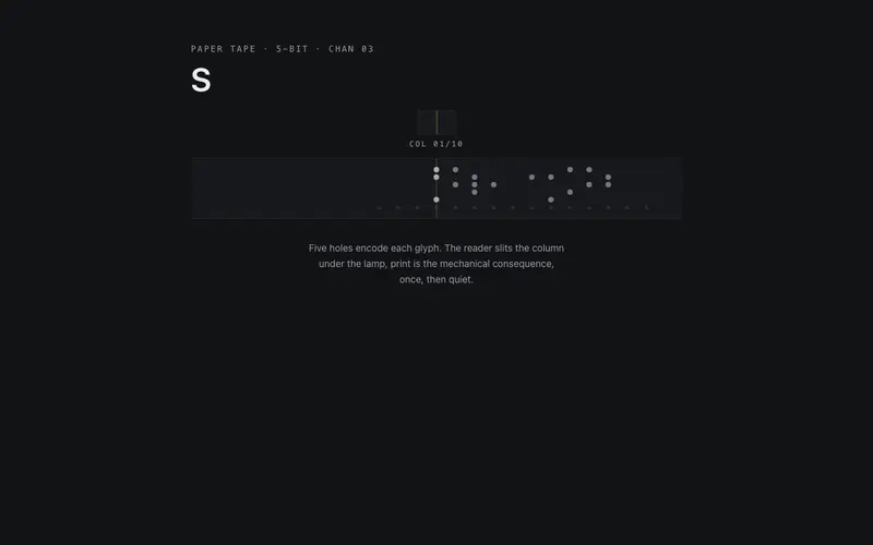
Punch Tape
A punched paper tape feeds through a reader head and your React headline prints glyph by glyph, the encoding visible in the holes. Tailwind tokens; one pass, then stillness.
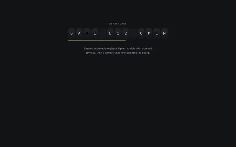
Split Flap
A split-flap departure board for React, mono cells flip through seeded glyphs with mechanical fold physics and land on your message left to right. Tailwind tokens only, designed reduced-motion still.
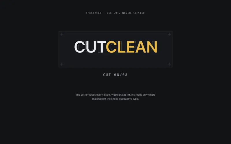
Stencil Cut
The headline is die-cut, never painted, a cutter traces glyph outlines, waste plates lift away, and React text reads as ink through stencil holes. Tailwind-token subtractive typography.
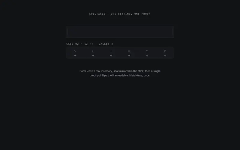
Compositor's Case
Type set from a visible case, sorts fly from their compartments, land mirrored in the composing stick, and one proof pull flips the React headline readable. Tailwind-token letterpress craft.
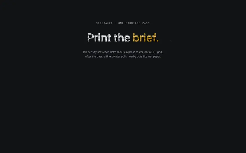
Dot Matrix Print
The headline prints as a dot-matrix raster, a carriage sweeps once and canvas dots sized by ink density pop in column by column. React and Tailwind tokens via probes; one accent word in primary.
Frequently asked questions
How do I install the Orbit Caption component?
Register the @cleverui registry in your components.json ("@cleverui": "https://cleverops.com.au/r/{name}.json"), then run `npx shadcn@latest add @cleverui/text-orbit-caption`. The shadcn CLI copies the source into your project, you own the code from that point. You can also copy the source directly from this page.
What dependencies does Orbit Caption require?
Orbit Caption has no npm dependencies beyond React and Tailwind CSS itself, so there is nothing extra to install or keep updated.
Can I theme Orbit Caption to match my brand?
Yes. The component is styled entirely with Tailwind utilities over standard design tokens (primary, background, muted, border), so it inherits your existing shadcn/ui theme automatically. Change your CSS variables and the component follows, no source edits needed for palette, radius, or fonts.
Want this built for you?
CleverUI is built by the Clever Ops web team. If you'd rather ship a hand-coded, fast, custom website than assemble one, we build them for Australian businesses every week.
Explore web development services