Clever Ops

Status Banner Navbar

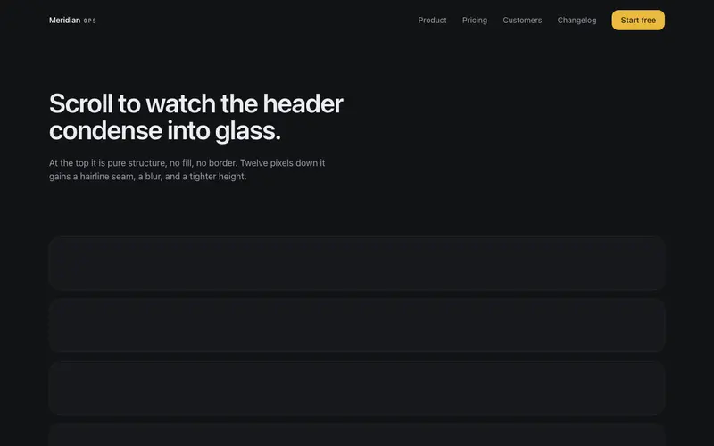
A navbar with an integrated status lane under its hairline seam, one line, a link and a dismiss; dismissing collapses the lane smoothly while the header holds steady.

Preview & code

Loading Status Banner Navbar preview

Installation

pnpm dlx shadcn@latest add @cleverui/navbar-status-banner

Requires the @cleverui registry in your components.json, a one-off, two-line setup.

Usage

tsx
import { NavbarStatusBanner } from '@/components/blocks/navbar-status-banner'
Exampletsx
'use client'

import { useState } from 'react'
import { NavbarStatusBanner } from '@/components/blocks/navbar-status-banner'

export default function NavbarStatusBannerDemo() {
  const [variant, setVariant] = useState<'info' | 'incident'>('info')
  const [laneKey, setLaneKey] = useState(0)

  const status =
    variant === 'info'
      ? {
          message:
            'Scheduled maintenance window: payments API, Sunday 02:00–04:00 UTC.',
          link: { label: 'View status', href: '#status' },
          variant: 'info' as const,
        }
      : {
          message:
            'Elevated latency on EU settlement rails, retry queues are healthy.',
          link: { label: 'Incident notes', href: '#incident' },
          variant: 'incident' as const,
        }

  return (
    <div className="min-h-[200vh]">
      <NavbarStatusBanner
        key={laneKey}
        brand={
          <span className="inline-flex items-baseline gap-1.5">
            Harbor
            <span className="font-mono text-[10px] uppercase tracking-[0.2em] text-muted-foreground">
              pay
            </span>
          </span>
        }
        links={[
          { label: 'Product', href: '#product' },
          { label: 'Pricing', href: '#pricing' },
          { label: 'Developers', href: '#developers' },
          { label: 'Status', href: '#status' },
        ]}
        cta={{ label: 'Open console', href: '#console' }}
        status={status}
        onDismiss={() => {
          /* parent would persist; demo just lets the lane collapse */
        }}
      />

      <div className="mx-auto max-w-6xl px-4 pt-10 sm:px-6">
        <p className="font-mono text-[11px] uppercase tracking-[0.2em] text-muted-foreground">
          Site chrome
        </p>
        <h1 className="mt-3 max-w-2xl text-3xl font-semibold tracking-tight text-balance sm:text-4xl">
          One header, one status lane, dismiss and the seam closes cleanly.
        </h1>
        <p className="mt-4 max-w-lg text-sm leading-relaxed text-muted-foreground sm:text-base">
          Harbor Pay fuses announcements into the sticky bar so you never stack two competing
          sticky regions. Scroll to condense the glass; dismiss to collapse the lane.
        </p>

        <div className="mt-8 flex flex-wrap gap-2">
          <button
            type="button"
            onClick={() => {
              setVariant('info')
              setLaneKey((k) => k + 1)
            }}
            className="inline-flex h-10 items-center rounded-lg border border-border/60 bg-card px-3 text-sm font-medium text-foreground transition-colors hover:bg-accent focus-visible:ring-2 focus-visible:ring-ring focus-visible:ring-offset-2 focus-visible:ring-offset-background focus-visible:outline-hidden"
          >
            Show info lane
          </button>
          <button
            type="button"
            onClick={() => {
              setVariant('incident')
              setLaneKey((k) => k + 1)
            }}
            className="inline-flex h-10 items-center rounded-lg border border-border/60 bg-card px-3 text-sm font-medium text-foreground transition-colors hover:bg-accent focus-visible:ring-2 focus-visible:ring-ring focus-visible:ring-offset-2 focus-visible:ring-offset-background focus-visible:outline-hidden"
          >
            Show incident lane
          </button>
        </div>

        <div className="mt-16 grid gap-4 sm:grid-cols-3">
          {[
            { label: 'Volume today', value: '$12.4M' },
            { label: 'Success rate', value: '99.97%' },
            { label: 'P95 settle', value: '1.8s' },
          ].map((stat) => (
            <div
              key={stat.label}
              className="rounded-2xl border border-border/60 bg-card px-5 py-5"
            >
              <p className="font-mono text-[11px] uppercase tracking-[0.2em] text-muted-foreground">
                {stat.label}
              </p>
              <p className="mt-2 text-2xl font-semibold tracking-tight text-foreground">
                {stat.value}
              </p>
            </div>
          ))}
        </div>

        <div className="mt-8 space-y-4">
          {Array.from({ length: 8 }, (_, i) => (
            <div key={i} className="h-20 rounded-2xl border border-border/60 bg-card" />
          ))}
        </div>
      </div>
    </div>
  )
}

API reference

NavbarStatusBanner accepts the following props.

PropTypeDefaultDescription
brandReact.ReactNode'CleverUI'
brandHrefstring'/'
links*{ label: string; href: string }[]
cta{ label: string; href: string }
status*{ message: string link?: { label: string; href: string } variant?: 'info' | 'incident' }status lane content; info keys primary, incident speaks in destructive tokens
onDismiss() => voidfired when the lane's dismiss button is pressed; parent owns persistence, omitting it hides the dismiss button

…plus everything from React.HTMLAttributes<HTMLElement>: className, event handlers, aria attributes and the rest pass straight through.

Frequently asked questions

How do I install the Status Banner Navbar component?

Register the @cleverui registry in your components.json ("@cleverui": "https://cleverops.com.au/r/{name}.json"), then run `npx shadcn@latest add @cleverui/navbar-status-banner`. The shadcn CLI copies the source into your project, you own the code from that point. You can also copy the source directly from this page.

What dependencies does Status Banner Navbar require?

Status Banner Navbar uses motion and lucide-react on top of React and Tailwind CSS. You don't need to install them manually, the shadcn CLI resolves and installs npm dependencies automatically when you add the component.

Can I theme Status Banner Navbar to match my brand?

Yes. The component is styled entirely with Tailwind utilities over standard design tokens (primary, background, muted, border), so it inherits your existing shadcn/ui theme automatically. Change your CSS variables and the component follows, no source edits needed for palette, radius, or fonts.

Want this built for you?

CleverUI is built by the Clever Ops web team. If you'd rather ship a hand-coded, fast, custom website than assemble one, we build them for Australian businesses every week.

Explore web development services