Clever Ops

Breadcrumb Morph Navbar

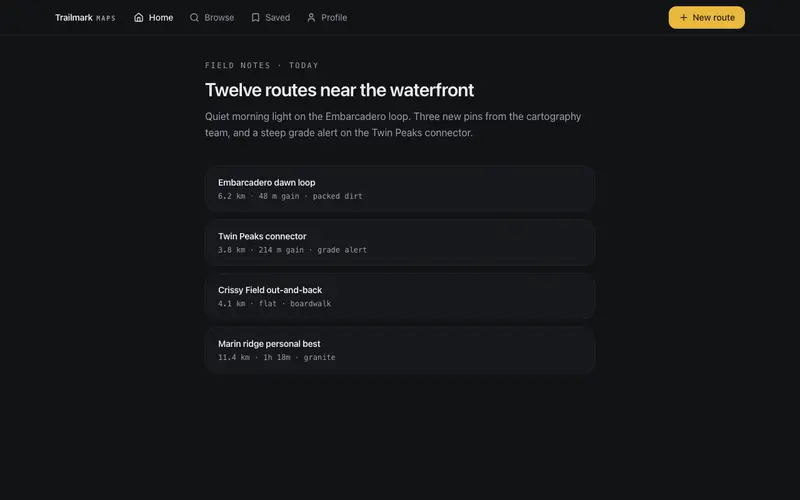
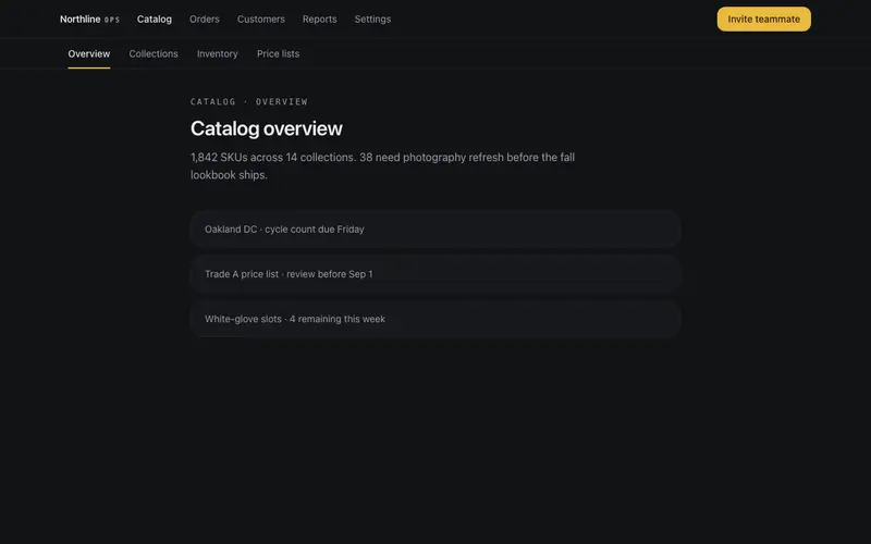
An app navbar that morphs between top-level links and a breadcrumb trail as a depth prop changes, the active link travels into crumb position with layoutId continuity.

Preview & code

Loading Breadcrumb Morph Navbar preview

Installation

pnpm dlx shadcn@latest add @cleverui/navbar-breadcrumb-morph

Requires the @cleverui registry in your components.json, a one-off, two-line setup.

Usage

tsx
import { NavbarBreadcrumbMorph } from '@/components/blocks/navbar-breadcrumb-morph'
Exampletsx
'use client'

import { useState } from 'react'
import { NavbarBreadcrumbMorph } from '@/components/blocks/navbar-breadcrumb-morph'

const LINKS = [
  { label: 'Projects', href: '/projects' },
  { label: 'Teams', href: '/teams' },
  { label: 'Billing', href: '/billing' },
  { label: 'Settings', href: '/settings' },
]

const TRAIL = [
  { label: 'Projects', href: '/projects' },
  { label: 'Northwind ERP', href: '/projects/northwind' },
  { label: 'Sprint 24', href: '/projects/northwind/sprints/24' },
  { label: 'Board', href: '/projects/northwind/sprints/24/board' },
]

export default function NavbarBreadcrumbMorphDemo() {
  const [depth, setDepth] = useState(0)

  return (
    <div className="min-h-[520px] bg-background">
      <NavbarBreadcrumbMorph
        brand={
          <span className="inline-flex items-baseline gap-1.5">
            Ledger
            <span className="font-mono text-[10px] uppercase tracking-[0.2em] text-muted-foreground">
              desk
            </span>
          </span>
        }
        links={LINKS}
        trail={TRAIL}
        depth={depth}
        cta={{ label: 'New issue', href: '#' }}
      />

      <div className="mx-auto max-w-6xl px-4 py-10 sm:px-6">
        <p className="font-mono text-[11px] uppercase tracking-[0.2em] text-muted-foreground">
          Depth control
        </p>
        <h1 className="mt-2 max-w-xl text-2xl font-semibold tracking-tight text-balance sm:text-3xl">
          Watch the active section become the first crumb.
        </h1>
        <p className="mt-3 max-w-lg text-sm leading-relaxed text-muted-foreground">
          Step through a project path. At depth 0 the bar shows top-level destinations;
          deeper levels morph into a breadcrumb trail with layout continuity on Projects.
        </p>

        <div className="mt-8 flex flex-wrap items-center gap-2">
          <button
            type="button"
            onClick={() => setDepth((d) => Math.max(0, d - 1))}
            disabled={depth === 0}
            className="inline-flex h-10 items-center rounded-lg border border-border/60 bg-card px-3 text-sm font-medium text-foreground transition-colors hover:bg-accent disabled:pointer-events-none disabled:opacity-40 focus-visible:ring-2 focus-visible:ring-ring focus-visible:ring-offset-2 focus-visible:ring-offset-background focus-visible:outline-hidden"
          >
            Shallower
          </button>
          <button
            type="button"
            onClick={() => setDepth((d) => Math.min(TRAIL.length, d + 1))}
            disabled={depth >= TRAIL.length}
            className="inline-flex h-10 items-center rounded-lg border border-border/60 bg-card px-3 text-sm font-medium text-foreground transition-colors hover:bg-accent disabled:pointer-events-none disabled:opacity-40 focus-visible:ring-2 focus-visible:ring-ring focus-visible:ring-offset-2 focus-visible:ring-offset-background focus-visible:outline-hidden"
          >
            Deeper
          </button>
          <span className="ml-2 font-mono text-xs text-muted-foreground">
            depth {depth}
            {depth > 0 && (
              <>
                {' · '}
                {TRAIL.slice(0, depth)
                  .map((t) => t.label)
                  .join(' / ')}
              </>
            )}
          </span>
        </div>

        <div className="mt-12 space-y-3">
          {[
            'Backlog grooming · 14 open issues',
            'API contract review · Northwind payments',
            'Release checklist · staging green',
          ].map((line) => (
            <div
              key={line}
              className="rounded-2xl border border-border/60 bg-card px-5 py-4 text-sm text-muted-foreground"
            >
              {line}
            </div>
          ))}
        </div>
      </div>
    </div>
  )
}

API reference

NavbarBreadcrumbMorph accepts the following props.

PropTypeDefaultDescription
brandReact.ReactNode'CleverUI'brand slot, text or logo node
brandHrefstring'/'
links*{ label: string; href: string }[]top-level destinations shown at depth 0
trail{ label: string; href: string }[][]breadcrumb segments for depth 1+; first segment should match the active top-level link
depthnumber00 renders top-level links; 1+ renders the trail truncated to that many segments
cta{ label: string; href: string }

…plus everything from React.HTMLAttributes<HTMLElement>: className, event handlers, aria attributes and the rest pass straight through.

Frequently asked questions

How do I install the Breadcrumb Morph Navbar component?

Register the @cleverui registry in your components.json ("@cleverui": "https://cleverops.com.au/r/{name}.json"), then run `npx shadcn@latest add @cleverui/navbar-breadcrumb-morph`. The shadcn CLI copies the source into your project, you own the code from that point. You can also copy the source directly from this page.

What dependencies does Breadcrumb Morph Navbar require?

Breadcrumb Morph Navbar uses motion and lucide-react on top of React and Tailwind CSS. You don't need to install them manually, the shadcn CLI resolves and installs npm dependencies automatically when you add the component.

Can I theme Breadcrumb Morph Navbar to match my brand?

Yes. The component is styled entirely with Tailwind utilities over standard design tokens (primary, background, muted, border), so it inherits your existing shadcn/ui theme automatically. Change your CSS variables and the component follows, no source edits needed for palette, radius, or fonts.

Want this built for you?

CleverUI is built by the Clever Ops web team. If you'd rather ship a hand-coded, fast, custom website than assemble one, we build them for Australian businesses every week.

Explore web development services