Clever Ops

Sidebar Hybrid Navbar

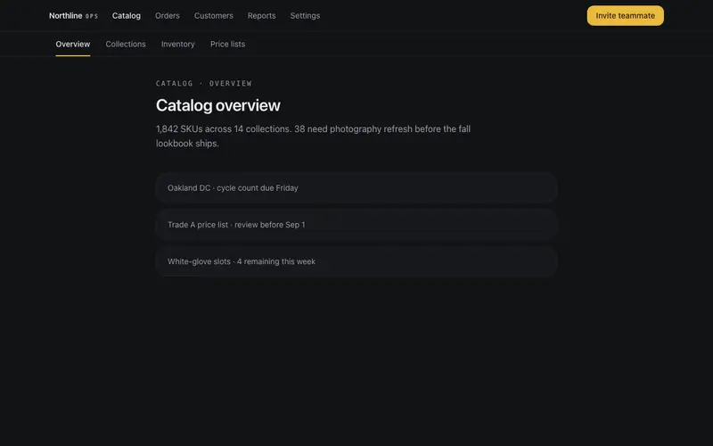
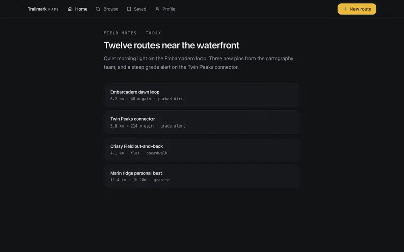
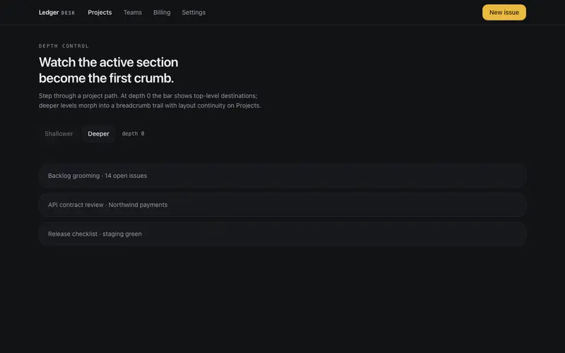
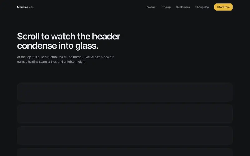
Docs-style responsive navigation, a glass top bar with a drawer on mobile becomes a left rail of grouped sections with an active keyline on lg. Skip link built in.

Preview & code

Loading Sidebar Hybrid Navbar preview

Installation

pnpm dlx shadcn@latest add @cleverui/navbar-sidebar-hybrid

Requires the @cleverui registry in your components.json, a one-off, two-line setup.

Usage

tsx
import { NavbarSidebarHybrid } from '@/components/blocks/navbar-sidebar-hybrid'
Exampletsx
'use client'

import { useEffect, useState } from 'react'
import { NavbarSidebarHybrid } from '@/components/blocks/navbar-sidebar-hybrid'

const GROUPS = [
  {
    label: 'Getting started',
    items: [
      { label: 'Introduction', href: '#intro' },
      { label: 'Installation', href: '#install' },
      { label: 'Project structure', href: '#structure' },
    ],
  },
  {
    label: 'Core concepts',
    items: [
      { label: 'Tokens', href: '#tokens' },
      { label: 'Motion', href: '#motion' },
      { label: 'Composition', href: '#composition' },
    ],
  },
  {
    label: 'Components',
    items: [
      { label: 'Buttons', href: '#buttons' },
      { label: 'Navbars', href: '#navbars' },
      { label: 'Forms', href: '#forms' },
    ],
  },
]

const INTRO_PAGE = {
  title: 'Introduction',
  body: 'Field Notes is the internal design system for Atlas Cloud. Every surface ships as a self-contained registry block, no app shell required, no provider tree to wire.',
}

const PAGES: Record<string, { title: string; body: string }> = {
  '#intro': INTRO_PAGE,
  '#install': {
    title: 'Installation',
    body: 'Add blocks with the registry CLI. Each item brings its own motion constants and token usage so themes re-skin live without rebuilds.',
  },
  '#structure': {
    title: 'Project structure',
    body: 'Blocks live under registry/<category>/<name>. A component file, a production demo, and meta.json are the only required artifacts.',
  },
  '#tokens': {
    title: 'Tokens',
    body: 'Semantic shadcn tokens only, background, foreground, primary, muted, border. Champagne ink is the default preset; seven more ship as registry themes.',
  },
  '#motion': {
    title: 'Motion',
    body: 'One choreographed sequence per component. EASE_OUT for entrances, SPRING_SETTLE for layout morphs, reduced-motion paths that still look designed.',
  },
  '#composition': {
    title: 'Composition',
    body: 'Hairlines over shadows. One accent moment per viewport. Mono micro-labels where others use colored pills.',
  },
  '#buttons': {
    title: 'Buttons',
    body: 'Primary fills use the accent once. Secondary and ghost stay neutral. Focus rings are mandatory on every interactive control.',
  },
  '#navbars': {
    title: 'Navbars',
    body: 'Site chrome is a first-class category, glass bars, pill docks, command sheets, and this docs hybrid all share the same drafting-table language.',
  },
  '#forms': {
    title: 'Forms',
    body: 'Inputs inherit focus and border tokens. Validation speaks in destructive without drowning the layout in color.',
  },
}

export default function NavbarSidebarHybridDemo() {
  const [active, setActive] = useState('#intro')
  const page = PAGES[active] ?? INTRO_PAGE

  // Demo-only: keep the rail keyline in sync without a real router
  useEffect(() => {
    const onClick = (e: MouseEvent) => {
      const a = (e.target as HTMLElement).closest('a')
      if (!a) return
      const href = a.getAttribute('href')
      if (href && href.startsWith('#') && PAGES[href]) {
        e.preventDefault()
        setActive(href)
      }
    }
    document.addEventListener('click', onClick)
    return () => document.removeEventListener('click', onClick)
  }, [])

  return (
    <NavbarSidebarHybrid
      brand={
        <span className="inline-flex items-baseline gap-1.5">
          Field
          <span className="font-mono text-[10px] uppercase tracking-[0.2em] text-muted-foreground">
            notes
          </span>
        </span>
      }
      groups={GROUPS}
      active={active}
      contentId="docs-main"
    >
      <div className="mx-auto max-w-3xl px-4 py-10 sm:px-6 sm:py-14">
        <p className="font-mono text-[11px] uppercase tracking-[0.2em] text-muted-foreground">
          Documentation
        </p>
        <h1 className="mt-2 text-3xl font-semibold tracking-tight text-balance sm:text-4xl">
          {page.title}
        </h1>
        <p className="mt-4 text-base leading-relaxed text-muted-foreground">
          {page.body}
        </p>

        <div className="mt-10 space-y-3">
          {[
            'Skip link is the first tab stop, focus it to jump past the rail.',
            'Active item uses weight plus a primary keyline, never color alone.',
            'On large screens the rail sticks; on small screens a glass drawer opens.',
          ].map((line) => (
            <div
              key={line}
              className="rounded-2xl border border-border/60 bg-card px-5 py-4 text-sm text-muted-foreground"
            >
              {line}
            </div>
          ))}
        </div>
      </div>
    </NavbarSidebarHybrid>
  )
}

API reference

NavbarSidebarHybrid accepts the following props.

PropTypeDefaultDescription
brandReact.ReactNode'CleverUI'
brandHrefstring'/'
groups*NavbarSidebarHybridGroup[]section groups rendered as the rail's labelled lists
activestringhref of the current page; receives aria-current and the keyline
contentIdstring'content'id given to the main content region the skip link targets
childrenReact.ReactNodepage content rendered in the main region beside the rail

…plus everything from React.HTMLAttributes<HTMLElement>: className, event handlers, aria attributes and the rest pass straight through.

Referenced types

Typestsx
export interface NavbarSidebarHybridGroup {
  label: string
  items: { label: string; href: string }[]
}

Frequently asked questions

How do I install the Sidebar Hybrid Navbar component?

Register the @cleverui registry in your components.json ("@cleverui": "https://cleverops.com.au/r/{name}.json"), then run `npx shadcn@latest add @cleverui/navbar-sidebar-hybrid`. The shadcn CLI copies the source into your project, you own the code from that point. You can also copy the source directly from this page.

What dependencies does Sidebar Hybrid Navbar require?

Sidebar Hybrid Navbar uses motion and lucide-react on top of React and Tailwind CSS. You don't need to install them manually, the shadcn CLI resolves and installs npm dependencies automatically when you add the component.

Can I theme Sidebar Hybrid Navbar to match my brand?

Yes. The component is styled entirely with Tailwind utilities over standard design tokens (primary, background, muted, border), so it inherits your existing shadcn/ui theme automatically. Change your CSS variables and the component follows, no source edits needed for palette, radius, or fonts.

Want this built for you?

CleverUI is built by the Clever Ops web team. If you'd rather ship a hand-coded, fast, custom website than assemble one, we build them for Australian businesses every week.

Explore web development services