Pill Dock Navbar
A floating pill nav that hangs centered under the top edge, the active link carries a sliding thumb, and the whole dock condenses on scroll. App-like, not corporate.
Preview & code
Installation
pnpm dlx shadcn@latest add @cleverui/navbar-pill-dockRequires the @cleverui registry in your components.json, a one-off, two-line setup.
Usage
API reference
NavbarPillDock accepts the following props.
…plus everything from React.HTMLAttributes<HTMLElement>: className, event handlers, aria attributes and the rest pass straight through.
Related components
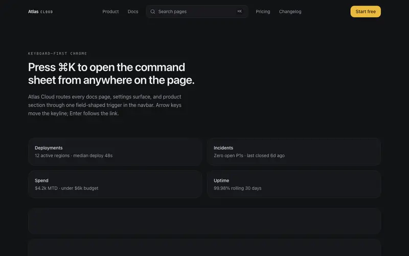
Command Center Navbar
A navbar whose centerpiece is a Cmd-K search button opening a compact command sheet, grouped destinations, arrow-key selection, quiet links flanking a keyboard-first affordance.
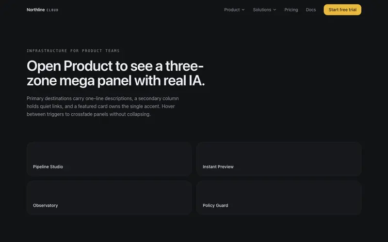
Mega Panel Navbar
Navbar whose product menu opens a three-zone mega panel, primary destinations with descriptions, a quiet secondary column, and a featured card. Real IA, not a link dump.
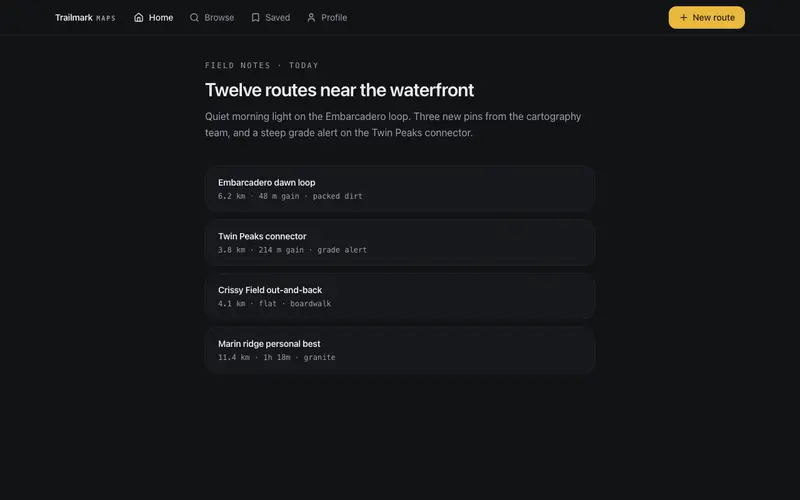
Bottom Tabs Navbar
App-style React navigation, a thumb-reach bottom tab bar with a raised primary action on mobile that becomes a top Tailwind glass bar on desktop; one landmark, safe-area aware.
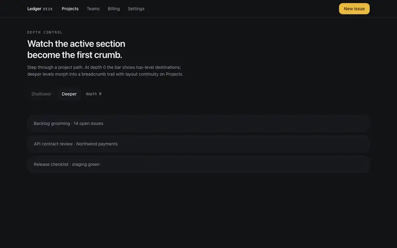
Breadcrumb Morph Navbar
An app navbar that morphs between top-level links and a breadcrumb trail as a depth prop changes, the active link travels into crumb position with layoutId continuity.
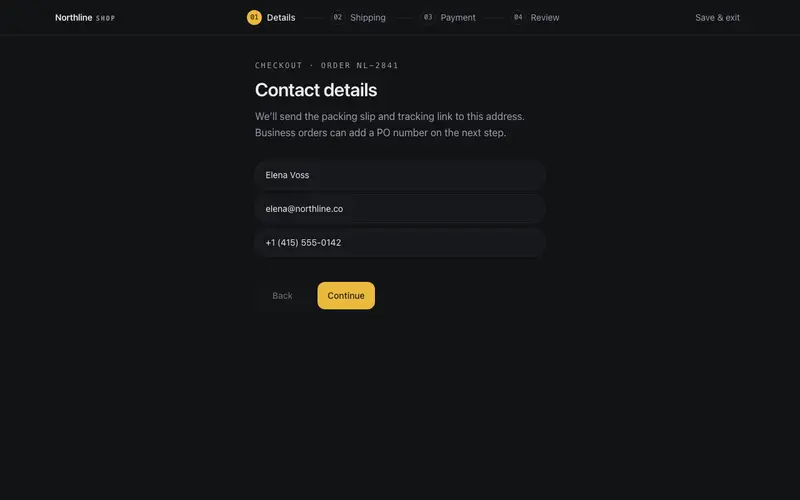
Flow Steps Navbar
Checkout-flow navbar for React, a numbered step trail with aria-current and honest revisit links, condensing to a mono counter and Tailwind hairline progress fill on mobile.
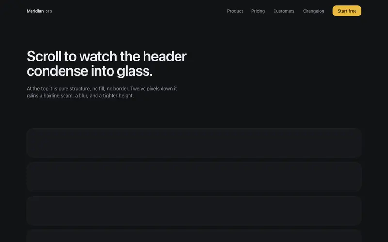
Glass Navbar
Header that starts as pure structure over the hero and condenses into glass on scroll, blur, hairline seam, tighter height. Accessible staggered mobile menu with Escape handling.
Frequently asked questions
How do I install the Pill Dock Navbar component?
Register the @cleverui registry in your components.json ("@cleverui": "https://cleverops.com.au/r/{name}.json"), then run `npx shadcn@latest add @cleverui/navbar-pill-dock`. The shadcn CLI copies the source into your project, you own the code from that point. You can also copy the source directly from this page.
What dependencies does Pill Dock Navbar require?
Pill Dock Navbar uses motion on top of React and Tailwind CSS. You don't need to install it manually, the shadcn CLI resolves and installs npm dependencies automatically when you add the component.
Can I theme Pill Dock Navbar to match my brand?
Yes. The component is styled entirely with Tailwind utilities over standard design tokens (primary, background, muted, border), so it inherits your existing shadcn/ui theme automatically. Change your CSS variables and the component follows, no source edits needed for palette, radius, or fonts.
Want this built for you?
CleverUI is built by the Clever Ops web team. If you'd rather ship a hand-coded, fast, custom website than assemble one, we build them for Australian businesses every week.
Explore web development services