Type Tunnel
A scroll-scrubbed typographic dolly for React, the camera dives through stacked word planes and drafting frames to land on the destination headline. Tailwind tokens, native scroll, poster-safe.
Preview & code
Installation
pnpm dlx shadcn@latest add @cleverui/scroll-type-tunnelRequires the @cleverui registry in your components.json, a one-off, two-line setup.
Usage
API reference
ScrollTypeTunnel accepts the following props.
…plus everything from React.HTMLAttributes<HTMLElement>: className, event handlers, aria attributes and the rest pass straight through.
Related components
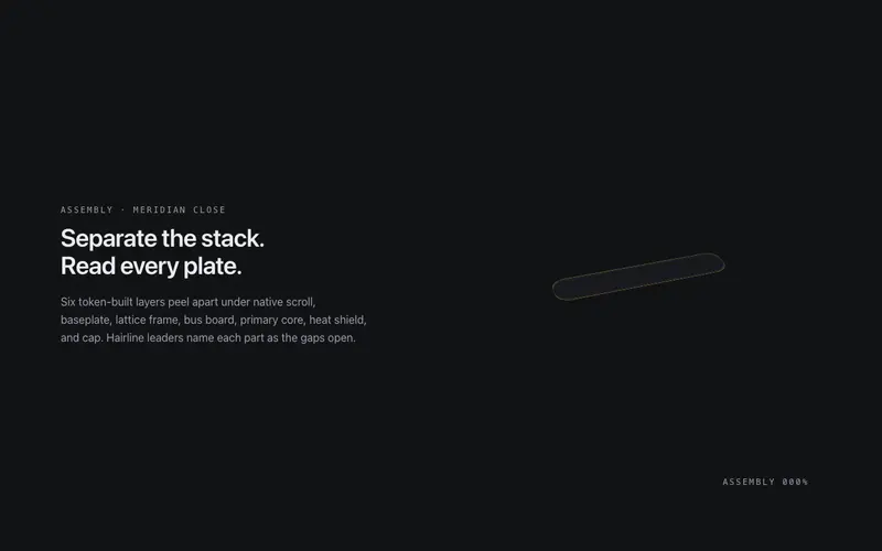
Exploded View
A pinned exploded-view scene for React, scroll separates a token-built 3D assembly into labeled plates with hairline leader lines, zero image assets. Native scroll, Tailwind-themed, poster-safe.
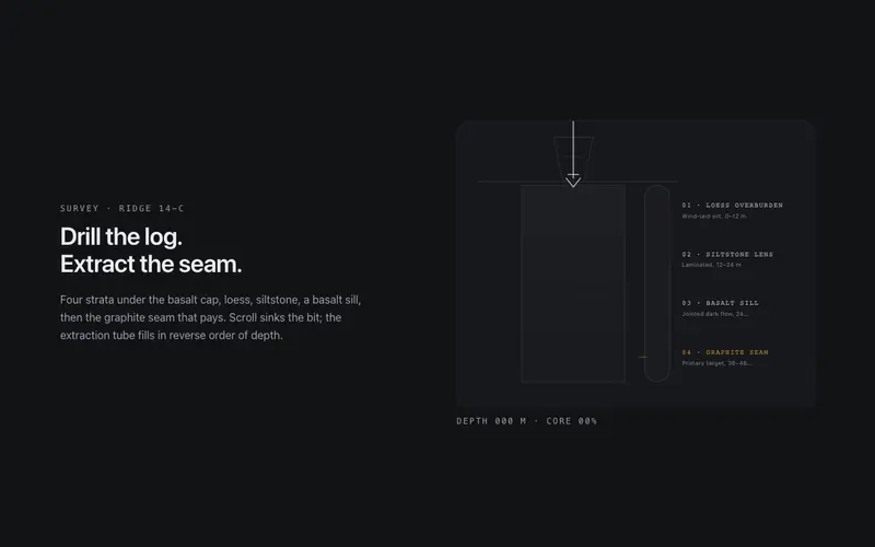
Core Sample
Scroll drills a core sample through labeled strata, the bit sinks, the extraction tube fills layer by layer, and a depth log counts to the primary seam. React and Tailwind tokens, no assets.
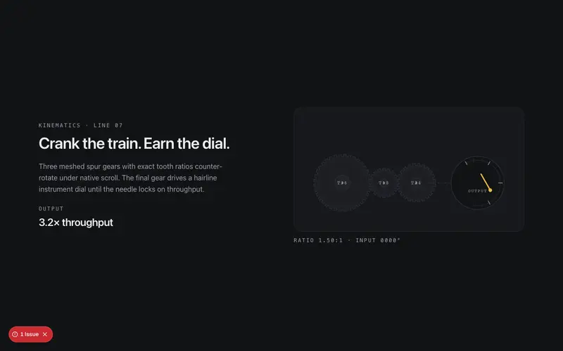
Gearworks
Scroll cranks a meshed SVG gear train, exact tooth ratios counter-rotate hairline gears until the primary dial needle lands on your stat. React and Tailwind tokens, native scroll scrub, no assets.

Sundial
Scroll runs the sun across a drafted sundial, the shadow wedge sweeps hour ticks, pinning content to times of day until the marked hour lights. React and Tailwind tokens, native scroll.

Suspension Span
Scroll builds a suspension bridge from dashed survey plan to open span, towers rise, catenary cables draw, hangers drop, the deck crosses. React and Tailwind tokens, fully reversible.

Wind Tunnel
Scroll pitches an airfoil in a drafted wind tunnel, hairline streamlines re-solve around the body until the lift vector peaks on your stat. React and Tailwind tokens, native scroll scrub.
Frequently asked questions
How do I install the Type Tunnel component?
Register the @cleverui registry in your components.json ("@cleverui": "https://cleverops.com.au/r/{name}.json"), then run `npx shadcn@latest add @cleverui/scroll-type-tunnel`. The shadcn CLI copies the source into your project, you own the code from that point. You can also copy the source directly from this page.
What dependencies does Type Tunnel require?
Type Tunnel uses motion on top of React and Tailwind CSS. You don't need to install it manually, the shadcn CLI resolves and installs npm dependencies automatically when you add the component.
Can I theme Type Tunnel to match my brand?
Yes. The component is styled entirely with Tailwind utilities over standard design tokens (primary, background, muted, border), so it inherits your existing shadcn/ui theme automatically. Change your CSS variables and the component follows, no source edits needed for palette, radius, or fonts.
Want this built for you?
CleverUI is built by the Clever Ops web team. If you'd rather ship a hand-coded, fast, custom website than assemble one, we build them for Australian businesses every week.
Explore web development services