Chapter Snap
Full-viewport chapters with CSS proximity scroll-snap, never a mandatory trap, and a side rail of dots with mono numerals that tracks the active chapter through honest anchor links.
Preview & code
Installation
pnpm dlx shadcn@latest add @cleverui/scroll-chapter-snapRequires the @cleverui registry in your components.json, a one-off, two-line setup.
Usage
API reference
ScrollChapterSnap accepts the following props.
…plus everything from React.HTMLAttributes<HTMLElement>: className, event handlers, aria attributes and the rest pass straight through.
Referenced types
Related components
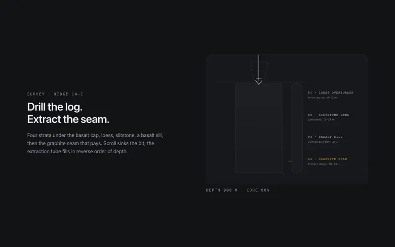
Core Sample
Scroll drills a core sample through labeled strata, the bit sinks, the extraction tube fills layer by layer, and a depth log counts to the primary seam. React and Tailwind tokens, no assets.

Depth Fade
A long-form wrapper where blocks you have read past gently recede in opacity and scale, keeping the active block crisp, reading focus as depth, clamped so text never goes illegible.

Exploded View
A pinned exploded-view scene for React, scroll separates a token-built 3D assembly into labeled plates with hairline leader lines, zero image assets. Native scroll, Tailwind-themed, poster-safe.

Gearworks
Scroll cranks a meshed SVG gear train, exact tooth ratios counter-rotate hairline gears until the primary dial needle lands on your stat. React and Tailwind tokens, native scroll scrub, no assets.
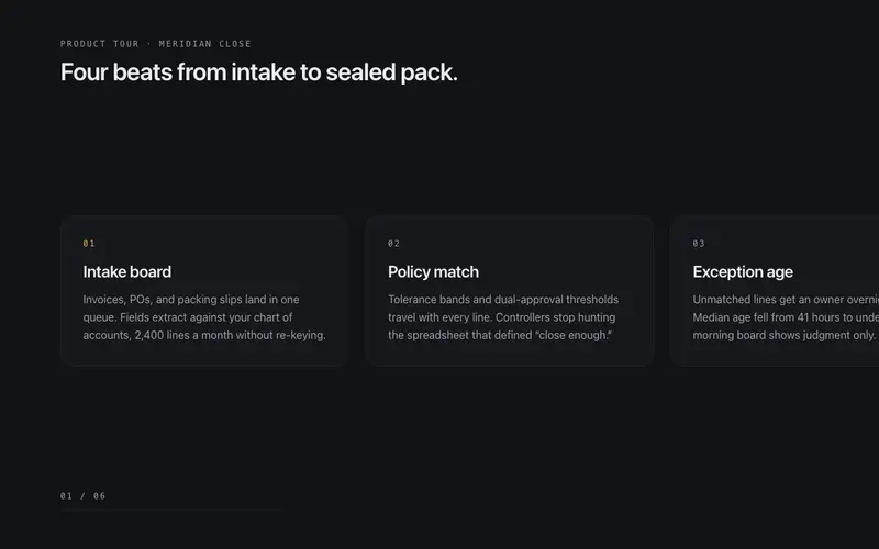
Horizontal Gallery
A vertical-scroll-driven horizontal track inside a sticky clipped viewport, translateX mapped to section progress, focusable cards, and a plain scrollable rail under reduced motion.

Image Sequence Lite
The Apple scroll-scrub technique without image assets, a token-built SVG diagram assembles across 24 deterministic frames as the section scrolls, every frame a designed still.
Frequently asked questions
How do I install the Chapter Snap component?
Register the @cleverui registry in your components.json ("@cleverui": "https://cleverops.com.au/r/{name}.json"), then run `npx shadcn@latest add @cleverui/scroll-chapter-snap`. The shadcn CLI copies the source into your project, you own the code from that point. You can also copy the source directly from this page.
What dependencies does Chapter Snap require?
Chapter Snap uses motion on top of React and Tailwind CSS. You don't need to install it manually, the shadcn CLI resolves and installs npm dependencies automatically when you add the component.
Can I theme Chapter Snap to match my brand?
Yes. The component is styled entirely with Tailwind utilities over standard design tokens (primary, background, muted, border), so it inherits your existing shadcn/ui theme automatically. Change your CSS variables and the component follows, no source edits needed for palette, radius, or fonts.
Want this built for you?
CleverUI is built by the Clever Ops web team. If you'd rather ship a hand-coded, fast, custom website than assemble one, we build them for Australian businesses every week.
Explore web development services