Program Block Card
A training-program card in the coach's voice, phase name in bold condensed caps, weeks and sessions per week as mono data, an outcome promise line, and five difficulty dots.
Preview & code
Installation
pnpm dlx shadcn@latest add @cleverui/program-block-cardRequires the @cleverui registry in your components.json, a one-off, two-line setup.
Usage
API reference
ProgramBlockCard accepts the following props.
…plus everything from Omit< React.HTMLAttributes<HTMLElement>, 'onDrag' | 'onDragStart' | 'onDragEnd' | 'onAnimationStart' >: className, event handlers, aria attributes and the rest pass straight through.
Related components
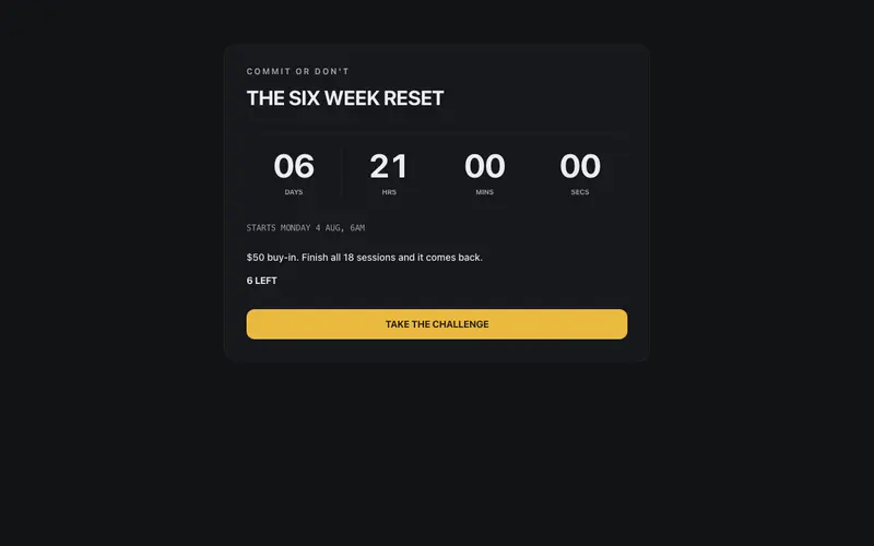
Challenge Countdown Panel
A gym challenge block that starts the clock, bold condensed challenge name, an SSR-safe rolling countdown to a prop-driven start date, stakes line and spots left. React and Tailwind.
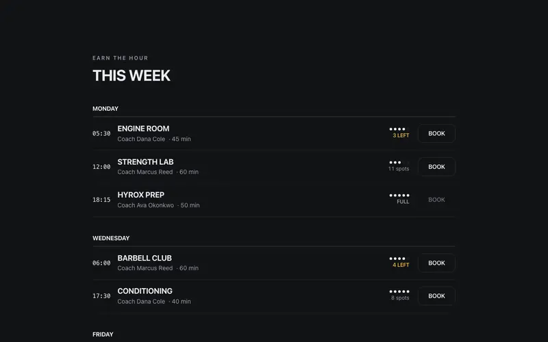
Class Timetable
A weekly timetable with gym-wall energy, bold condensed class names, mono start times, coach lines, five-dot intensity marks, and a spots-left state that makes you book now.
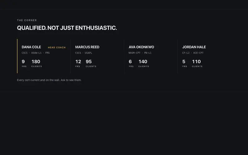
Coach Cred Strip
A certifications strip that treats coaching credentials as data, cert codes in mono with sr-only expansions, years and clients in tabular figures, and one lead-coach keyline.
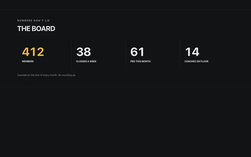
Gym Stats Board
The gym's numbers board, members, classes a week, and PBs this month counting up in heavy tabular figures under bold condensed labels, with a plain-spoken honesty footnote.
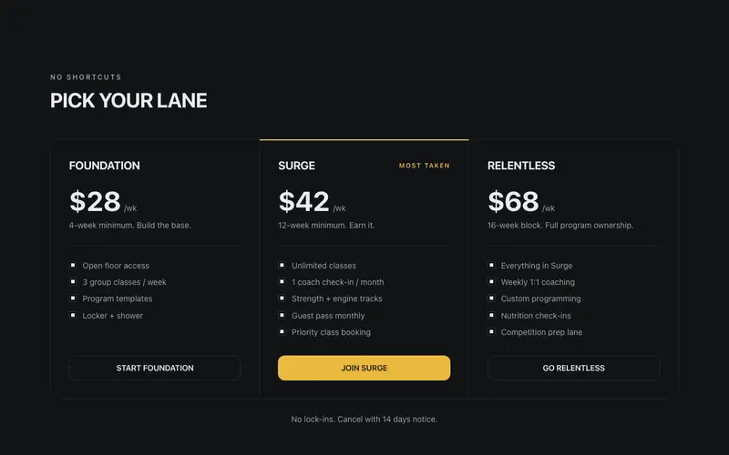
Membership Tiers
Gym pricing in the coach's voice, bold uppercase tier names like FOUNDATION and SURGE, per-week prices in big tabular figures, commitment notes, and a ruled ledger with zero glow.
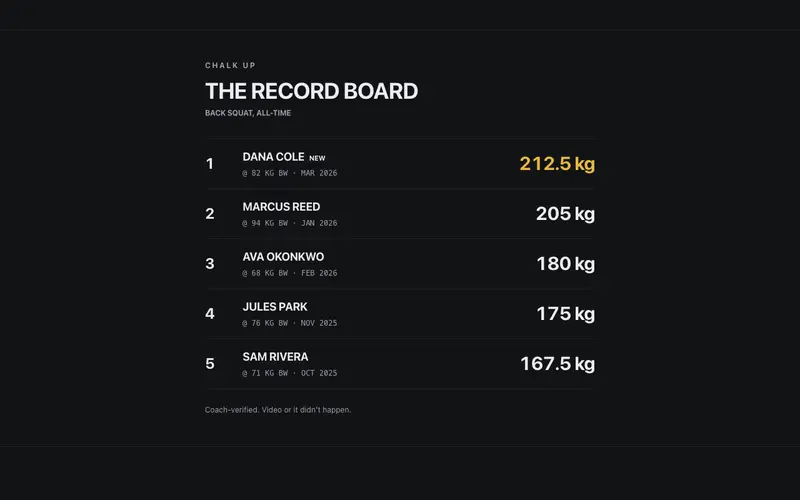
PR Leaderboard
The gym's record board in React, ranked lifters with heavy tabular kilograms, NEW flags on fresh PRs, a coach-verified footnote, and Tailwind contrast that reads across the room.
Frequently asked questions
How do I install the Program Block Card component?
Register the @cleverui registry in your components.json ("@cleverui": "https://cleverops.com.au/r/{name}.json"), then run `npx shadcn@latest add @cleverui/program-block-card`. The shadcn CLI copies the source into your project, you own the code from that point. You can also copy the source directly from this page.
What dependencies does Program Block Card require?
Program Block Card uses motion on top of React and Tailwind CSS. You don't need to install it manually, the shadcn CLI resolves and installs npm dependencies automatically when you add the component.
Can I theme Program Block Card to match my brand?
Yes. The component is styled entirely with Tailwind utilities over standard design tokens (primary, background, muted, border), so it inherits your existing shadcn/ui theme automatically. Change your CSS variables and the component follows, no source edits needed for palette, radius, or fonts.
Want this built for you?
CleverUI is built by the Clever Ops web team. If you'd rather ship a hand-coded, fast, custom website than assemble one, we build them for Australian businesses every week.
Explore web development services