Testimonial Spotlight
One voice at a time, an oversized editorial quote with a quiet author rail, mono counter and hairline prev/next controls. A reading, not a carousel.
Preview & code
Installation
pnpm dlx shadcn@latest add @cleverui/testimonial-spotlightRequires the @cleverui registry in your components.json, a one-off, two-line setup.
Usage
API reference
TestimonialSpotlight accepts the following props.
…plus everything from React.HTMLAttributes<HTMLElement>: className, event handlers, aria attributes and the rest pass straight through.
Referenced types
Related components
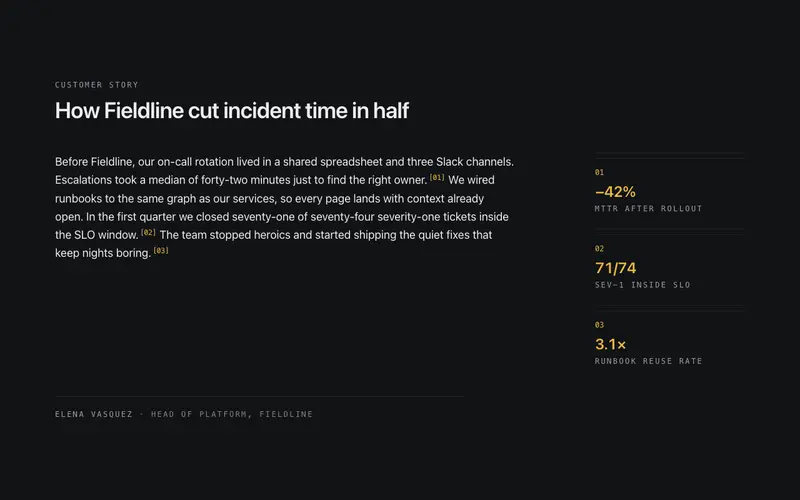
Testimonial Annotated
One long-form customer story read like an annotated manuscript, numbered mono metric callouts in the margin wire to the exact sentences that earned them.
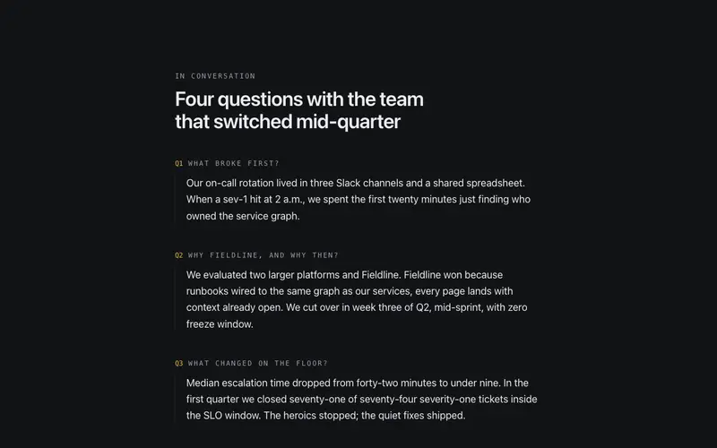
Testimonial Interview
Editorial Q&A testimonial, mono interviewer questions over one customer's long-form answers, closed by a monogram byline. An interview-excerpt block for React and Tailwind.
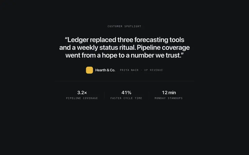
Testimonial Logo Lockup
A single decisive quote locked up with the customer's typographic wordmark, role line, and a hairline stat row beneath, one-customer depth instead of a wall of voices.
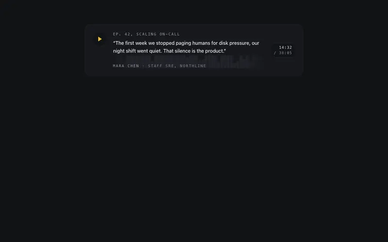
Testimonial Audio Strip
Podcast-style quote strip, deterministic SVG waveform, mono timestamp and a play affordance that hands playback to an onPlay callback. Ships zero audio dependencies.
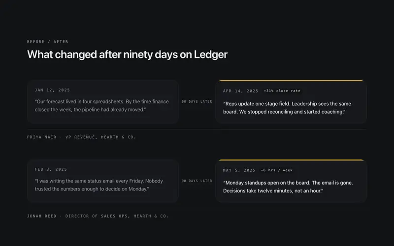
Testimonial Before After
Paired quotes from the same customer, what they said before and after 90 days, as two linked cards joined by a drawn connector, with honest mono dates.
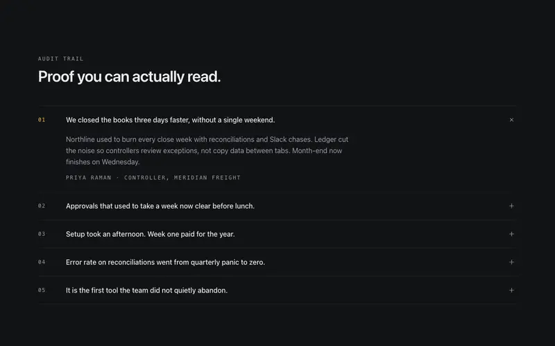
Testimonial Ledger
Testimonials filed as a ruled ledger, mono index numbers and one-line pull-quotes that expand on click to the full quote and attribution. Proof you can audit.
Frequently asked questions
How do I install the Testimonial Spotlight component?
Register the @cleverui registry in your components.json ("@cleverui": "https://cleverops.com.au/r/{name}.json"), then run `npx shadcn@latest add @cleverui/testimonial-spotlight`. The shadcn CLI copies the source into your project, you own the code from that point. You can also copy the source directly from this page.
What dependencies does Testimonial Spotlight require?
Testimonial Spotlight uses motion and lucide-react on top of React and Tailwind CSS. You don't need to install them manually, the shadcn CLI resolves and installs npm dependencies automatically when you add the component.
Can I theme Testimonial Spotlight to match my brand?
Yes. The component is styled entirely with Tailwind utilities over standard design tokens (primary, background, muted, border), so it inherits your existing shadcn/ui theme automatically. Change your CSS variables and the component follows, no source edits needed for palette, radius, or fonts.
Want this built for you?
CleverUI is built by the Clever Ops web team. If you'd rather ship a hand-coded, fast, custom website than assemble one, we build them for Australian businesses every week.
Explore web development services