Editorial Team Grid
Industry-neutral team grid, initials-panel portraits, mono focus-area lines, and link icons with real visible labels; one principal card carries a hairline primary keyline.
Preview & code
Installation
pnpm dlx shadcn@latest add @cleverui/team-grid-editorialRequires the @cleverui registry in your components.json, a one-off, two-line setup.
Usage
API reference
TeamGridEditorial accepts the following props.
…plus everything from React.HTMLAttributes<HTMLElement>: className, event handlers, aria attributes and the rest pass straight through.
Referenced types
Related components

Team Cohort Timeline
React team timeline grouping members into year-joined cohorts along a hairline spine, mono year markers and Tailwind-ruled rows tell the growth story.
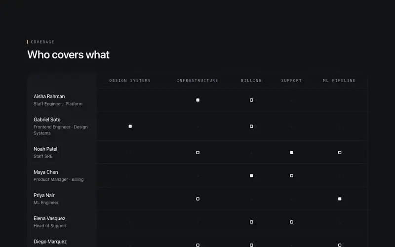
Team Coverage Matrix
Accessible React team matrix mapping people to focus areas, real table semantics and a Tailwind hairline grid, with ink marks showing who covers and leads what.
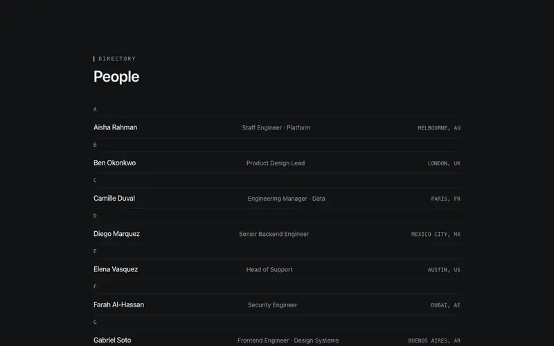
Team Directory Rows
Dense industry-neutral directory rows under alphabetical mono group headers, name, role, and location column ruled by hairlines; scales from ten people to two hundred.
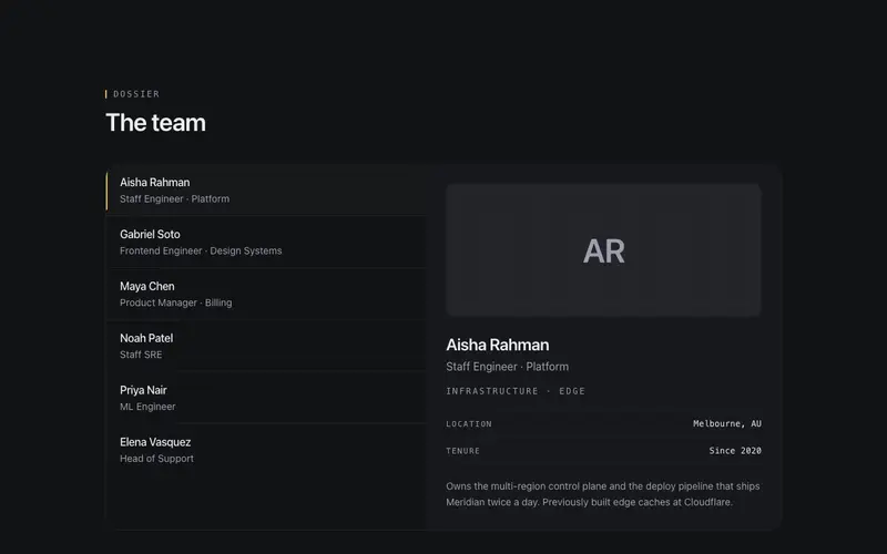
Team Hover Dossier
Master-detail React team section, hover or focus a roster name to swap a monogram dossier panel; Tailwind hairlines, tabs semantics, no photos needed.
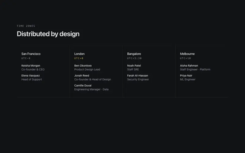
Team Timezone Strip
Distributed React team strip grouping members under city and UTC-offset mono headers, a Tailwind hairline band for remote-team pages, no headshots or WebGL.
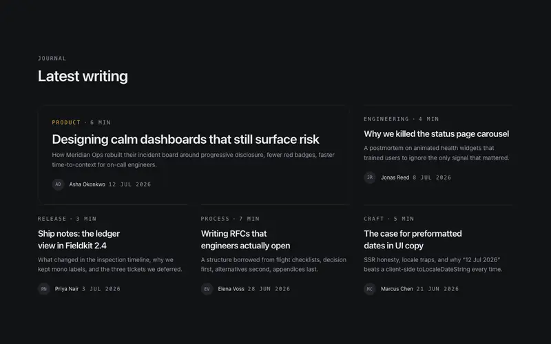
Article Card Grid
Editorial article cards, mono kicker with category and read time, display titles, a dek line, and initials-avatar bylines. The featured story spans wide inside a hairline frame.
Frequently asked questions
How do I install the Editorial Team Grid component?
Register the @cleverui registry in your components.json ("@cleverui": "https://cleverops.com.au/r/{name}.json"), then run `npx shadcn@latest add @cleverui/team-grid-editorial`. The shadcn CLI copies the source into your project, you own the code from that point. You can also copy the source directly from this page.
What dependencies does Editorial Team Grid require?
Editorial Team Grid uses motion and lucide-react on top of React and Tailwind CSS. You don't need to install them manually, the shadcn CLI resolves and installs npm dependencies automatically when you add the component.
Can I theme Editorial Team Grid to match my brand?
Yes. The component is styled entirely with Tailwind utilities over standard design tokens (primary, background, muted, border), so it inherits your existing shadcn/ui theme automatically. Change your CSS variables and the component follows, no source edits needed for palette, radius, or fonts.
Want this built for you?
CleverUI is built by the Clever Ops web team. If you'd rather ship a hand-coded, fast, custom website than assemble one, we build them for Australian businesses every week.
Explore web development services