Article Card Grid
Editorial article cards, mono kicker with category and read time, display titles, a dek line, and initials-avatar bylines. The featured story spans wide inside a hairline frame.
Preview & code
Installation
pnpm dlx shadcn@latest add @cleverui/article-card-gridRequires the @cleverui registry in your components.json, a one-off, two-line setup.
Usage
API reference
ArticleCardGrid accepts the following props.
…plus everything from React.HTMLAttributes<HTMLElement>: className, event handlers, aria attributes and the rest pass straight through.
Referenced types
Related components
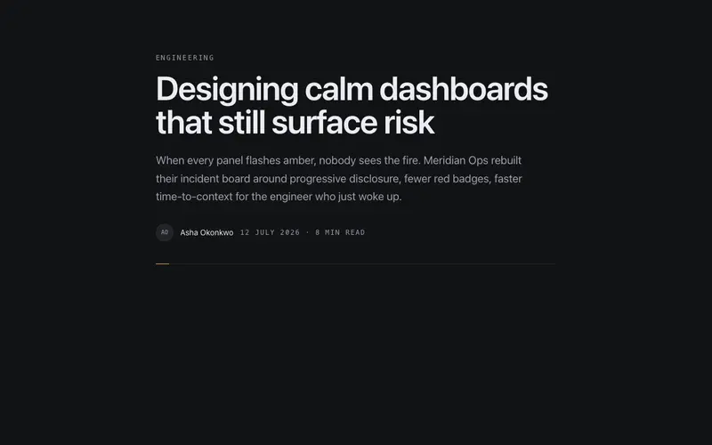
Article Header
The opening block of a post, category eyebrow, display title, standfirst, and a byline row with preformatted date and read time, closed by a hairline rule that draws itself.
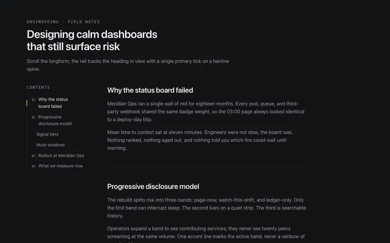
Article TOC Rail
Sticky table-of-contents rail for React articles, mono indices, a hairline spine, and a primary tick that slides to the active heading via built-in scroll-spy. Tailwind tokens throughout.
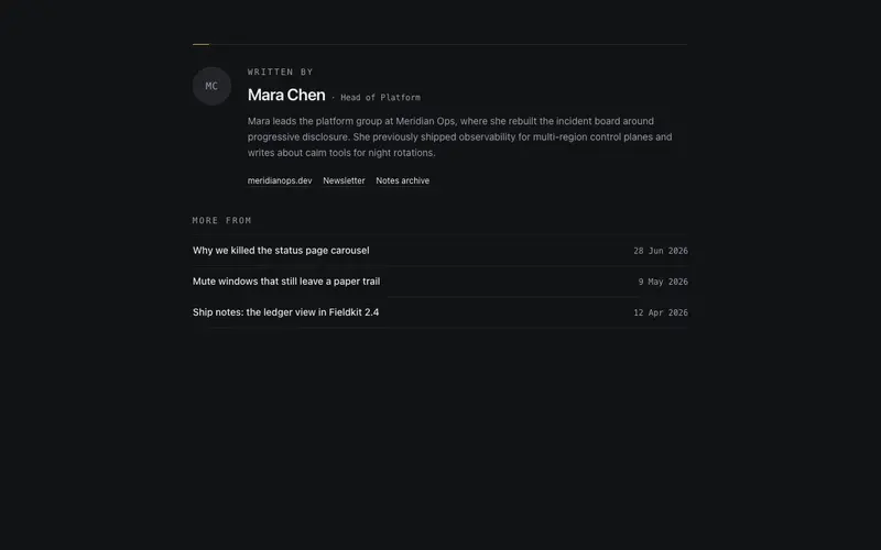
Author Bio Card
End-of-article author bio for React blogs, mono initials avatar, role, short bio, quiet text links, and a 'More from' reading list with preformatted dates. Tailwind tokens, zero icon clutter.
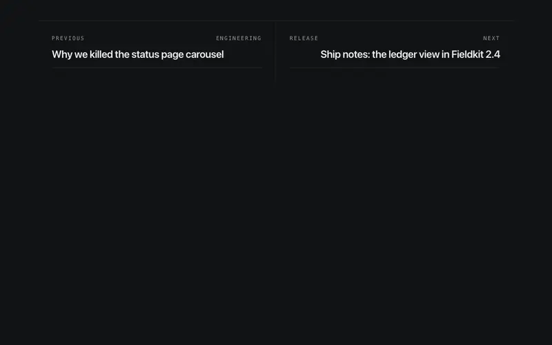
Prev Next Articles
End-of-article pagination, two hairline panels with mono direction labels and display titles, hairlines extending on hover. A lone neighbour panel spans the full width.
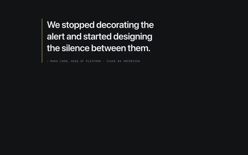
Pull Quote Break
An in-article pause, an oversized pull quote set against a primary quote-bar keyline, attribution in mono, and generous whitespace on both sides. Typography does all the work.
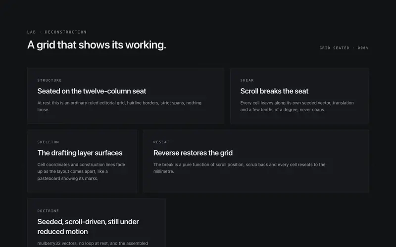
Grid Break
A deconstructing editorial grid for React, scroll shears each cell off its seat along seeded vectors as the drafting skeleton surfaces, then reseats in reverse. Tailwind-themed, zero dependencies.
Frequently asked questions
How do I install the Article Card Grid component?
Register the @cleverui registry in your components.json ("@cleverui": "https://cleverops.com.au/r/{name}.json"), then run `npx shadcn@latest add @cleverui/article-card-grid`. The shadcn CLI copies the source into your project, you own the code from that point. You can also copy the source directly from this page.
What dependencies does Article Card Grid require?
Article Card Grid uses motion on top of React and Tailwind CSS. You don't need to install it manually, the shadcn CLI resolves and installs npm dependencies automatically when you add the component.
Can I theme Article Card Grid to match my brand?
Yes. The component is styled entirely with Tailwind utilities over standard design tokens (primary, background, muted, border), so it inherits your existing shadcn/ui theme automatically. Change your CSS variables and the component follows, no source edits needed for palette, radius, or fonts.
Want this built for you?
CleverUI is built by the Clever Ops web team. If you'd rather ship a hand-coded, fast, custom website than assemble one, we build them for Australian businesses every week.
Explore web development services