Property Listing Card
The listing card done right, status ribbon over a structural image panel, price in large tabular figures, a beds-baths-cars icon row, and the address doing the talking as the heading.
Preview & code
Installation
pnpm dlx shadcn@latest add @cleverui/property-listing-cardRequires the @cleverui registry in your components.json, a one-off, two-line setup.
Usage
API reference
PropertyListingCard accepts the following props.
…plus everything from Omit< React.HTMLAttributes<HTMLElement>, 'onDrag' | 'onDragStart' | 'onDragEnd' | 'onAnimationStart' >: className, event handlers, aria attributes and the rest pass straight through.
Referenced types
Related components
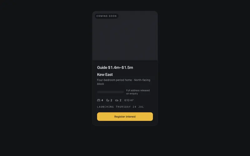
Off-Market Teaser
A coming-soon listing teaser in React, suburb leads while the address stays withheld behind a redaction bar, with a launch date line and a register-interest CTA. Tailwind tokens.
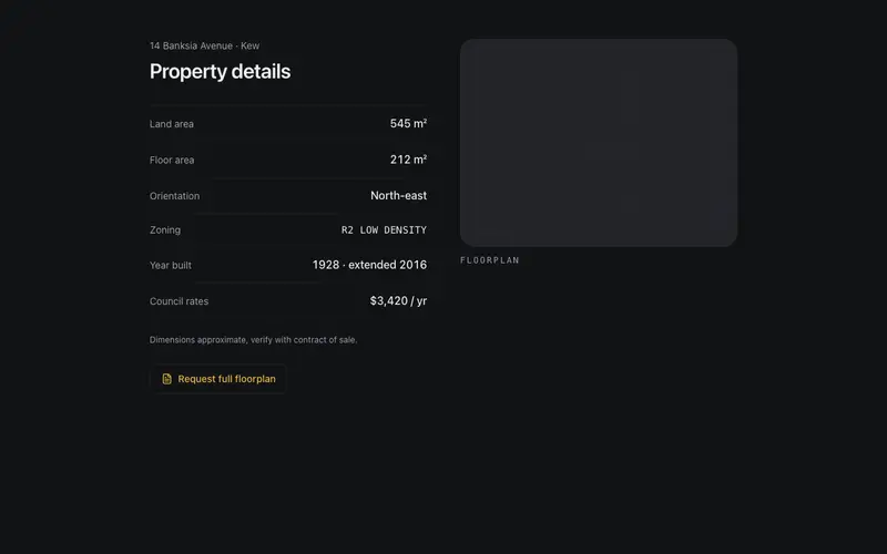
Property Feature Sheet
The listing's spec sheet set like a printed document, land and floor areas, orientation, and zoning in ruled two-column rows beside a structural floorplan placeholder panel.
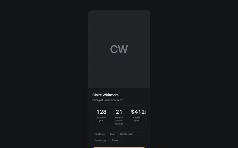
Agent Profile Card
An agent card that sells with proof, portrait placeholder, sold count and median days-on-market ticking up in tabular figures, suburbs served as chips, and an appraisal CTA.
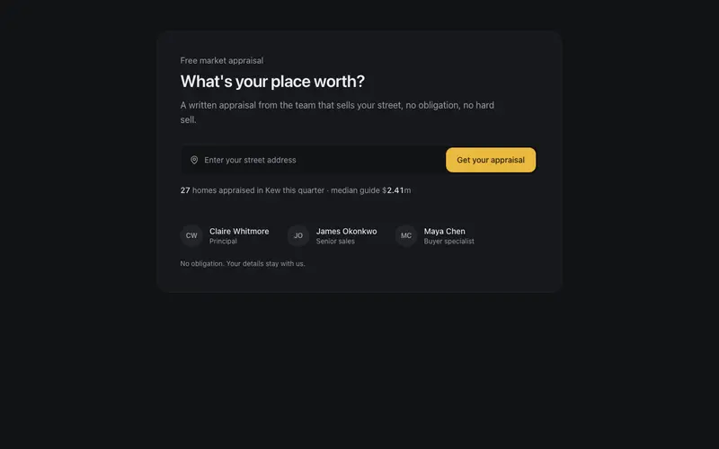
Appraisal CTA Panel
The what's-your-place-worth conversion block, a single address field with a callback-only submit, a recent-sales proof line in tabular figures, and an agent trust row.
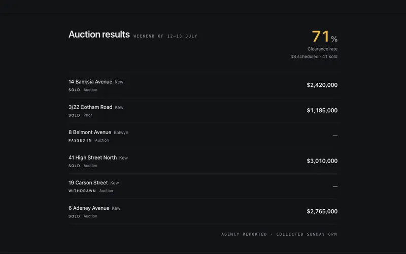
Auction Results Strip
Last weekend's auction results as a ruled band, a clearance rate counting up once, then sold and passed-in rows with addresses leading and prices set in tabular figures.
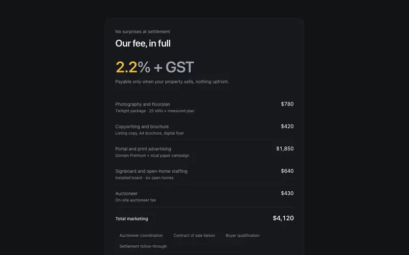
Commission Breakdown Sheet
Agent fees in full view, commission rate as the hero figure, itemised campaign costs in a ruled Tailwind ledger, and a payable-at-settlement note. React transparency block.
Frequently asked questions
How do I install the Property Listing Card component?
Register the @cleverui registry in your components.json ("@cleverui": "https://cleverops.com.au/r/{name}.json"), then run `npx shadcn@latest add @cleverui/property-listing-card`. The shadcn CLI copies the source into your project, you own the code from that point. You can also copy the source directly from this page.
What dependencies does Property Listing Card require?
Property Listing Card uses motion and lucide-react on top of React and Tailwind CSS. You don't need to install them manually, the shadcn CLI resolves and installs npm dependencies automatically when you add the component.
Can I theme Property Listing Card to match my brand?
Yes. The component is styled entirely with Tailwind utilities over standard design tokens (primary, background, muted, border), so it inherits your existing shadcn/ui theme automatically. Change your CSS variables and the component follows, no source edits needed for palette, radius, or fonts.
Want this built for you?
CleverUI is built by the Clever Ops web team. If you'd rather ship a hand-coded, fast, custom website than assemble one, we build them for Australian businesses every week.
Explore web development services