Donation Tier Grid
Honest donation tiers in a seamed React grid, preformatted amounts bound to concrete outcomes, nothing preselected, no guilt copy, one quiet accent. Tailwind, dark-pattern-free.
Preview & code
Installation
pnpm dlx shadcn@latest add @cleverui/donation-tier-gridRequires the @cleverui registry in your components.json, a one-off, two-line setup.
Usage
API reference
DonationTierGrid accepts the following props.
…plus everything from React.HTMLAttributes<HTMLElement>: className, event handlers, aria attributes and the rest pass straight through.
Referenced types
Related components
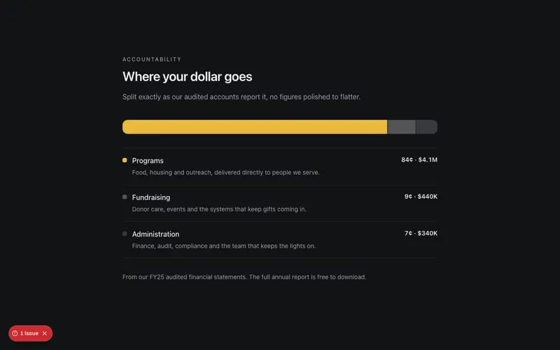
Funds Allocation Band
Where your dollar goes, a nonprofit transparency bar in React with seam-cut segments, a plain-language Tailwind ledger legend and an audited-statements footnote.
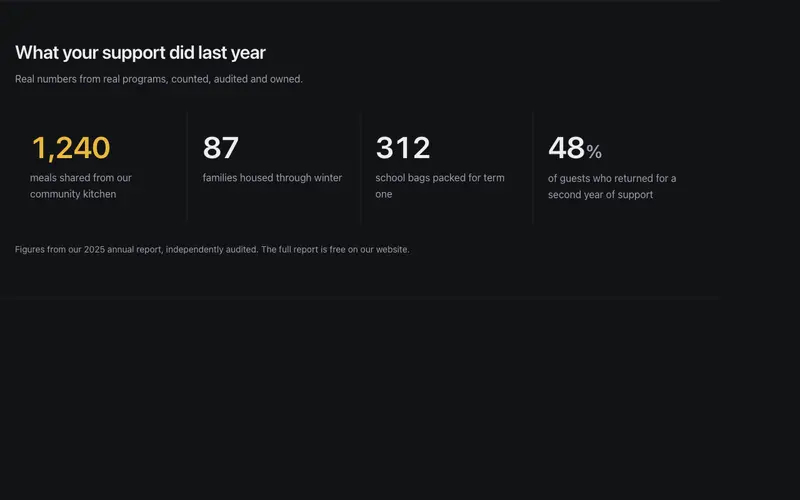
Impact Stat Band
A nonprofit impact band in React, concrete figures like 1,240 meals counting up once in tabular numerals over warm sentence labels, closed by an audited source line. Tailwind-set.
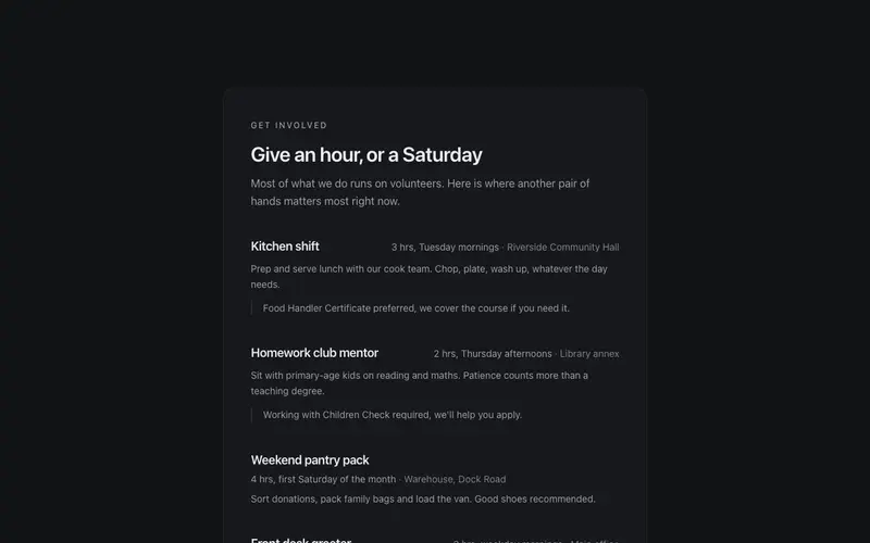
Volunteer Roles Panel
A volunteer get-involved panel in React, real roles with honest time commitments, plain requirements, a training reassurance and one direct sign-up action. Warm Tailwind, no guilt.
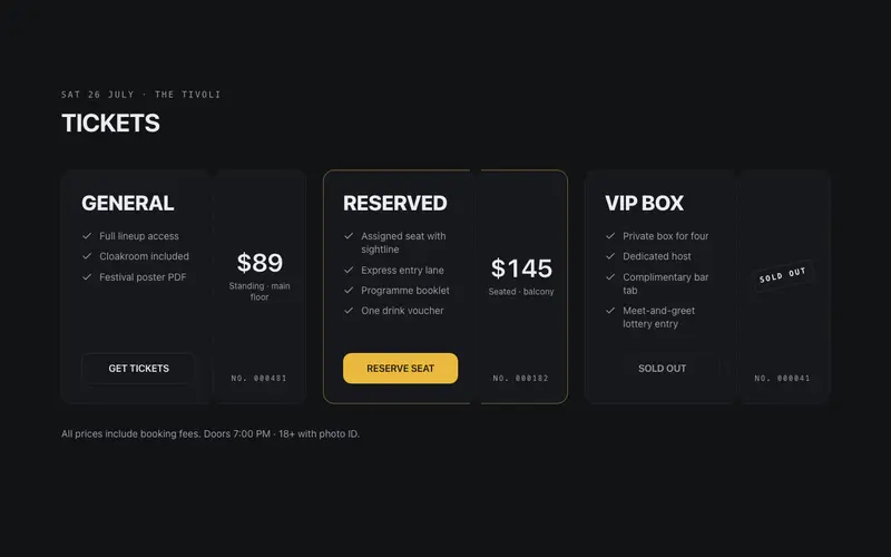
Event Ticket Tiers
GA and VIP tickets as perforated stub cards, mono serials, tabular prices, and an honest sold-out state. Box-office paper, not SaaS pricing chrome.
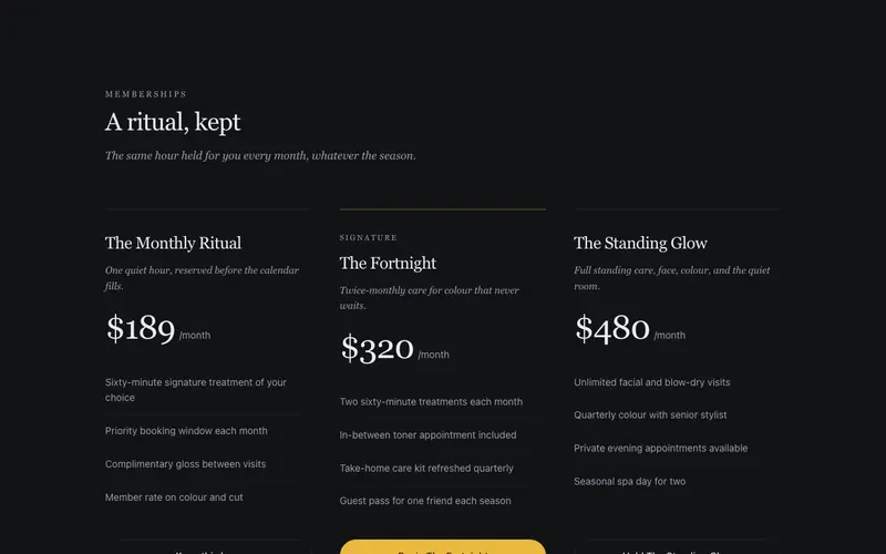
Membership Glow
Beauty memberships with serif tier names like The Monthly Ritual, included treatments as airy lists, per-month prices in tabular figures, and a soft masked halo behind the signature tier.
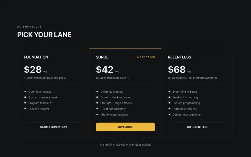
Membership Tiers
Gym pricing in the coach's voice, bold uppercase tier names like FOUNDATION and SURGE, per-week prices in big tabular figures, commitment notes, and a ruled ledger with zero glow.
Frequently asked questions
How do I install the Donation Tier Grid component?
Register the @cleverui registry in your components.json ("@cleverui": "https://cleverops.com.au/r/{name}.json"), then run `npx shadcn@latest add @cleverui/donation-tier-grid`. The shadcn CLI copies the source into your project, you own the code from that point. You can also copy the source directly from this page.
What dependencies does Donation Tier Grid require?
Donation Tier Grid uses motion on top of React and Tailwind CSS. You don't need to install it manually, the shadcn CLI resolves and installs npm dependencies automatically when you add the component.
Can I theme Donation Tier Grid to match my brand?
Yes. The component is styled entirely with Tailwind utilities over standard design tokens (primary, background, muted, border), so it inherits your existing shadcn/ui theme automatically. Change your CSS variables and the component follows, no source edits needed for palette, radius, or fonts.
Want this built for you?
CleverUI is built by the Clever Ops web team. If you'd rather ship a hand-coded, fast, custom website than assemble one, we build them for Australian businesses every week.
Explore web development services