Logo Proof Wall
Static categorized logo wall, 'Backed by' and 'Works with' groups under mono labels and hairline rules, grayscale wordmarks with every company name in the accessibility tree.
Preview & code
Installation
pnpm dlx shadcn@latest add @cleverui/logo-proof-wallRequires the @cleverui registry in your components.json, a one-off, two-line setup.
Usage
API reference
LogoProofWall accepts the following props.
…plus everything from React.HTMLAttributes<HTMLElement>: className, event handlers, aria attributes and the rest pass straight through.
Referenced types
Related components
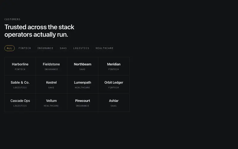
Logo Sector Filter
Interactive React logo wall with sector filter chips, picking an industry spotlights matching Tailwind wordmarks in place while the rest recede, never reflowing.

Logo Case Index
React logo cloud as an index ledger, each Tailwind-styled wordmark row pairs a customer with a one-line outcome and a tabular metric, optionally case-linked.
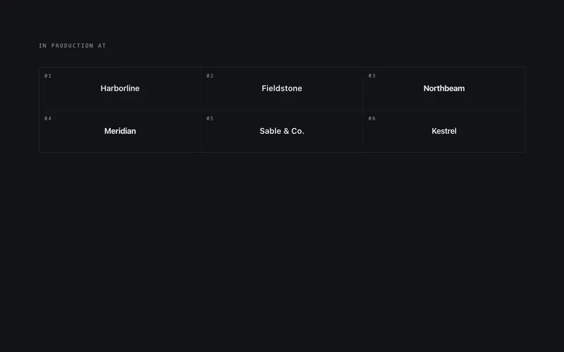
Logo Departures Board
Split-flap React logo board, a fixed Tailwind grid of typographic wordmarks where one cell flips at a time in reading order, rotating more brands than cells.
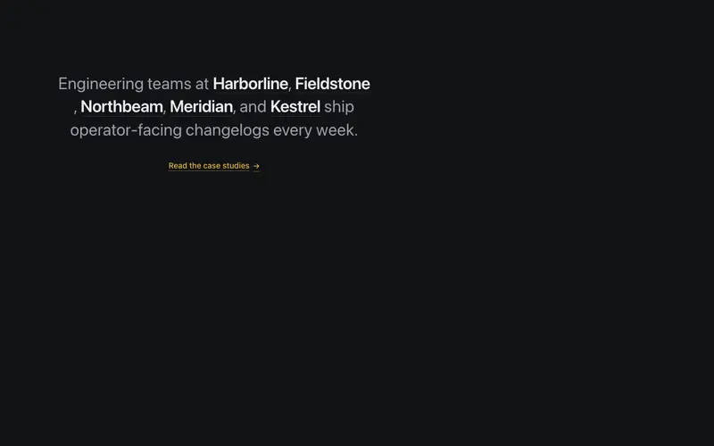
Logo Prose Inline
React social-proof paragraph with customer wordmarks set inline in the sentence, a Tailwind typographic lockup where every brand is real, readable text.
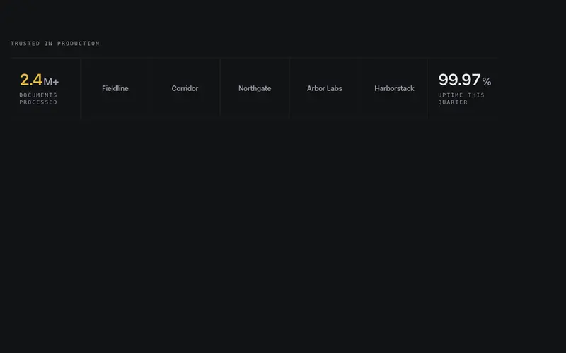
Logo Stat Strip
One hairline instrument band interleaving grayscale wordmarks with two counting proof stats, logos as the nouns, tabular numerals as the numbers, seam-divided.
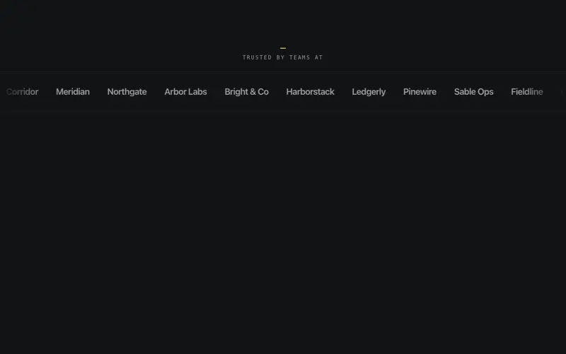
Logo Marquee
Single-row logo strip on a pure-CSS loop, wordmarks sit grayscale and dimmed until hover restores them, with edge fade masks and an honest sr-only roster of company names.
Frequently asked questions
How do I install the Logo Proof Wall component?
Register the @cleverui registry in your components.json ("@cleverui": "https://cleverops.com.au/r/{name}.json"), then run `npx shadcn@latest add @cleverui/logo-proof-wall`. The shadcn CLI copies the source into your project, you own the code from that point. You can also copy the source directly from this page.
What dependencies does Logo Proof Wall require?
Logo Proof Wall uses motion on top of React and Tailwind CSS. You don't need to install it manually, the shadcn CLI resolves and installs npm dependencies automatically when you add the component.
Can I theme Logo Proof Wall to match my brand?
Yes. The component is styled entirely with Tailwind utilities over standard design tokens (primary, background, muted, border), so it inherits your existing shadcn/ui theme automatically. Change your CSS variables and the component follows, no source edits needed for palette, radius, or fonts.
Want this built for you?
CleverUI is built by the Clever Ops web team. If you'd rather ship a hand-coded, fast, custom website than assemble one, we build them for Australian businesses every week.
Explore web development services