Vault Dials
Concentric instrument dials rotate and lock as loading advances, each quarter seats a ring with a spring snap until the keyway aligns at 100. React and Tailwind spectacle preloader.
Preview & code
Installation
pnpm dlx shadcn@latest add @cleverui/loader-vault-dialsRequires the @cleverui registry in your components.json, a one-off, two-line setup.
Usage
API reference
LoaderVaultDials accepts the following props.
…plus everything from React.HTMLAttributes<HTMLDivElement>: className, event handlers, aria attributes and the rest pass straight through.
Related components
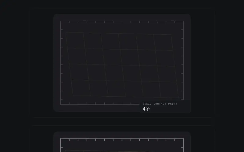
Diazo Develop
A blueprint develops as data arrives, latent linework surfaces in ink-density order, no sweep, bound to a 0-100 progress prop. React SVG preloader on Tailwind tokens with live percent.
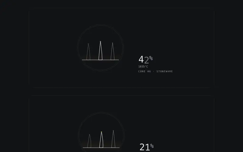
Kiln Cone
Pyrometric cones slump as heat work accumulates, the firing cone's bend tracks a 0-100 progress prop until its tip touches at 100. React SVG preloader on Tailwind tokens, live percent.
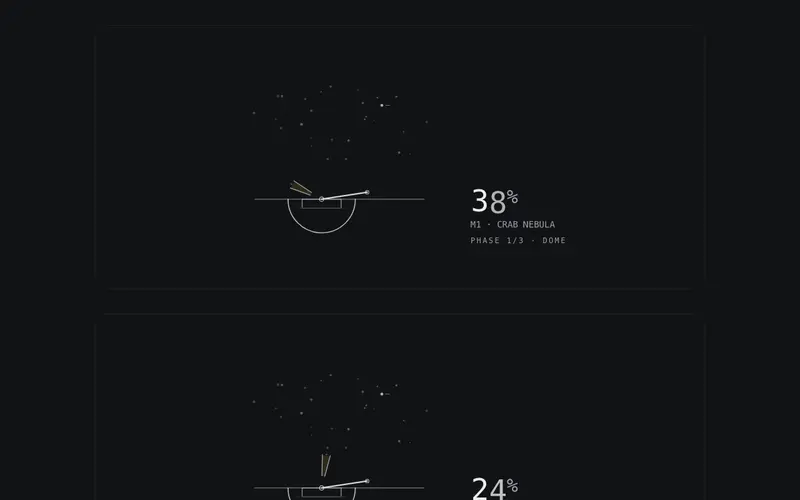
Observatory
An observatory acquires its target while data loads, dome slit, telescope slew and guiding reticle converge on a seeded star, locking at 100. React SVG preloader on Tailwind tokens.
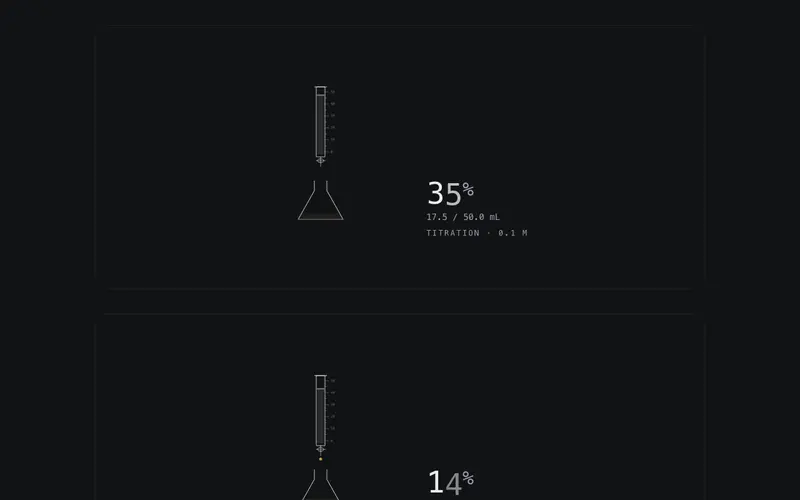
Titration
A burette meters primary drops into the flask, the meniscus falls with a 0-100 progress prop until the indicator flips at the endpoint. React SVG preloader on Tailwind tokens, live percent.
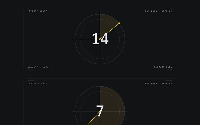
Film Leader
Cinema countdown leader as a React preloader, crosshair plate, radial clock wipe, and a giant mono numeral bound to a 0-100 progress prop. Tailwind tokens, designed reduced-motion still.
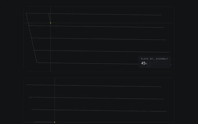
Plotter Trace
A pen plotter drafts a seeded schematic while your React app loads, stroke length bound to a 0-100 progress prop, percent stamped in a live title block. Canvas preloader in Tailwind tokens.
Frequently asked questions
How do I install the Vault Dials component?
Register the @cleverui registry in your components.json ("@cleverui": "https://cleverops.com.au/r/{name}.json"), then run `npx shadcn@latest add @cleverui/loader-vault-dials`. The shadcn CLI copies the source into your project, you own the code from that point. You can also copy the source directly from this page.
What dependencies does Vault Dials require?
Vault Dials uses motion on top of React and Tailwind CSS. You don't need to install it manually, the shadcn CLI resolves and installs npm dependencies automatically when you add the component.
Can I theme Vault Dials to match my brand?
Yes. The component is styled entirely with Tailwind utilities over standard design tokens (primary, background, muted, border), so it inherits your existing shadcn/ui theme automatically. Change your CSS variables and the component follows, no source edits needed for palette, radius, or fonts.
Want this built for you?
CleverUI is built by the Clever Ops web team. If you'd rather ship a hand-coded, fast, custom website than assemble one, we build them for Australian businesses every week.
Explore web development services