Ink Dots
Three ink dots with a liquid squash-and-merge cadence, a scoped SVG goo filter fuses them as they meet, then they rebound apart. A working ellipsis, tiny and cheap. Pure CSS animation.
Preview & code
Installation
pnpm dlx shadcn@latest add @cleverui/loader-ink-dotsRequires the @cleverui registry in your components.json, a one-off, two-line setup.
Usage
API reference
LoaderInkDots accepts the following props.
…plus everything from React.HTMLAttributes<HTMLDivElement>: className, event handlers, aria attributes and the rest pass straight through.
Related components
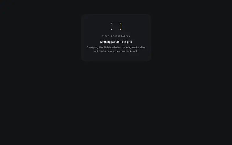
Blueprint Scan
A small drafting plate under survey, a hairline sweep crosses it while corner registration ticks resolve in its wake, holds, and rescans. The sweep carries the only primary ink. SVG and motion.
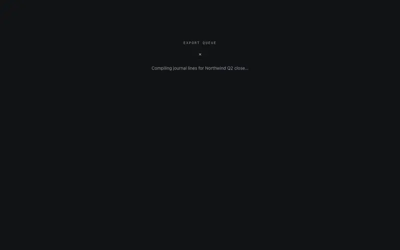
Glyph Cycle
A single mono glyph slot rolls through a deterministic character set behind a mask, and when the done prop flips, it rolls once more onto a primary check and stops. A one-character machine.
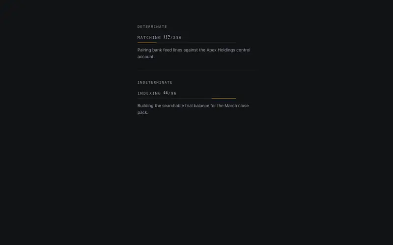
Ledger Fill
A mono working readout, "reconciling 047/128" with tabular digits rolling in a masked slot above a hairline progress rule. Determinate via a progress prop, or indeterminate by default.
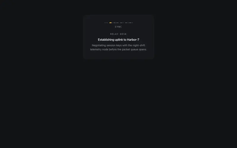
Morse Pulse
A short word transmitted in morse, dot and dash glyphs pulse in sequence on a telegraph cadence, with the word as a mono legend beneath. Playful, legible, sub-3Hz. Pure CSS, zero deps.
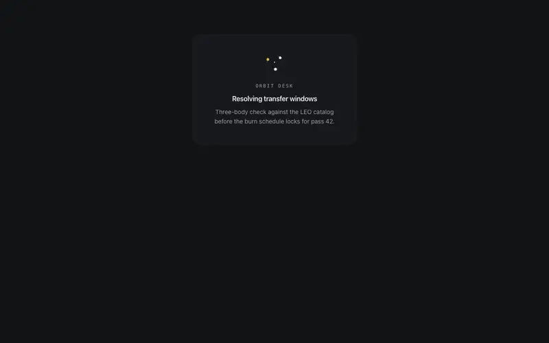
Orbit Trio
Three bodies orbit a common center at staggered phases, each towing a short decaying trail, a micro ephemeris as spinner. One body burns primary. Tiny SVG, pure CSS animation, zero deps.
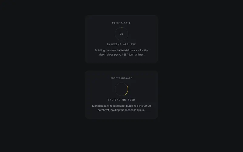
Percent Ring
Determinate loading ring, hairline token track, primary arc, tabular mono percent at center and a micro-label beneath. Falls back to an orbiting indeterminate segment when no progress is given.
Frequently asked questions
How do I install the Ink Dots component?
Register the @cleverui registry in your components.json ("@cleverui": "https://cleverops.com.au/r/{name}.json"), then run `npx shadcn@latest add @cleverui/loader-ink-dots`. The shadcn CLI copies the source into your project, you own the code from that point. You can also copy the source directly from this page.
What dependencies does Ink Dots require?
Ink Dots has no npm dependencies beyond React and Tailwind CSS itself, so there is nothing extra to install or keep updated.
Can I theme Ink Dots to match my brand?
Yes. The component is styled entirely with Tailwind utilities over standard design tokens (primary, background, muted, border), so it inherits your existing shadcn/ui theme automatically. Change your CSS variables and the component follows, no source edits needed for palette, radius, or fonts.
Want this built for you?
CleverUI is built by the Clever Ops web team. If you'd rather ship a hand-coded, fast, custom website than assemble one, we build them for Australian businesses every week.
Explore web development services