Compare Frame
Neutral labeled compare slider for any two children, a clipped divider with true keyboard slider semantics, framed like a plate in a technical catalog.
Preview & code
Installation
pnpm dlx shadcn@latest add @cleverui/image-compare-frameRequires the @cleverui registry in your components.json, a one-off, two-line setup.
Usage
API reference
ImageCompareFrame accepts the following props.
…plus everything from React.HTMLAttributes<HTMLElement>: className, event handlers, aria attributes and the rest pass straight through.
Related components
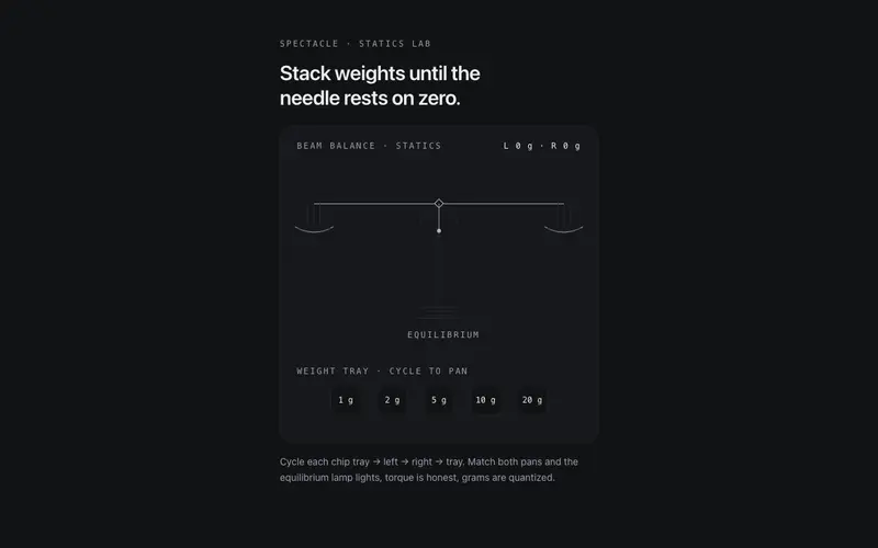
Beam Balance
A working two-pan beam balance for React, place mono weight chips on either pan, the beam tips with damped torque physics, and equilibrium earns the lamp. Tailwind tokens.
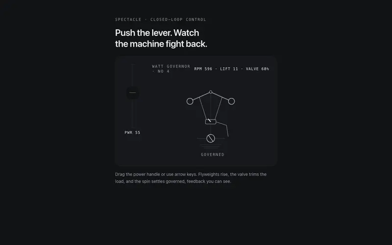
Centrifugal Governor
A working centrifugal governor for React, drive the power lever, flyweights rise and the valve trims the spin until it settles governed. ARIA slider semantics, Tailwind tokens.
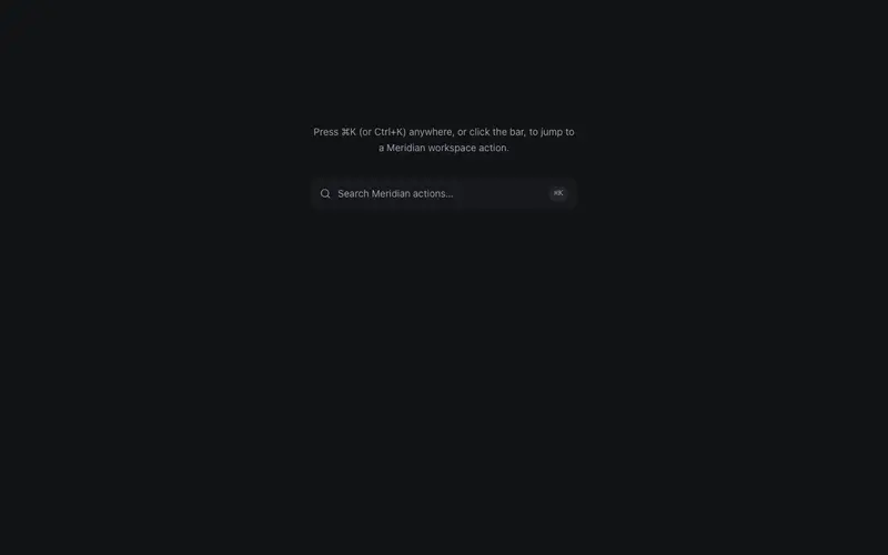
Command Hint Bar
A command-K hint bar that opens a compact command sheet, static list from props with a filter input, arrow-key selection, and Escape, real keyboard semantics without the cmdk weight.
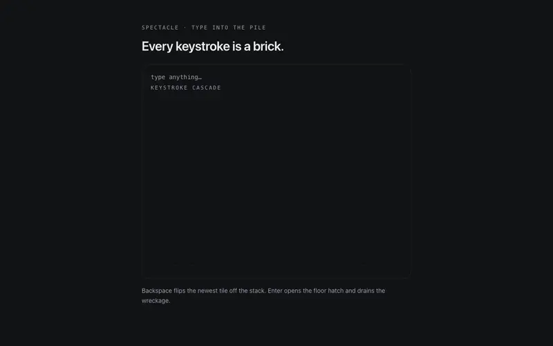
Keystroke Cascade
A type-anything React toy, every keystroke drops a physical glyph tile onto a canvas stage to bounce and stack; Enter opens the floor. Keyboard-native, Tailwind-tokened spectacle.
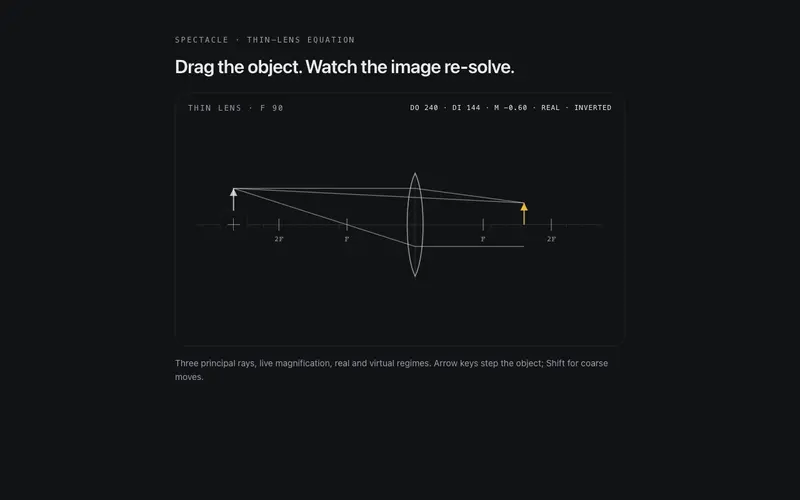
Lens Lab
A playable thin-lens ray lab for React, drag the object along the axis and principal rays, image, and magnification re-solve live. ARIA slider semantics, Tailwind token ink.
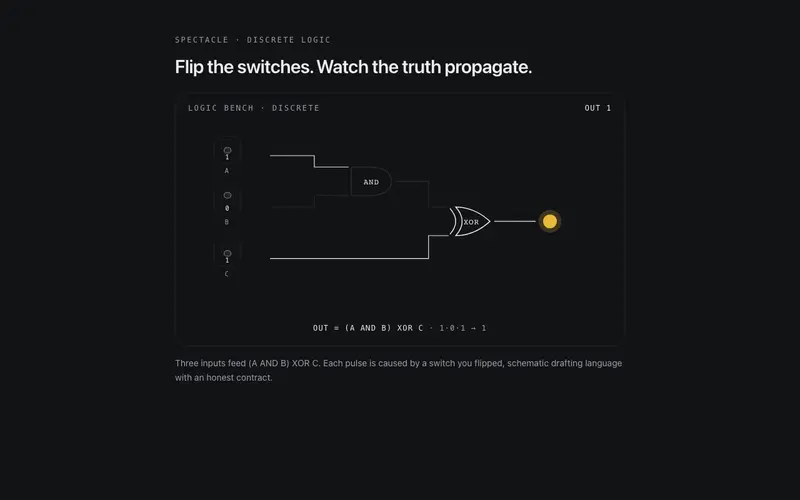
Logic Gate Bench
A live logic schematic for React, flip real toggle switches and watch pulses race hairline traces through gates to the output lamp. aria-pressed switches, Tailwind tokens.
Frequently asked questions
How do I install the Compare Frame component?
Register the @cleverui registry in your components.json ("@cleverui": "https://cleverops.com.au/r/{name}.json"), then run `npx shadcn@latest add @cleverui/image-compare-frame`. The shadcn CLI copies the source into your project, you own the code from that point. You can also copy the source directly from this page.
What dependencies does Compare Frame require?
Compare Frame uses motion on top of React and Tailwind CSS. You don't need to install it manually, the shadcn CLI resolves and installs npm dependencies automatically when you add the component.
Can I theme Compare Frame to match my brand?
Yes. The component is styled entirely with Tailwind utilities over standard design tokens (primary, background, muted, border), so it inherits your existing shadcn/ui theme automatically. Change your CSS variables and the component follows, no source edits needed for palette, radius, or fonts.
Want this built for you?
CleverUI is built by the Clever Ops web team. If you'd rather ship a hand-coded, fast, custom website than assemble one, we build them for Australian businesses every week.
Explore web development services