Metrics Fusion Features
Feature rows fused with proof, every capability carries its own counting mini-stat in tabular figures, so the claim and its evidence share one line.
Preview & code
Installation
pnpm dlx shadcn@latest add @cleverui/feature-metrics-fusionRequires the @cleverui registry in your components.json, a one-off, two-line setup.
Usage
API reference
FeatureMetricsFusion accepts the following props.
…plus everything from React.HTMLAttributes<HTMLElement>: className, event handlers, aria attributes and the rest pass straight through.
Referenced types
Related components
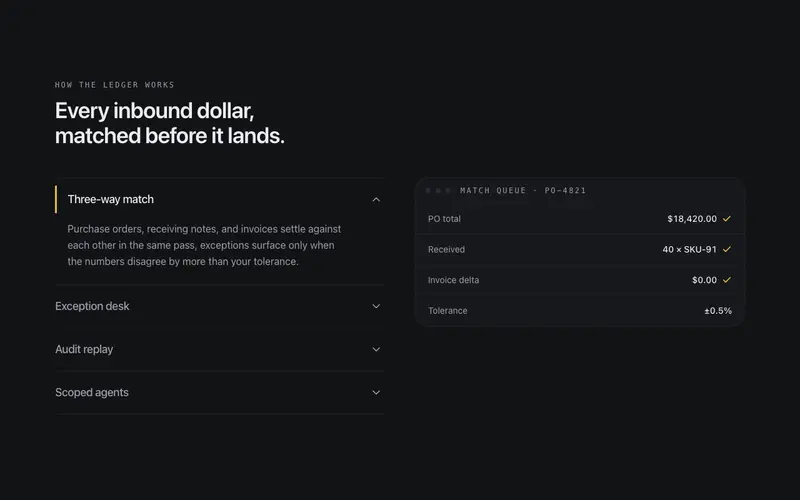
Accordion Stage
Feature accordion synced to a stage, expanding a row swaps the token-built preview beside it, one open at a time, height animated without jank.
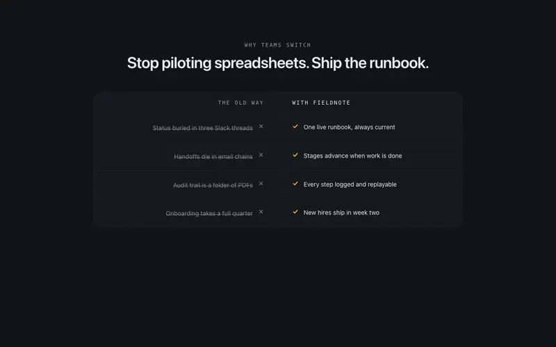
Before After Strip
A narrow strip pairing the old way against your product in two mirrored quiet columns, each pain struck through as its counterpart lands with a check.
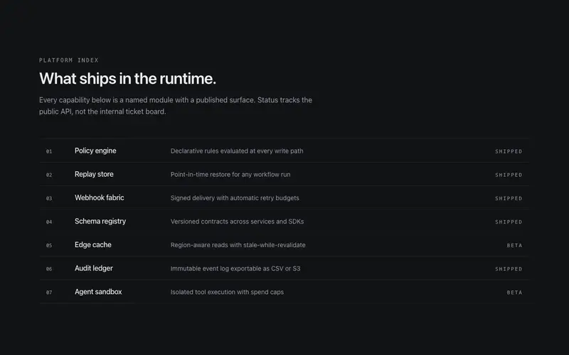
Ledger List Features
Features as a ruled ledger, mono index, name, and one-line value statement per row with a right-aligned shipped/beta status. Dense, scannable, no grid.
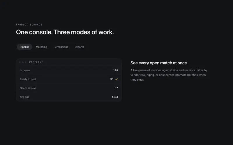
Tabbed Feature Stage
Feature tabs with a live stage, switching tabs morphs a token-built product panel between states, with the active tab carried by a sliding thumb.
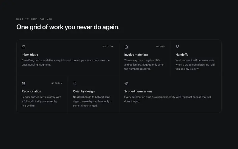
Bento Feature Grid
A bento grid drawn like a drafting table, tiles share single hairline seams instead of floating as glow cards. Staggered reveal, quiet hover shift, wide and tall spans.
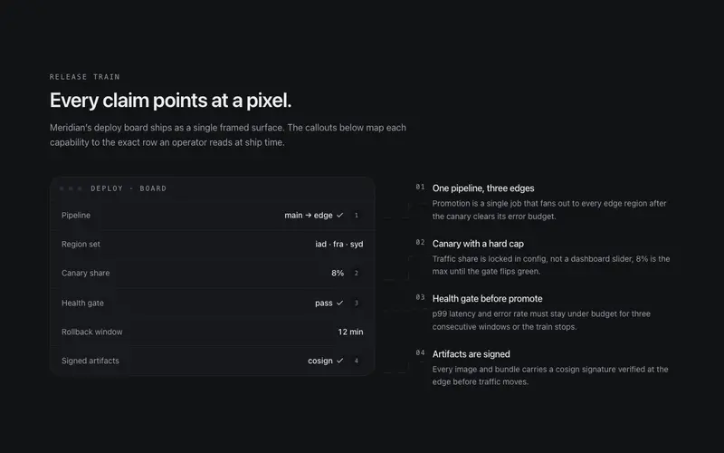
Callout Figure Features
Annotated product figure for React marketing pages, numbered leader lines tie a token-built Tailwind mock to margin notes, so every feature claim points at the pixel it explains.
Frequently asked questions
How do I install the Metrics Fusion Features component?
Register the @cleverui registry in your components.json ("@cleverui": "https://cleverops.com.au/r/{name}.json"), then run `npx shadcn@latest add @cleverui/feature-metrics-fusion`. The shadcn CLI copies the source into your project, you own the code from that point. You can also copy the source directly from this page.
What dependencies does Metrics Fusion Features require?
Metrics Fusion Features uses motion and lucide-react on top of React and Tailwind CSS. You don't need to install them manually, the shadcn CLI resolves and installs npm dependencies automatically when you add the component.
Can I theme Metrics Fusion Features to match my brand?
Yes. The component is styled entirely with Tailwind utilities over standard design tokens (primary, background, muted, border), so it inherits your existing shadcn/ui theme automatically. Change your CSS variables and the component follows, no source edits needed for palette, radius, or fonts.
Want this built for you?
CleverUI is built by the Clever Ops web team. If you'd rather ship a hand-coded, fast, custom website than assemble one, we build them for Australian businesses every week.
Explore web development services