FAQ Split Detail
Master-detail FAQ for React, question rail on the left, full answer stage on the right, a sliding hairline marker and real arrow-key tab semantics. Tailwind, reading-first.
Preview & code
Installation
pnpm dlx shadcn@latest add @cleverui/faq-split-detailRequires the @cleverui registry in your components.json, a one-off, two-line setup.
Usage
API reference
FaqSplitDetail accepts the following props.
…plus everything from React.HTMLAttributes<HTMLElement>: className, event handlers, aria attributes and the rest pass straight through.
Referenced types
Related components

FAQ Carousel
One-question-at-a-time FAQ deck for React, editorial type, mono counter, hairline progress, strictly manual prev/next. A calm Tailwind alternative to accordion walls.
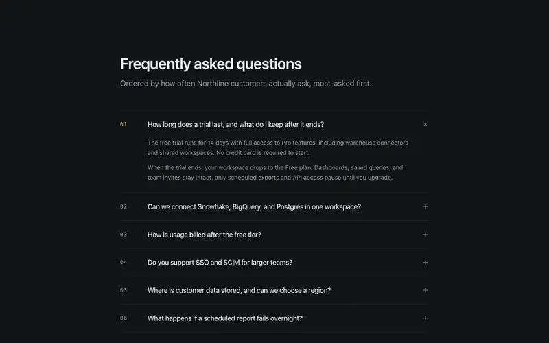
FAQ Disclosure List
The accordion FAQ perfected, real disclosure semantics over hairline rows, mono two-digit numbering earned by most-asked order, multi-paragraph answers, optional single-open.
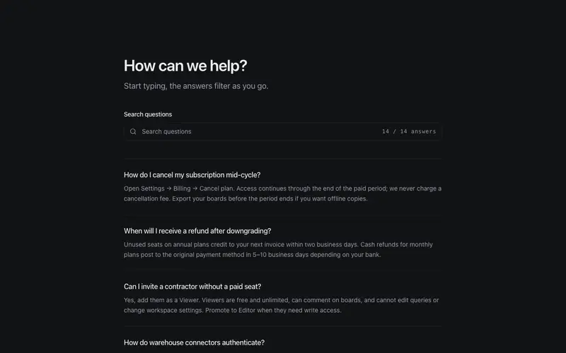
FAQ Inline Search
Searchable FAQ section for React, type-to-filter with live match highlighting, a mono result count, and an empty state that hands off to support. Tailwind hairline rows, no search backend.

FAQ Topic Index
Grouped FAQ with a sticky topic index, scrollspy rail, anchor jumps, every answer visible in dl semantics. A documentation-grade FAQ section in React and Tailwind.
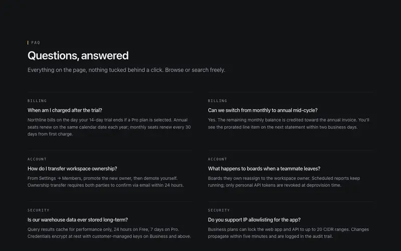
Two-Column FAQ
Static two-column FAQ that hides nothing, every answer visible and scannable, questions in medium weight over quiet answers, mono category micro-labels. No accordions.
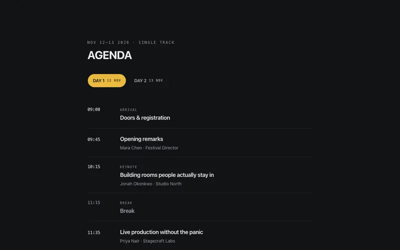
Agenda Day Picker
Day pills over a single-track agenda, pick a day, read its sessions down a mono time rail. One room, one running order, real tablist semantics.
Frequently asked questions
How do I install the FAQ Split Detail component?
Register the @cleverui registry in your components.json ("@cleverui": "https://cleverops.com.au/r/{name}.json"), then run `npx shadcn@latest add @cleverui/faq-split-detail`. The shadcn CLI copies the source into your project, you own the code from that point. You can also copy the source directly from this page.
What dependencies does FAQ Split Detail require?
FAQ Split Detail uses motion on top of React and Tailwind CSS. You don't need to install it manually, the shadcn CLI resolves and installs npm dependencies automatically when you add the component.
Can I theme FAQ Split Detail to match my brand?
Yes. The component is styled entirely with Tailwind utilities over standard design tokens (primary, background, muted, border), so it inherits your existing shadcn/ui theme automatically. Change your CSS variables and the component follows, no source edits needed for palette, radius, or fonts.
Want this built for you?
CleverUI is built by the Clever Ops web team. If you'd rather ship a hand-coded, fast, custom website than assemble one, we build them for Australian businesses every week.
Explore web development services