Speaker Spotlight Row
Headline speakers as poster rows, names set huge, talk titles in italic, companies in mono, and a day-stage chip per row. The speaker bill is the artwork.
Preview & code
Installation
pnpm dlx shadcn@latest add @cleverui/speaker-spotlight-rowRequires the @cleverui registry in your components.json, a one-off, two-line setup.
Usage
API reference
SpeakerSpotlightRow accepts the following props.
…plus everything from React.HTMLAttributes<HTMLElement>: className, event handlers, aria attributes and the rest pass straight through.
Referenced types
Related components
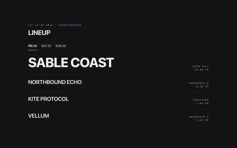
Event Lineup Board
A poster-type lineup board, acts in oversized weight-contrast rows, stage and time in mono, day tabs with real tablist semantics. The bill is the artwork.
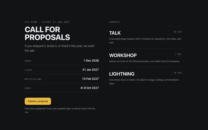
Event CFP Block
A call-for-proposals block, poster heading, mono deadline rail, talk formats with durations, and one submit CTA. React and Tailwind CFP section for conference sites.
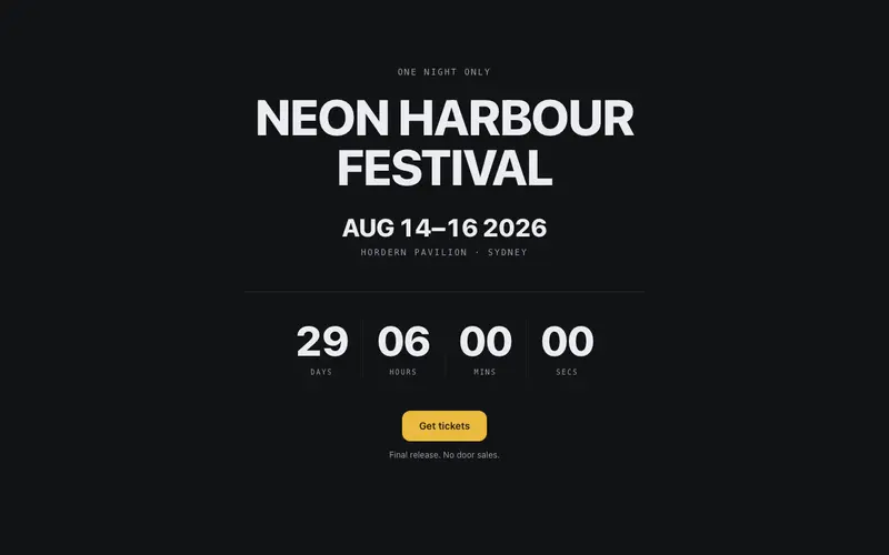
Event Countdown Hero
The event's own countdown hero, oversized date numerals, a mono venue line, poster-scale rolling countdown digits, and one ticket CTA. Doors open in exactly this long.
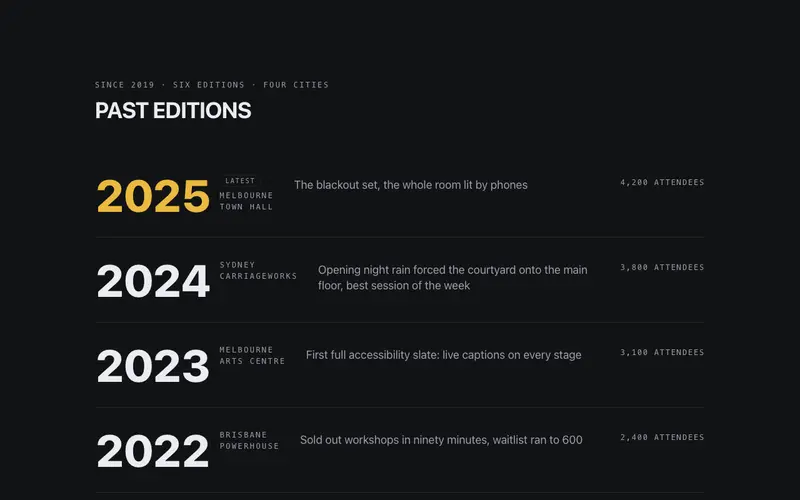
Event Past Editions
Past editions as a typographic reel, years set huge, cities in mono, one headline moment and attendance per row. A React and Tailwind pedigree block for event sites.
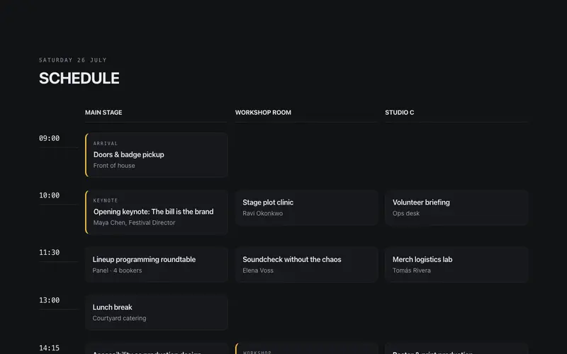
Event Schedule Tracks
A multi-track agenda, mono time rail against parallel track columns that collapse into one accessible chronological list on mobile. Conference wayfinding, poster confidence.
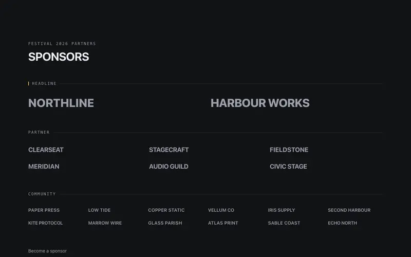
Sponsor Tier Wall
Sponsors ranked the way posters rank them, headline wordmarks set huge, partners mid, community small, grouped under mono tier labels on hairline rules. No logo files needed.
Frequently asked questions
How do I install the Speaker Spotlight Row component?
Register the @cleverui registry in your components.json ("@cleverui": "https://cleverops.com.au/r/{name}.json"), then run `npx shadcn@latest add @cleverui/speaker-spotlight-row`. The shadcn CLI copies the source into your project, you own the code from that point. You can also copy the source directly from this page.
What dependencies does Speaker Spotlight Row require?
Speaker Spotlight Row uses motion on top of React and Tailwind CSS. You don't need to install it manually, the shadcn CLI resolves and installs npm dependencies automatically when you add the component.
Can I theme Speaker Spotlight Row to match my brand?
Yes. The component is styled entirely with Tailwind utilities over standard design tokens (primary, background, muted, border), so it inherits your existing shadcn/ui theme automatically. Change your CSS variables and the component follows, no source edits needed for palette, radius, or fonts.
Want this built for you?
CleverUI is built by the Clever Ops web team. If you'd rather ship a hand-coded, fast, custom website than assemble one, we build them for Australian businesses every week.
Explore web development services