Orbit Satellites
Two or three tiny satellites orbit the pointer on offset periods, trailing slightly on fast moves and tightening formation over links and buttons, affordance as gravity.
Preview & code
Installation
pnpm dlx shadcn@latest add @cleverui/cursor-orbit-satellitesRequires the @cleverui registry in your components.json, a one-off, two-line setup.
Usage
API reference
CursorOrbitSatellites accepts the following props.
…plus everything from React.HTMLAttributes<HTMLDivElement>: className, event handlers, aria attributes and the rest pass straight through.
Related components
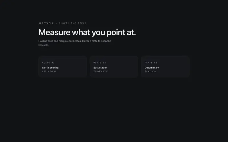
Survey Crosshair
Full-viewport drafting crosshair, hairline axes track the pointer with mono coordinate readouts in the margins, and hovering targets snaps brackets around them.
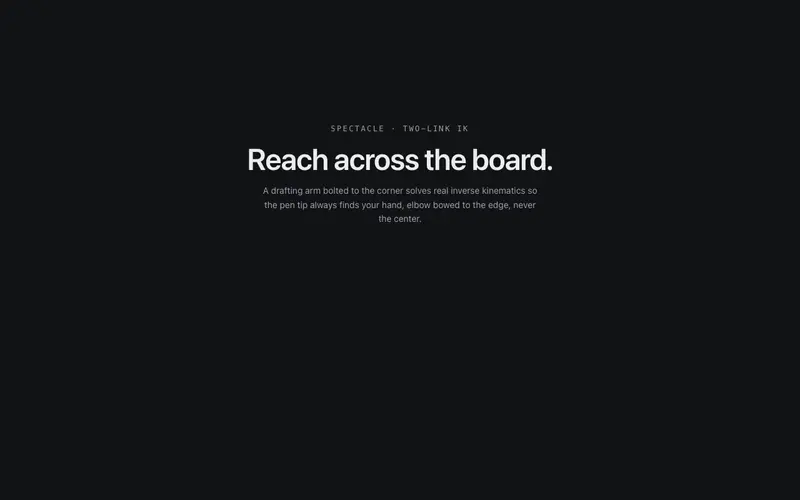
Drafting Arm
A drafting-machine arm bolted to the viewport corner reaches the pointer, two hairline links solved by real IK, joint discs, and spring lag. React page companion on Tailwind tokens.
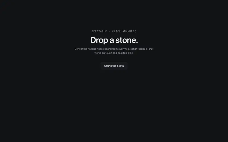
Echo Rings
Every click drops a stone in the page, concentric hairline rings ripple out from the point and dissolve, with a soft accent pulse at the center. Sonar for the UI.
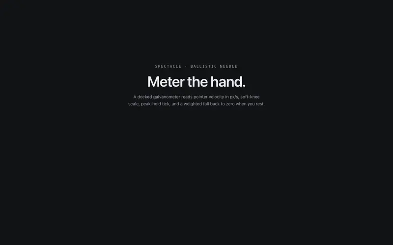
Pointer Galvanometer
A docked galvanometer meters the pointer, a ballistic needle kicks across a graduated arc with cursor speed, a primary peak-hold tick decays behind it. React + Tailwind tokens.
Glyph Wake
The pointer leaves a wake of mono glyphs, characters condense along the path, hold for a breath, and evaporate. Typography as vapor trail.
Goo Cursor Trail
A chain of accent blobs chases the cursor through an SVG goo filter, merging, stretching, splitting like liquid ink. Touch devices get an autonomous lava-lamp drift.
Frequently asked questions
How do I install the Orbit Satellites component?
Register the @cleverui registry in your components.json ("@cleverui": "https://cleverops.com.au/r/{name}.json"), then run `npx shadcn@latest add @cleverui/cursor-orbit-satellites`. The shadcn CLI copies the source into your project, you own the code from that point. You can also copy the source directly from this page.
What dependencies does Orbit Satellites require?
Orbit Satellites uses motion on top of React and Tailwind CSS. You don't need to install it manually, the shadcn CLI resolves and installs npm dependencies automatically when you add the component.
Can I theme Orbit Satellites to match my brand?
Yes. The component is styled entirely with Tailwind utilities over standard design tokens (primary, background, muted, border), so it inherits your existing shadcn/ui theme automatically. Change your CSS variables and the component follows, no source edits needed for palette, radius, or fonts.
Want this built for you?
CleverUI is built by the Clever Ops web team. If you'd rather ship a hand-coded, fast, custom website than assemble one, we build them for Australian businesses every week.
Explore web development services