Contact Split Panel
Seam-divided contact section, left a form done right with visible labels and honest validation, right the office in mono: hours, address, working tel and mailto links.
Preview & code
Installation
pnpm dlx shadcn@latest add @cleverui/contact-split-panelRequires the @cleverui registry in your components.json, a one-off, two-line setup.
Usage
API reference
ContactSplitPanel accepts the following props.
…plus everything from Omit<React.HTMLAttributes<HTMLElement>, 'onSubmit'>: className, event handlers, aria attributes and the rest pass straight through.
Referenced types
Related components
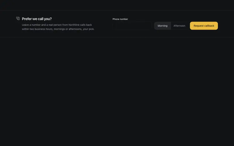
Contact Callback Strip
Slim request-a-callback band in React, one tel field, a morning or afternoon window picker and an honest callback promise, collapsing to a confirmation. Tailwind micro form.
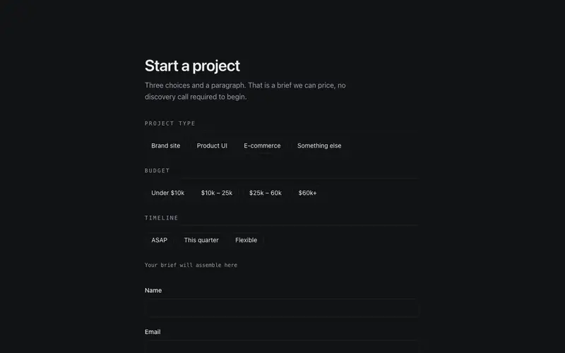
Contact Project Brief
Project inquiry form that composes a brief, radio-chip fieldsets for type, budget and timeline with a live mono summary line. An honest React and Tailwind contact form for agencies.
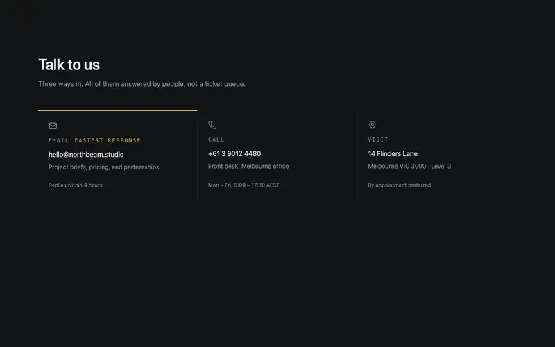
Contact Channel Cards
Pick-your-channel contact tiles, email, call, visit, each a working link with a quiet response-time promise; the single recommended channel carries the primary keyline.
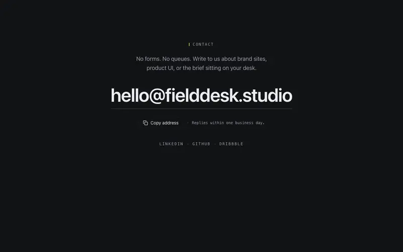
Contact Email Spotlight
Minimal contact block that commits to one channel, the email address set at display scale as a working mailto with copy-to-clipboard and a quiet response promise. React + Tailwind.
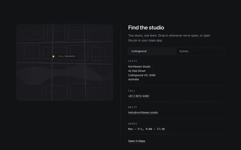
Contact Split Map
Contact section with a token-drawn SVG map, abstract street grid, primary pin, office switcher, and working tel, mailto and directions links. React + Tailwind, no map embed.
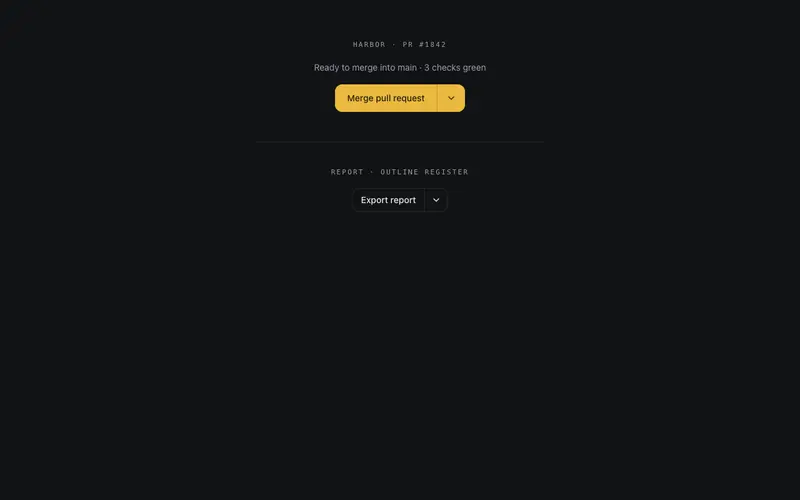
Split Button
A self-contained split button for React, filled primary action, hairline-divided menu toggle, and real role=menu keyboard semantics with zero Radix or portal dependencies.
Frequently asked questions
How do I install the Contact Split Panel component?
Register the @cleverui registry in your components.json ("@cleverui": "https://cleverops.com.au/r/{name}.json"), then run `npx shadcn@latest add @cleverui/contact-split-panel`. The shadcn CLI copies the source into your project, you own the code from that point. You can also copy the source directly from this page.
What dependencies does Contact Split Panel require?
Contact Split Panel uses motion and lucide-react on top of React and Tailwind CSS. You don't need to install them manually, the shadcn CLI resolves and installs npm dependencies automatically when you add the component.
Can I theme Contact Split Panel to match my brand?
Yes. The component is styled entirely with Tailwind utilities over standard design tokens (primary, background, muted, border), so it inherits your existing shadcn/ui theme automatically. Change your CSS variables and the component follows, no source edits needed for palette, radius, or fonts.
Want this built for you?
CleverUI is built by the Clever Ops web team. If you'd rather ship a hand-coded, fast, custom website than assemble one, we build them for Australian businesses every week.
Explore web development services