Before & After Care
A pre and post appointment care card, two gentle columns headed before you arrive and afterwards, guidance lines in italic serif, and one primary keyline. Practical instructions, beautifully set.
Preview & code
Installation
pnpm dlx shadcn@latest add @cleverui/before-care-notesRequires the @cleverui registry in your components.json, a one-off, two-line setup.
Usage
API reference
BeforeCareNotes accepts the following props.
…plus everything from React.HTMLAttributes<HTMLElement>: className, event handlers, aria attributes and the rest pass straight through.
Related components

Booking Ritual CTA
An appointment CTA framed as the start of a ritual, a light serif invitation, a softened primary action, and a quiet phone path beside it. Unhurried, sensory, certain of itself.
Gift Voucher Card
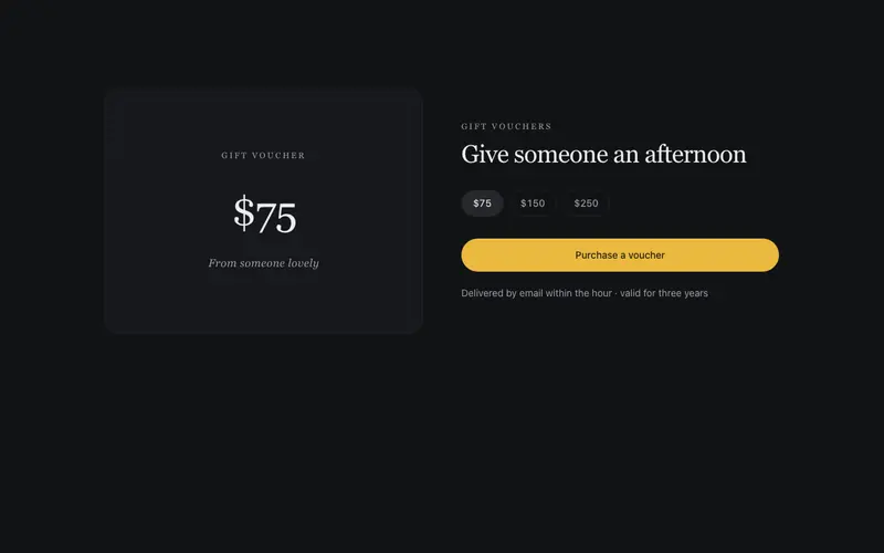
A voucher presented like the gift itself, certificate hairlines, a light serif denomination display, a from-someone-lovely line, and a purchase CTA. E-commerce in the beauty voice.
Ritual Steps
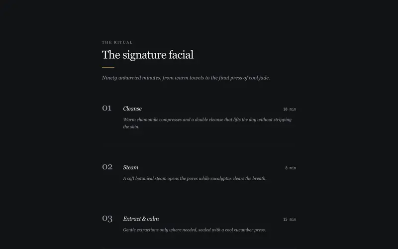
A signature treatment unfolded as a numbered ritual, large serif numerals, italic sensory step descriptions, and durations in quiet mono. The sequence reads like a printed ceremony card.
Treatment Menu
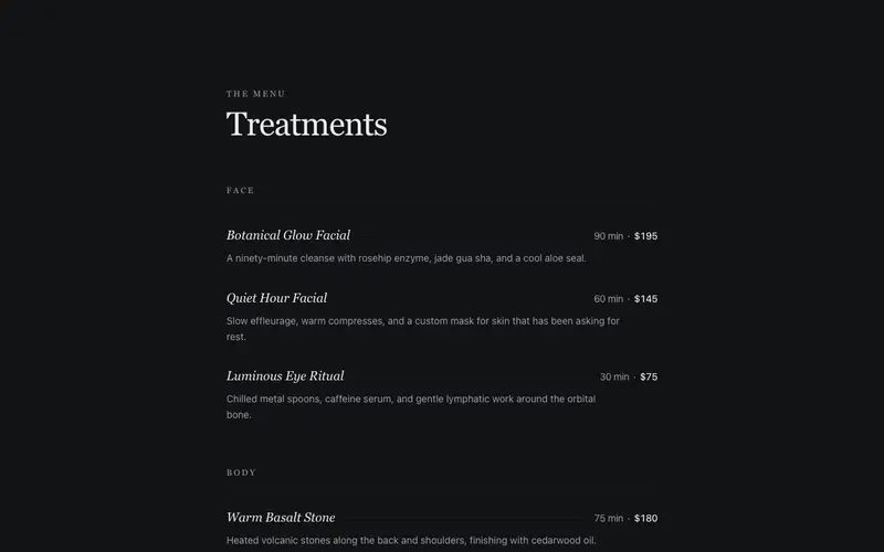
A spa treatment menu set like a printed ritual card, serif italic treatment names, duration and price in quiet tabular figures, delicate hairline leaders. Sensory and unhurried.
Membership Glow
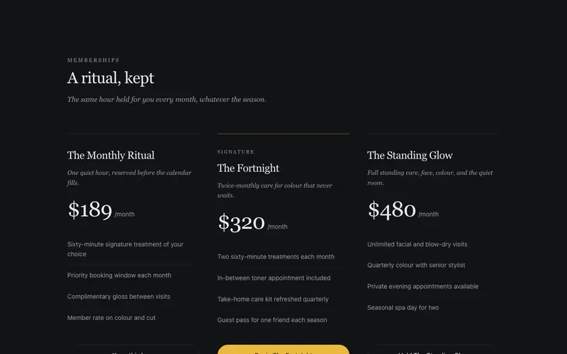
Beauty memberships with serif tier names like The Monthly Ritual, included treatments as airy lists, per-month prices in tabular figures, and a soft masked halo behind the signature tier.
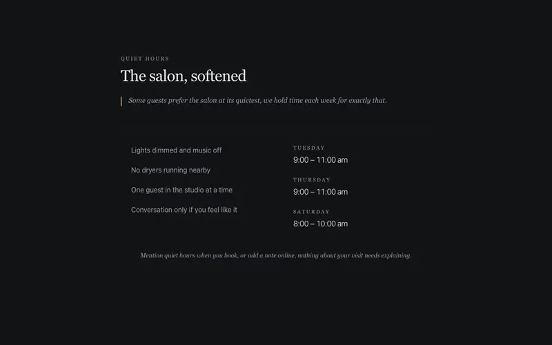
Quiet Hours
Sensory-friendly quiet hours, weekly low-stimulation session times beside a gentle list of what changes, from dimmed lights to no dryers. A React and Tailwind panel for salons.
Frequently asked questions
How do I install the Before & After Care component?
Register the @cleverui registry in your components.json ("@cleverui": "https://cleverops.com.au/r/{name}.json"), then run `npx shadcn@latest add @cleverui/before-care-notes`. The shadcn CLI copies the source into your project, you own the code from that point. You can also copy the source directly from this page.
What dependencies does Before & After Care require?
Before & After Care uses motion on top of React and Tailwind CSS. You don't need to install it manually, the shadcn CLI resolves and installs npm dependencies automatically when you add the component.
Can I theme Before & After Care to match my brand?
Yes. The component is styled entirely with Tailwind utilities over standard design tokens (primary, background, muted, border), so it inherits your existing shadcn/ui theme automatically. Change your CSS variables and the component follows, no source edits needed for palette, radius, or fonts.
Want this built for you?
CleverUI is built by the Clever Ops web team. If you'd rather ship a hand-coded, fast, custom website than assemble one, we build them for Australian businesses every week.
Explore web development services