HITL Approval Card
Human-in-the-loop approval for a pending agent action, plain-language summary, honest risk chip, expandable raw-payload mono block, and allow-once / always-allow / deny callbacks.
Preview & code
Installation
pnpm dlx shadcn@latest add @cleverui/hitl-approval-cardRequires the @cleverui registry in your components.json, a one-off, two-line setup.
Usage
API reference
HitlApprovalCard accepts the following props.
…plus everything from Omit< React.HTMLAttributes<HTMLElement>, 'onDrag' | 'onDragStart' | 'onDragEnd' | 'onAnimationStart' >: className, event handlers, aria attributes and the rest pass straight through.
Referenced types
Related components
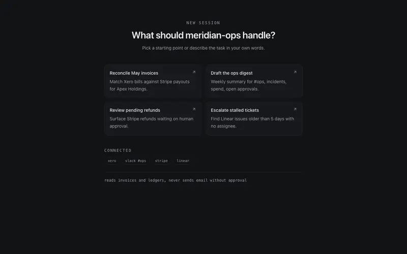
AI Empty State
Agent session zero state for React AI apps, starter prompt cards, connected-tool chips, and an honest scope note, styled with Tailwind hairline restraint; composes above any composer.
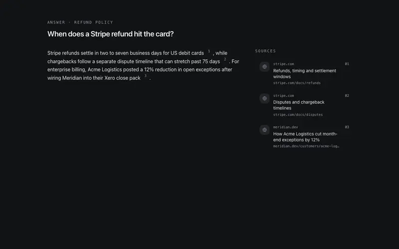
Citation Rail
Inline numbered source chips paired with a rail of sources, favicon placeholder, domain, and title, plus a keyboard-accessible snippet peek on hover or focus.
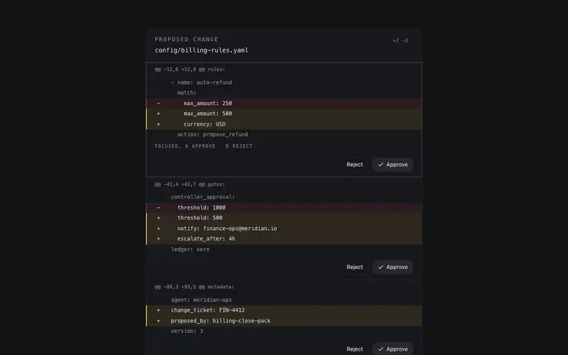
Diff Approval Block
An agent's proposed change as reviewable hunks, mono before/after lines with token-honest added and removed tints, per-hunk approve/reject callbacks, and j/k keyboard navigation.
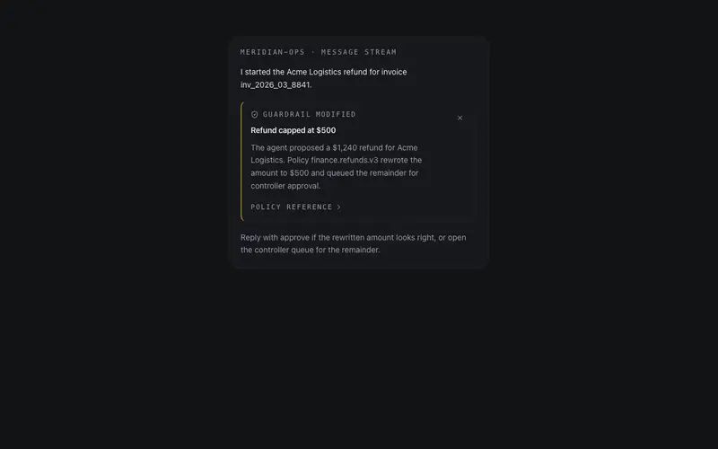
Guardrail Notice
An inline policy interjection, a quiet card explaining why the agent modified or declined an action, with an expandable mono policy reference; honest tone, destructive keyline only when blocked.

Memory Ledger
What the agent remembers, as ruled ledger rows, stored facts with source chips, mono added-at stamps, per-row forget buttons, and one pinned fact held on a primary keyline.
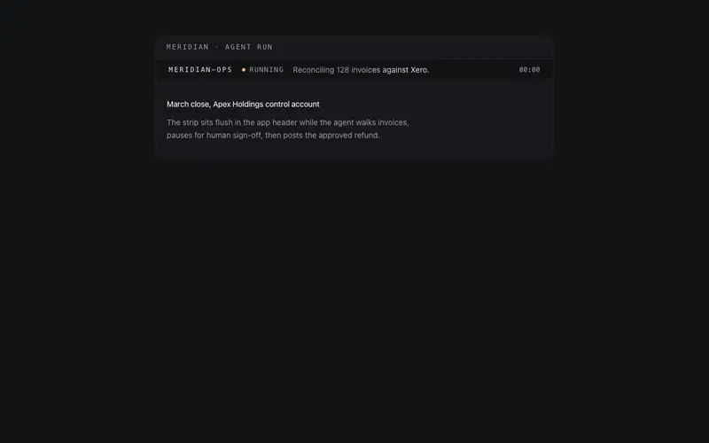
Agent Status Strip
A slim strip for app headers, agent name, state lamp, a one-line current step that shimmers while running, and an SSR-safe elapsed mono timer that starts post-mount.
Frequently asked questions
How do I install the HITL Approval Card component?
Register the @cleverui registry in your components.json ("@cleverui": "https://cleverops.com.au/r/{name}.json"), then run `npx shadcn@latest add @cleverui/hitl-approval-card`. The shadcn CLI copies the source into your project, you own the code from that point. You can also copy the source directly from this page.
What dependencies does HITL Approval Card require?
HITL Approval Card uses motion and lucide-react on top of React and Tailwind CSS. You don't need to install them manually, the shadcn CLI resolves and installs npm dependencies automatically when you add the component.
Can I theme HITL Approval Card to match my brand?
Yes. The component is styled entirely with Tailwind utilities over standard design tokens (primary, background, muted, border), so it inherits your existing shadcn/ui theme automatically. Change your CSS variables and the component follows, no source edits needed for palette, radius, or fonts.
Want this built for you?
CleverUI is built by the Clever Ops web team. If you'd rather ship a hand-coded, fast, custom website than assemble one, we build them for Australian businesses every week.
Explore web development services