Amenity Constellation
Hotel amenities as an airy constellation, icon and serif label pairs grouped by pool, spa and dining, one signature amenity carrying the accent. The whitespace does the luxury.
Preview & code
Installation
pnpm dlx shadcn@latest add @cleverui/amenity-constellationRequires the @cleverui registry in your components.json, a one-off, two-line setup.
Usage
The example itself also uses lucide-react , install it too if you copy the example as-is (the component itself does not need it).
API reference
AmenityConstellation accepts the following props.
…plus everything from React.HTMLAttributes<HTMLElement>: className, event handlers, aria attributes and the rest pass straight through.
Referenced types
Related components
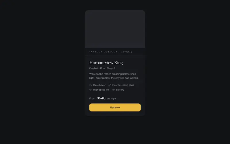
Room & Suite Card
A hotel room card in serif calm, framed view placeholder, quiet amenity icons, the from-rate in tabular figures with per-night whispered, and a single reserved booking accent.
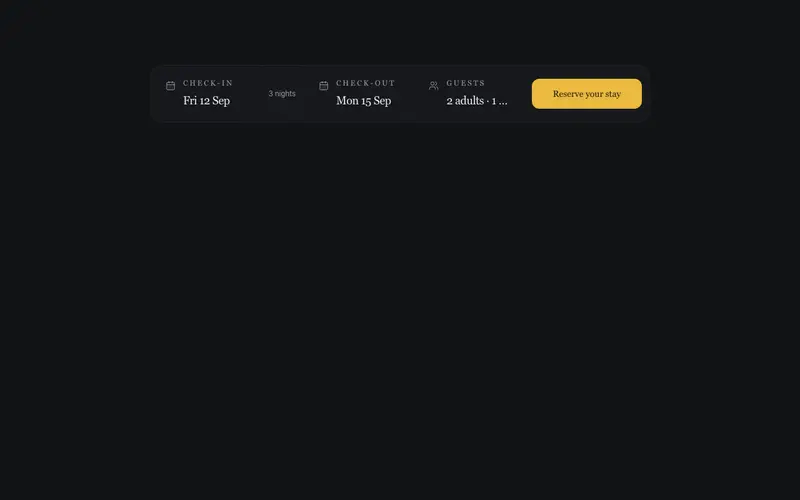
Booking Window Bar
A check-in, check-out and guests summary bar with hairline seams and a serif reserve action, display-only fields from preformatted props, onSearch delegated, zero date-picker weight.
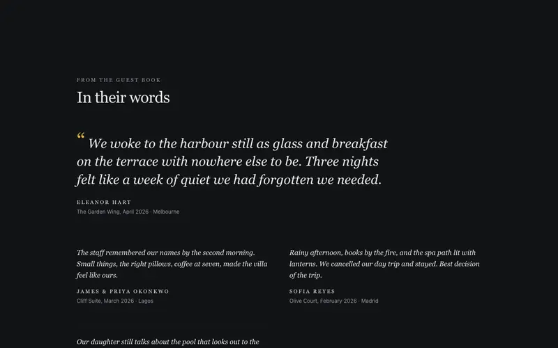
Guest Book Spread
Hotel guest reviews set like a guest book, one lead quote in large serif italic with stay details, smaller notes alongside. A React testimonial spread styled with Tailwind.
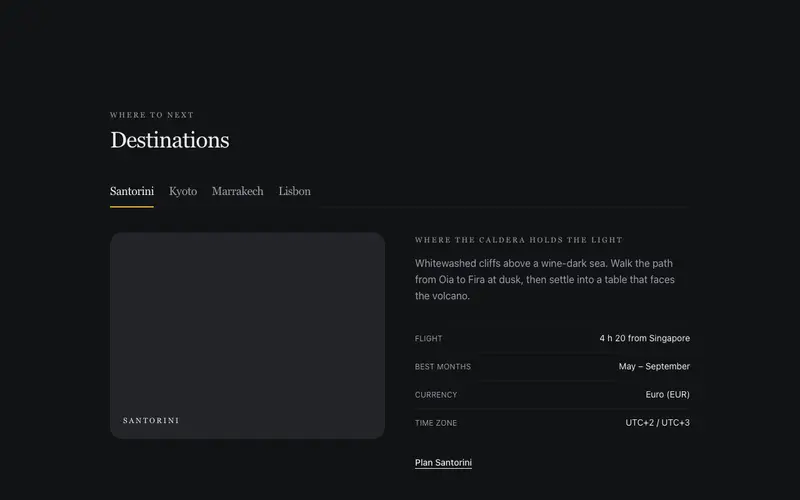
Destination Tabs
Destination tabs for travel sites, serif place names on a hairline rail, evocative intros and quiet fact pairs per place. Accessible React tabs themed with Tailwind tokens.
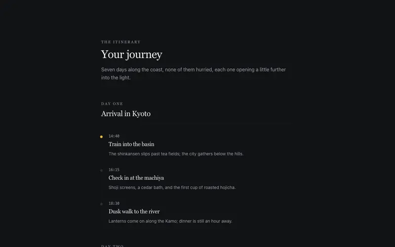
Itinerary Day Flow
A day-by-day itinerary set like a travel journal, serif day headings, a hairline timeline of moments with mono times, and evocative one-line descriptions that smell of the place.
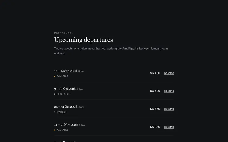
Tour Departures List
Upcoming small-group tour departures as a serif ledger, preformatted date ranges, tabular prices and real-text availability. A React booking list themed with Tailwind.
Frequently asked questions
How do I install the Amenity Constellation component?
Register the @cleverui registry in your components.json ("@cleverui": "https://cleverops.com.au/r/{name}.json"), then run `npx shadcn@latest add @cleverui/amenity-constellation`. The shadcn CLI copies the source into your project, you own the code from that point. You can also copy the source directly from this page.
What dependencies does Amenity Constellation require?
Amenity Constellation uses motion on top of React and Tailwind CSS. You don't need to install it manually, the shadcn CLI resolves and installs npm dependencies automatically when you add the component.
Can I theme Amenity Constellation to match my brand?
Yes. The component is styled entirely with Tailwind utilities over standard design tokens (primary, background, muted, border), so it inherits your existing shadcn/ui theme automatically. Change your CSS variables and the component follows, no source edits needed for palette, radius, or fonts.
Want this built for you?
CleverUI is built by the Clever Ops web team. If you'd rather ship a hand-coded, fast, custom website than assemble one, we build them for Australian businesses every week.
Explore web development services