Stats Composition Bar
Part-to-whole React stat band, one Tailwind-token stacked bar splits into hairline-seamed segments with a legend ledger of preformatted shares beneath it.
Preview & code
Installation
pnpm dlx shadcn@latest add @cleverui/stats-composition-barRequires the @cleverui registry in your components.json, a one-off, two-line setup.
Usage
API reference
StatsCompositionBar accepts the following props.
…plus everything from React.HTMLAttributes<HTMLElement>: className, event handlers, aria attributes and the rest pass straight through.
Referenced types
Related components
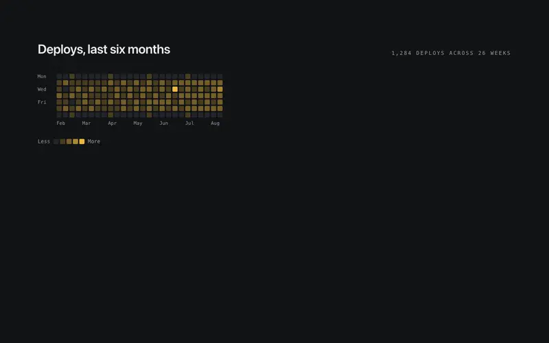
Stats Activity Grid
Contribution-style React activity heatmap, a dependency-free Tailwind grid of cells stepped through primary opacities, with mono axis labels and an honest text summary.
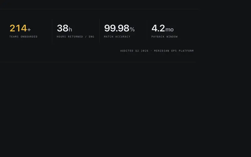
Stats Band
Full-width hairline band of three to five counting stats, tabular numerals tick up once on view over mono micro-labels, separated by vertical hairline seams.

Stats Bar List
Ranked React stats ledger, each row pairs a mono index and preformatted value with a 2px Tailwind-token bar drawn to scale, the leading row carrying the accent.
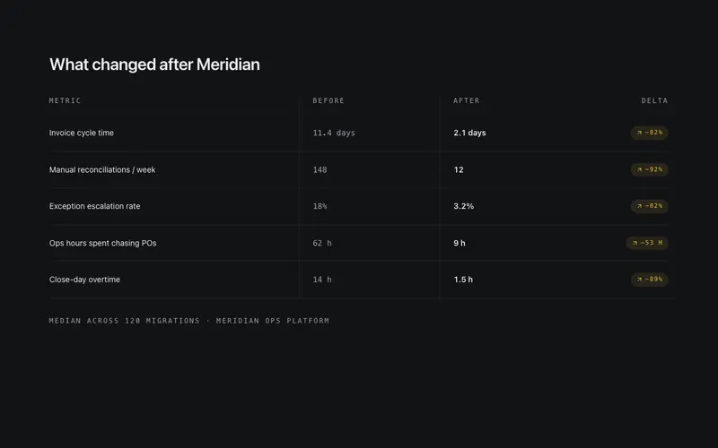
Stats Compare
Before-and-after metrics in two hairline columns, each row pairs the old number with the new one and settles a delta chip that quantifies the improvement.

Live Board Stats
Instrument-panel grid of stat tiles, counting numerals over mono labels, with one tile carrying a tiny inline SVG sparkline drawn from deterministic prop data.
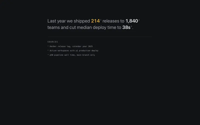
Stats Prose Inline
Editorial React stats paragraph, preformatted figures set inline in one flowing Tailwind sentence, with superscript footnote markers tied to a mono sources ledger.
Frequently asked questions
How do I install the Stats Composition Bar component?
Register the @cleverui registry in your components.json ("@cleverui": "https://cleverops.com.au/r/{name}.json"), then run `npx shadcn@latest add @cleverui/stats-composition-bar`. The shadcn CLI copies the source into your project, you own the code from that point. You can also copy the source directly from this page.
What dependencies does Stats Composition Bar require?
Stats Composition Bar uses motion on top of React and Tailwind CSS. You don't need to install it manually, the shadcn CLI resolves and installs npm dependencies automatically when you add the component.
Can I theme Stats Composition Bar to match my brand?
Yes. The component is styled entirely with Tailwind utilities over standard design tokens (primary, background, muted, border), so it inherits your existing shadcn/ui theme automatically. Change your CSS variables and the component follows, no source edits needed for palette, radius, or fonts.
Want this built for you?
CleverUI is built by the Clever Ops web team. If you'd rather ship a hand-coded, fast, custom website than assemble one, we build them for Australian businesses every week.
Explore web development services