Ambience Mosaic
A room-first gallery mosaic built entirely from structural placeholder panels, varied warm muted token tones under a shared grain, each with a serif caption. Space, not food, no images.
Preview & code
Installation
pnpm dlx shadcn@latest add @cleverui/restaurant-gallery-mosaicRequires the @cleverui registry in your components.json, a one-off, two-line setup.
Usage
API reference
RestaurantGalleryMosaic accepts the following props.
…plus everything from React.HTMLAttributes<HTMLElement>: className, event handlers, aria attributes and the rest pass straight through.
Referenced types
Related components
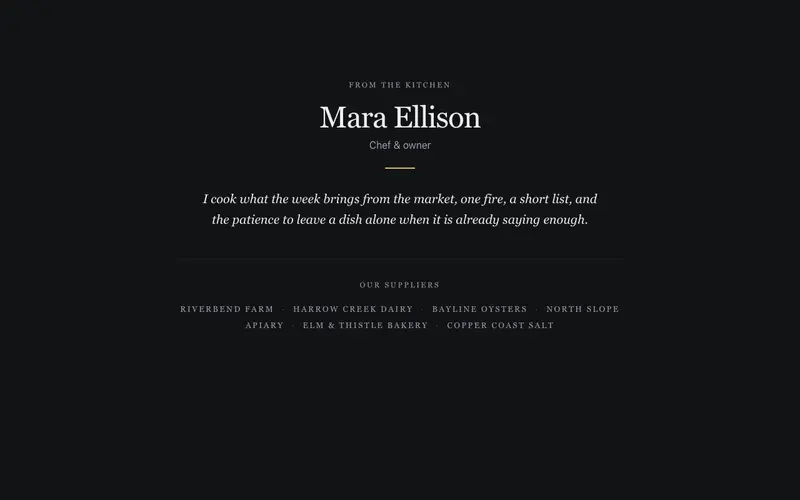
Chef Story Strip
A provenance strip, the chef's name set in serif, one italic paragraph of kitchen philosophy, and a still small-caps line of the farms that supply the menu. Stillness as the trust signal.
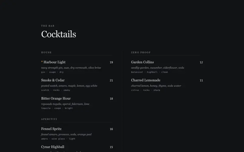
Cocktail List Spread
Cocktail menu React component set as a bifold bar list, serif drink names, italic builds, mono spec lines and prices across a two-column Tailwind spread.
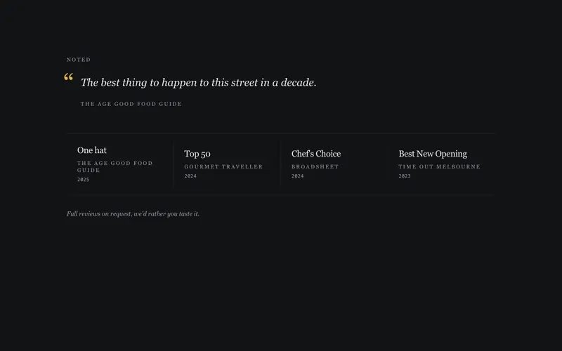
Press Accolades Band
Restaurant press and awards band for React, accolades as serif text mastheads with mono years and one critic quote. Tailwind tokens, zero logo assets.
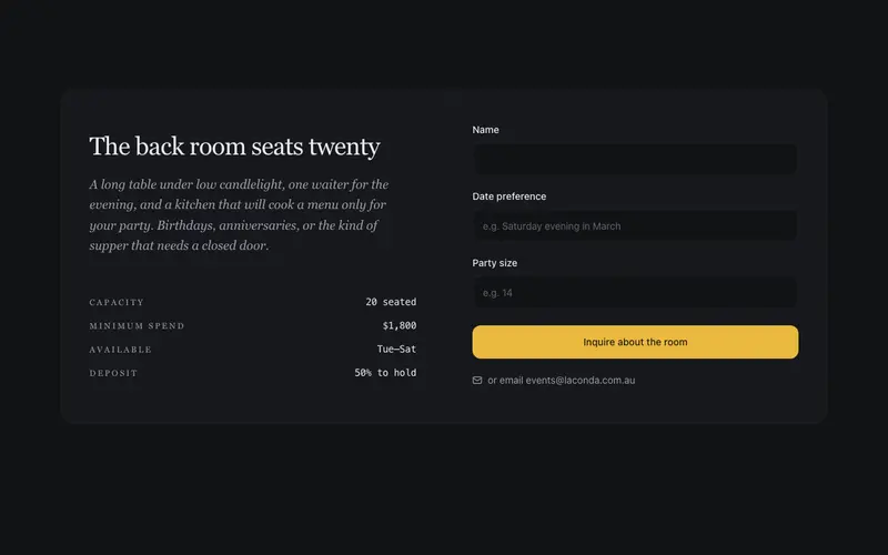
Private Dining Inquiry
An events block that sells the back room in serif, capacity and minimum spend as quiet data rows, and a three-field inquiry form with visible labels. Warm, unhurried, no SaaS urgency.
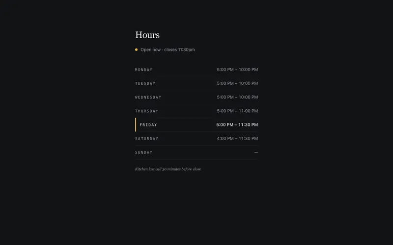
Hours & Status Strip
Opening hours as a clean mono table with a live open-now lamp, today's row highlighted, next opening surfaced when closed. Print-schedule clarity, zero deps beyond motion.
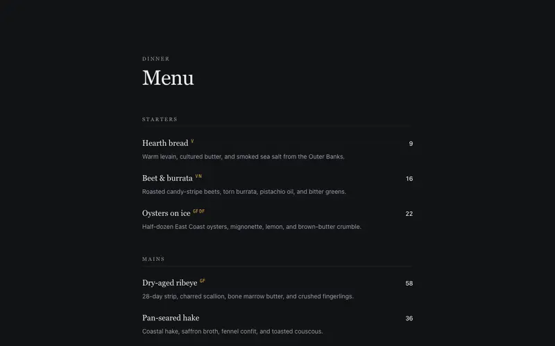
Editorial Menu
A restaurant menu set like a fine editorial page, courses with dotted price leaders, dish notes in quiet ink, and dietary marks in mono. Print-menu craft for the web.
Frequently asked questions
How do I install the Ambience Mosaic component?
Register the @cleverui registry in your components.json ("@cleverui": "https://cleverops.com.au/r/{name}.json"), then run `npx shadcn@latest add @cleverui/restaurant-gallery-mosaic`. The shadcn CLI copies the source into your project, you own the code from that point. You can also copy the source directly from this page.
What dependencies does Ambience Mosaic require?
Ambience Mosaic uses motion on top of React and Tailwind CSS. You don't need to install it manually, the shadcn CLI resolves and installs npm dependencies automatically when you add the component.
Can I theme Ambience Mosaic to match my brand?
Yes. The component is styled entirely with Tailwind utilities over standard design tokens (primary, background, muted, border), so it inherits your existing shadcn/ui theme automatically. Change your CSS variables and the component follows, no source edits needed for palette, radius, or fonts.
Want this built for you?
CleverUI is built by the Clever Ops web team. If you'd rather ship a hand-coded, fast, custom website than assemble one, we build them for Australian businesses every week.
Explore web development services