Glow Pricing Tiers
Three quiet tiers with one accent moment, the featured plan carries a primary hairline and soft glow. Billing toggle with sprung thumb; prices crossfade on flip.
Preview & code
Installation
pnpm dlx shadcn@latest add @cleverui/pricing-tiers-glowRequires the @cleverui registry in your components.json, a one-off, two-line setup.
Usage
API reference
PricingTiersGlow accepts the following props.
…plus everything from React.HTMLAttributes<HTMLElement>: className, event handlers, aria attributes and the rest pass straight through.
Referenced types
Related components

Add-on Builder Pricing
Configurable React pricing, a base plan plus real checkbox add-ons, an itemized ledger that re-rules itself as items land, and a rolling tabular total. No dark patterns.
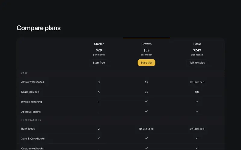
Pricing Compare Matrix
Feature-by-plan pricing matrix on real table semantics, a sticky plan header row with prices and CTAs, check, dash and mono cell values, and a single keyline marking the featured plan column.
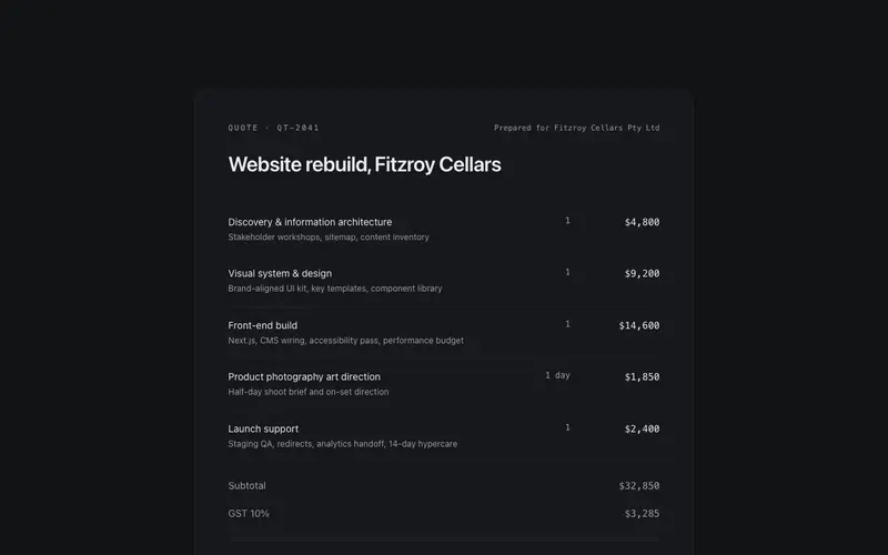
Ledger Quote Pricing
Agency pricing set as a quote document, ruled line items with tabular mono prices, subtotal, GST and total ledger rows, and a mono valid-until note. Pricing as paperwork, not cards.

Plan Rows Pricing
SaaS pricing as a ruled rate sheet in React and Tailwind, one hairline row per plan with inline feature inventory, mono tabular prices, and a keyline on the featured plan.
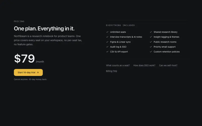
Single Plan Pricing
One-plan pricing stated with confidence, the price set as the hero figure, included features in two ruled columns, and quiet FAQ links. For products with one honest price and nothing to upsell.
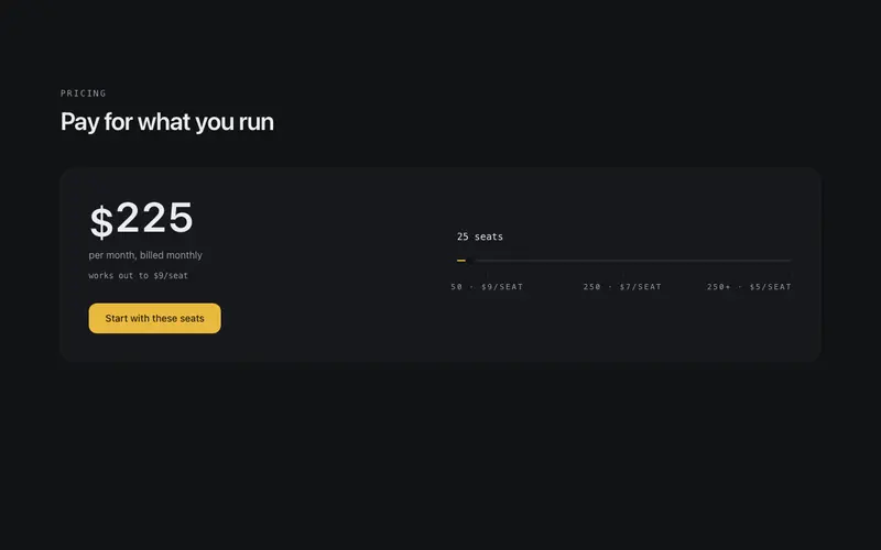
Usage Pricing Slider
Usage-based pricing with an honest slider, an arrow-key accessible role=slider sets seats or volume, the price recalculates with rolling digits, and breakpoints are labelled in mono under the track.
Frequently asked questions
How do I install the Glow Pricing Tiers component?
Register the @cleverui registry in your components.json ("@cleverui": "https://cleverops.com.au/r/{name}.json"), then run `npx shadcn@latest add @cleverui/pricing-tiers-glow`. The shadcn CLI copies the source into your project, you own the code from that point. You can also copy the source directly from this page.
What dependencies does Glow Pricing Tiers require?
Glow Pricing Tiers uses motion and lucide-react on top of React and Tailwind CSS. You don't need to install them manually, the shadcn CLI resolves and installs npm dependencies automatically when you add the component.
Can I theme Glow Pricing Tiers to match my brand?
Yes. The component is styled entirely with Tailwind utilities over standard design tokens (primary, background, muted, border), so it inherits your existing shadcn/ui theme automatically. Change your CSS variables and the component follows, no source edits needed for palette, radius, or fonts.
Want this built for you?
CleverUI is built by the Clever Ops web team. If you'd rather ship a hand-coded, fast, custom website than assemble one, we build them for Australian businesses every week.
Explore web development services