Number Ticker
Counts to a value once in view with an expo-out feel, fast start, precise landing. Locale-aware formatting, prefix and suffix, tabular numerals against layout shift.
Preview & code
Installation
pnpm dlx shadcn@latest add @cleverui/number-tickerRequires the @cleverui registry in your components.json, a one-off, two-line setup.
Usage
API reference
NumberTicker accepts the following props.
…plus everything from React.HTMLAttributes<HTMLSpanElement>: className, event handlers, aria attributes and the rest pass straight through.
Related components
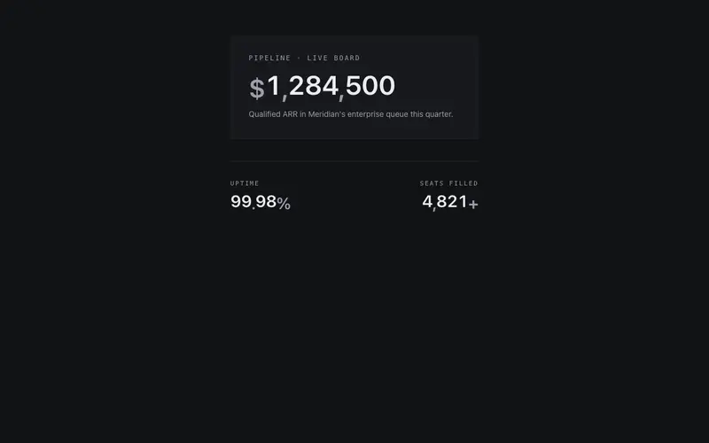
Number Odometer
Multi-digit odometer where every digit rolls inside its own masked column, settling right to left like a meter, with prefix, suffix, and decimal support.
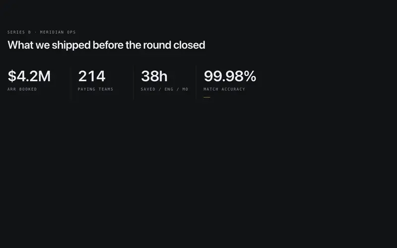
Number Milestone Row
A row of milestone numbers between hairline separators, each figure lands in sequence with a spring settle, and a primary tick draws itself under the final one.
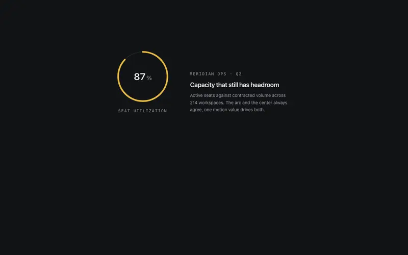
Number Radial Gauge
Determinate SVG radial gauge, a hairline token track, one primary arc drawn via pathLength, a tabular counted value at center and a mono label beneath.
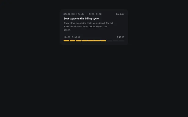
Number Segment Meter
Discrete React meter primitive, value-of-max rendered as Tailwind-token unit cells that fill in stepped sequence, with a mono fraction readout and threshold tick.
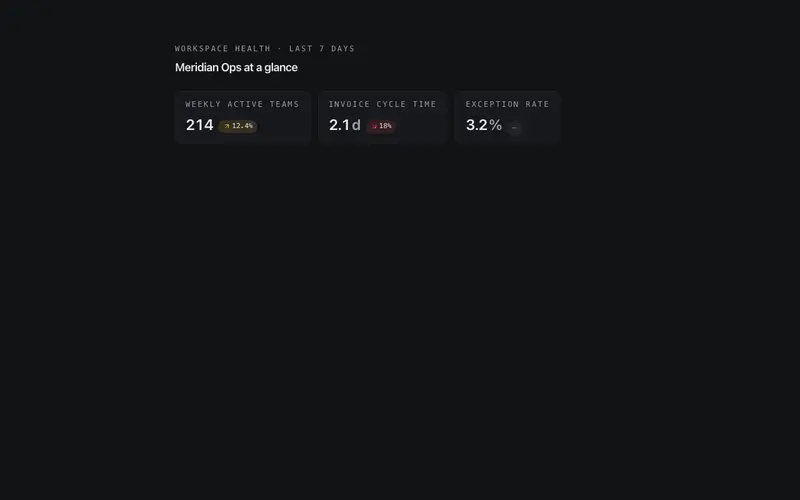
Stat Delta Chip
Compact metric chip pairing a counted-up value with a signed delta pill, direction glyph and token-honest color, primary for gains, destructive for losses.
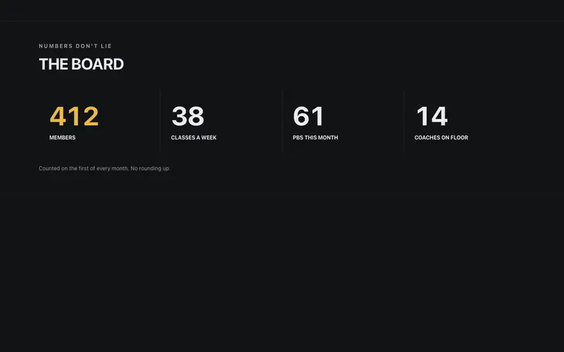
Gym Stats Board
The gym's numbers board, members, classes a week, and PBs this month counting up in heavy tabular figures under bold condensed labels, with a plain-spoken honesty footnote.
Frequently asked questions
How do I install the Number Ticker component?
Register the @cleverui registry in your components.json ("@cleverui": "https://cleverops.com.au/r/{name}.json"), then run `npx shadcn@latest add @cleverui/number-ticker`. The shadcn CLI copies the source into your project, you own the code from that point. You can also copy the source directly from this page.
What dependencies does Number Ticker require?
Number Ticker uses motion on top of React and Tailwind CSS. You don't need to install it manually, the shadcn CLI resolves and installs npm dependencies automatically when you add the component.
Can I theme Number Ticker to match my brand?
Yes. The component is styled entirely with Tailwind utilities over standard design tokens (primary, background, muted, border), so it inherits your existing shadcn/ui theme automatically. Change your CSS variables and the component follows, no source edits needed for palette, radius, or fonts.
Want this built for you?
CleverUI is built by the Clever Ops web team. If you'd rather ship a hand-coded, fast, custom website than assemble one, we build them for Australian businesses every week.
Explore web development services