Patient Info Bar
The practical strip patients actually need, bulk-billing badge, accessibility notes, parking, and the after-hours line, set with the same care most sites reserve for heroes.
Preview & code
Installation
pnpm dlx shadcn@latest add @cleverui/patient-info-barRequires the @cleverui registry in your components.json, a one-off, two-line setup.
Usage
API reference
PatientInfoBar accepts the following props.
…plus everything from React.HTMLAttributes<HTMLElement>: className, event handlers, aria attributes and the rest pass straight through.
Referenced types
Related components
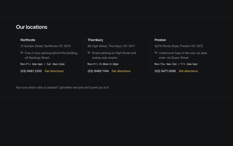
Clinic Locations Strip
Multi-location clinic strip, suburb name, plain street address, a practical parking note, and an hours snippet in quiet mono per location, closed by one gentle closest-to-you hint.
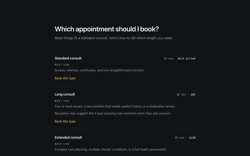
Which Appointment Should I Book?
Consult types compared in plain language, length and fee in quiet figures, an honest best-for line each, and a calm not-sure fallback. A React and Tailwind decision aid for clinics.
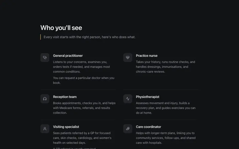
Who You'll See
A who-you'll-see panel pairing practitioner roles, GP, practice nurse, physio, with plain one-line explanations of what each actually does, demystifying the visit before it happens.
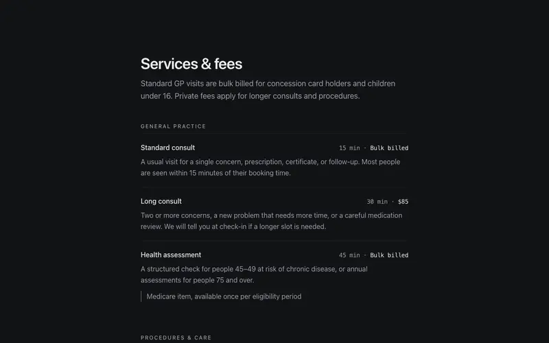
Services & Fees
Clinic services set with menu discipline, plain-language descriptions, consult length and fee in tabular figures, and quiet notes like GP referral required. Zero jargon, high clarity.
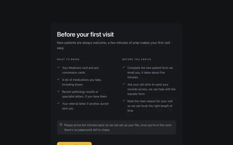
Before Your First Visit
First-visit checklist for new patients, what to bring and what to do beforehand in two calm columns, with an arrive-early aside. Plain-language React and Tailwind onboarding for clinics.
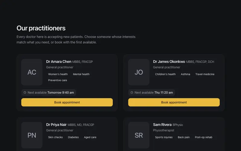
Practitioner Directory
Clinician cards with real credential lines, special-interest tags, and a next-available chip, the calm, plain-language way patients choose who to see.
Frequently asked questions
How do I install the Patient Info Bar component?
Register the @cleverui registry in your components.json ("@cleverui": "https://cleverops.com.au/r/{name}.json"), then run `npx shadcn@latest add @cleverui/patient-info-bar`. The shadcn CLI copies the source into your project, you own the code from that point. You can also copy the source directly from this page.
What dependencies does Patient Info Bar require?
Patient Info Bar uses motion and lucide-react on top of React and Tailwind CSS. You don't need to install them manually, the shadcn CLI resolves and installs npm dependencies automatically when you add the component.
Can I theme Patient Info Bar to match my brand?
Yes. The component is styled entirely with Tailwind utilities over standard design tokens (primary, background, muted, border), so it inherits your existing shadcn/ui theme automatically. Change your CSS variables and the component follows, no source edits needed for palette, radius, or fonts.
Want this built for you?
CleverUI is built by the Clever Ops web team. If you'd rather ship a hand-coded, fast, custom website than assemble one, we build them for Australian businesses every week.
Explore web development services