Accordion Sitemap Footer
A deep sitemap footer that stays honest on phones, open Tailwind link columns at desktop collapse into true disclosure accordions below lg, React button semantics intact.
Preview & code
Installation
pnpm dlx shadcn@latest add @cleverui/footer-accordion-sitemapRequires the @cleverui registry in your components.json, a one-off, two-line setup.
Usage
API reference
FooterAccordionSitemap accepts the following props.
…plus everything from React.HTMLAttributes<HTMLElement>: className, event handlers, aria attributes and the rest pass straight through.
Related components
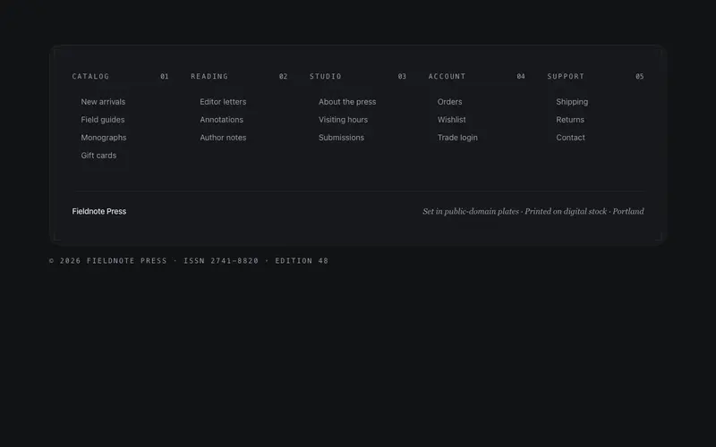
Index Sheet Footer
A footer set like a book's index, dense, beautifully-ordered link columns with mono folio numbers, a hairline frame, and a colophon line. For sites with real depth.
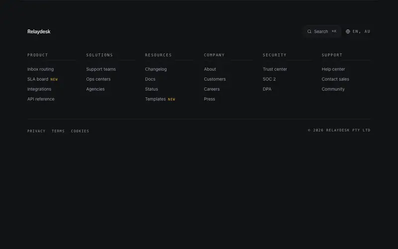
Mega Directory Footer
A directory footer for big sites, multi-column grouped links under a utility row with a search affordance and locale display, closed by a legal rail. Dense but ruled.
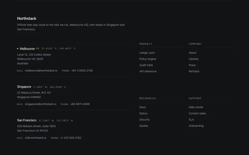
Atlas Footer
A global-presence footer for React sites, offices with mono coordinates, addresses, and dl contact pairs beside Tailwind directory columns, closed by a quiet legal rail.
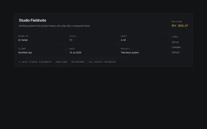
Blueprint Block Footer
The footer as an engineering drawing's title block, a hairline grid of zones for brand, revision, field pairs, socials, and legal. The drafting identity literalized.
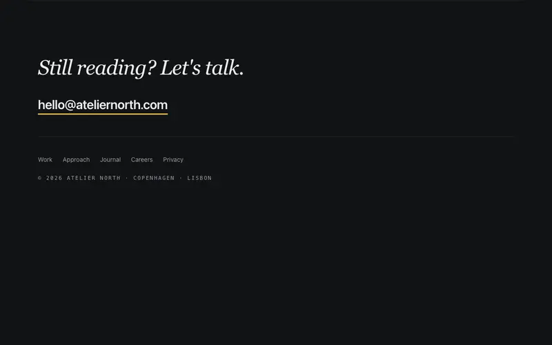
Conversation Footer
A footer that opens a conversation, a serif "Still reading? Let's talk." line with an oversized email link as the hero, quiet links beneath. The footer as an invitation.
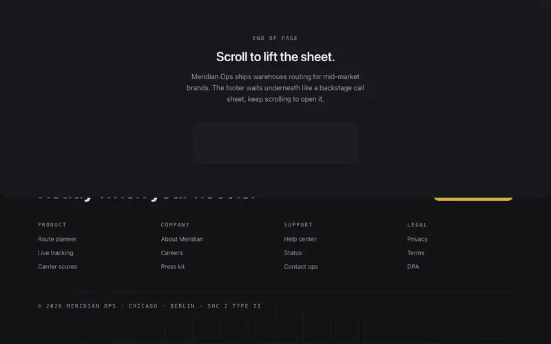
Curtain Reveal Footer
The page lifts like a curtain to reveal the footer waiting underneath, a fixed backstage layer with CTA, links, and meta, exposed by the scroll itself.
Frequently asked questions
How do I install the Accordion Sitemap Footer component?
Register the @cleverui registry in your components.json ("@cleverui": "https://cleverops.com.au/r/{name}.json"), then run `npx shadcn@latest add @cleverui/footer-accordion-sitemap`. The shadcn CLI copies the source into your project, you own the code from that point. You can also copy the source directly from this page.
What dependencies does Accordion Sitemap Footer require?
Accordion Sitemap Footer uses motion and lucide-react on top of React and Tailwind CSS. You don't need to install them manually, the shadcn CLI resolves and installs npm dependencies automatically when you add the component.
Can I theme Accordion Sitemap Footer to match my brand?
Yes. The component is styled entirely with Tailwind utilities over standard design tokens (primary, background, muted, border), so it inherits your existing shadcn/ui theme automatically. Change your CSS variables and the component follows, no source edits needed for palette, radius, or fonts.
Want this built for you?
CleverUI is built by the Clever Ops web team. If you'd rather ship a hand-coded, fast, custom website than assemble one, we build them for Australian businesses every week.
Explore web development services