Coverage Explainer Panel
An insurance coverage disclosure panel in React, inclusions with preformatted limits, exclusions at equal weight, a plain excess line and a PDS note. Tailwind, no fine-print burial.
Preview & code
Installation
pnpm dlx shadcn@latest add @cleverui/coverage-explainer-panelRequires the @cleverui registry in your components.json, a one-off, two-line setup.
Usage
API reference
CoverageExplainerPanel accepts the following props.
…plus everything from React.HTMLAttributes<HTMLElement>: className, event handlers, aria attributes and the rest pass straight through.
Referenced types
Related components
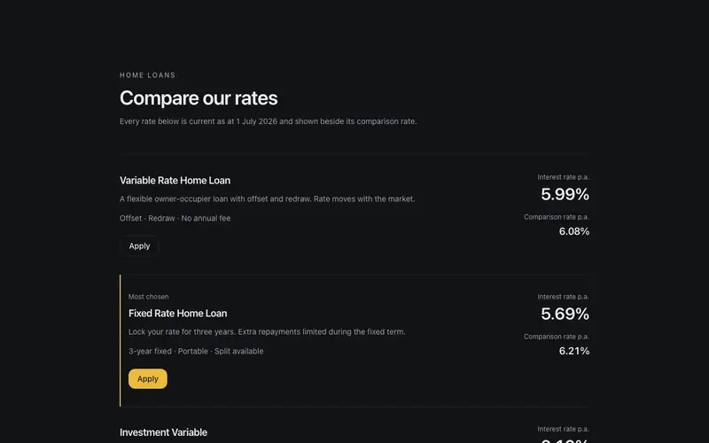
Rate Comparison Sheet
Home loan rate comparison rows in React, advertised and comparison rates paired in tabular numerals with the statutory warning as first-class Tailwind copy. Disclosure-forward, zero urgency.
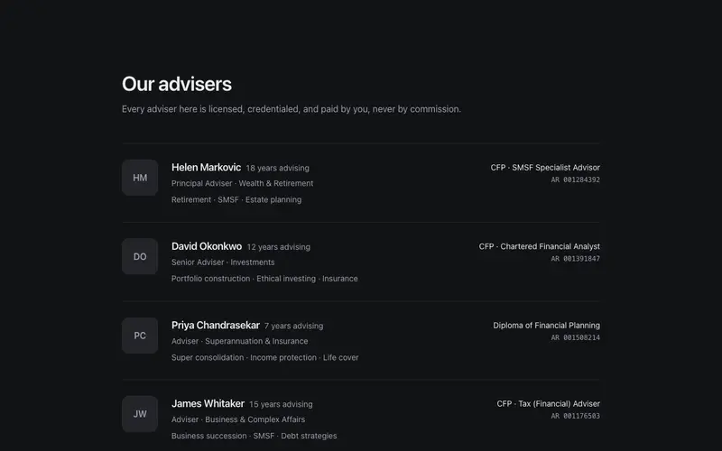
Advisor Credentials Rows
A financial adviser directory of sober hairline rows, credentials, mono licence numbers, specialty runs and an AFSL disclosure line as the accent. React and Tailwind, zero hype.
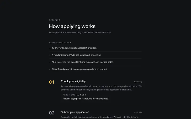
Loan Eligibility Steps
Loan eligibility and application steps in React, plain criteria up front, numbered stages with document notes and honest preformatted timeframes in Tailwind. No approval hype.
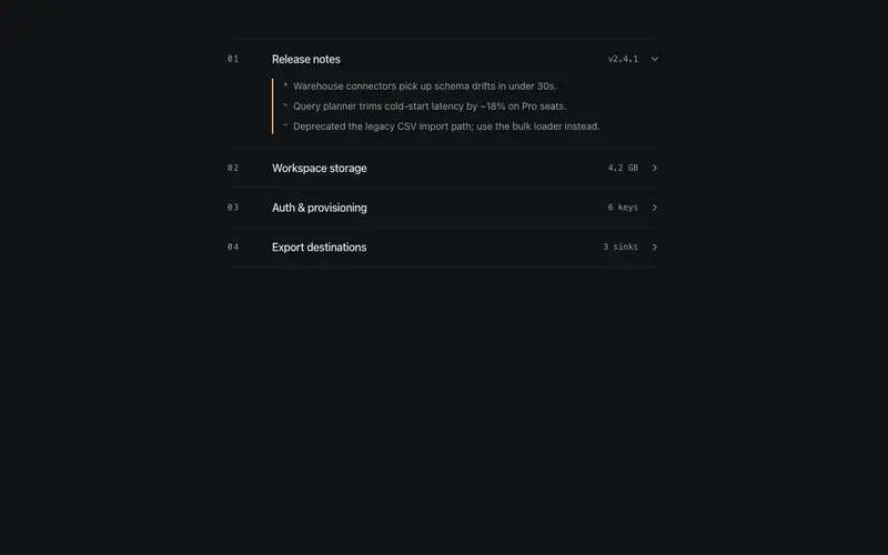
Ledger Accordion
A standalone accordion in the ruled-ledger voice, mono indices, right-aligned mono meta figures, hairline rows, and a primary keyline beside the open region. A content container, not a FAQ.
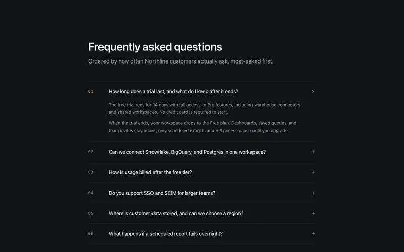
FAQ Disclosure List
The accordion FAQ perfected, real disclosure semantics over hairline rows, mono two-digit numbering earned by most-asked order, multi-paragraph answers, optional single-open.
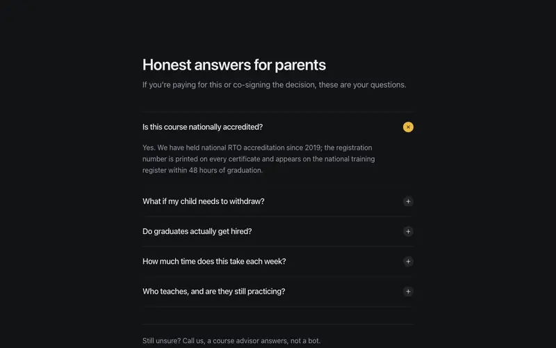
Parents FAQ
The questions parents and skeptics actually ask, accreditation, refunds, job outcomes, answered plainly behind real disclosure semantics, with a talk-to-a-human fallback.
Frequently asked questions
How do I install the Coverage Explainer Panel component?
Register the @cleverui registry in your components.json ("@cleverui": "https://cleverops.com.au/r/{name}.json"), then run `npx shadcn@latest add @cleverui/coverage-explainer-panel`. The shadcn CLI copies the source into your project, you own the code from that point. You can also copy the source directly from this page.
What dependencies does Coverage Explainer Panel require?
Coverage Explainer Panel uses motion and lucide-react on top of React and Tailwind CSS. You don't need to install them manually, the shadcn CLI resolves and installs npm dependencies automatically when you add the component.
Can I theme Coverage Explainer Panel to match my brand?
Yes. The component is styled entirely with Tailwind utilities over standard design tokens (primary, background, muted, border), so it inherits your existing shadcn/ui theme automatically. Change your CSS variables and the component follows, no source edits needed for palette, radius, or fonts.
Want this built for you?
CleverUI is built by the Clever Ops web team. If you'd rather ship a hand-coded, fast, custom website than assemble one, we build them for Australian businesses every week.
Explore web development services