Course Card Grid
Friendly course cards with level chips, duration and next-cohort lines, outcome checklists, and one warm enrol CTA per card, the encouraging way a training site earns sign-ups.
Preview & code
Installation
pnpm dlx shadcn@latest add @cleverui/course-card-gridRequires the @cleverui registry in your components.json, a one-off, two-line setup.
Usage
API reference
CourseCardGrid accepts the following props.
…plus everything from React.HTMLAttributes<HTMLElement>: className, event handlers, aria attributes and the rest pass straight through.
Referenced types
Related components

Cohort Countdown Strip
An enrolment-closing strip, seats left, a preformatted close date, and a compact rolling countdown pointing at one warm CTA. Encouraging urgency, not a fire alarm.

Admission Checklist
What you need to get in and what you can skip, admission requirements as an encouraging two-group checklist with real dl semantics. React and Tailwind block for course sites.

Alumni Story Cards
Graduate stories told as career arcs, from old job to new title, a short quote, cohort chip, and hired-in timeline. React and Tailwind alumni proof cards for course sites.
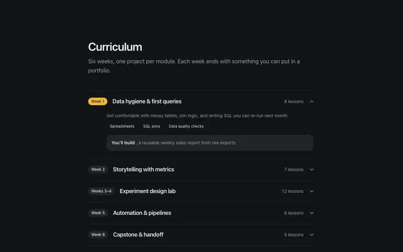
Curriculum Outline
A module-by-module curriculum accordion, week markers, lesson counts, and honest 'what you'll build' notes behind real disclosure semantics. A syllabus students can trust.

Parents FAQ
The questions parents and skeptics actually ask, accreditation, refunds, job outcomes, answered plainly behind real disclosure semantics, with a talk-to-a-human fallback.

Instructor Panel
Educator bios that read like a good syllabus, plain-text credentials, an approachable register, and student-count tickers that prove the teaching miles without bragging.
Frequently asked questions
How do I install the Course Card Grid component?
Register the @cleverui registry in your components.json ("@cleverui": "https://cleverops.com.au/r/{name}.json"), then run `npx shadcn@latest add @cleverui/course-card-grid`. The shadcn CLI copies the source into your project, you own the code from that point. You can also copy the source directly from this page.
What dependencies does Course Card Grid require?
Course Card Grid uses motion and lucide-react on top of React and Tailwind CSS. You don't need to install them manually, the shadcn CLI resolves and installs npm dependencies automatically when you add the component.
Can I theme Course Card Grid to match my brand?
Yes. The component is styled entirely with Tailwind utilities over standard design tokens (primary, background, muted, border), so it inherits your existing shadcn/ui theme automatically. Change your CSS variables and the component follows, no source edits needed for palette, radius, or fonts.
Want this built for you?
CleverUI is built by the Clever Ops web team. If you'd rather ship a hand-coded, fast, custom website than assemble one, we build them for Australian businesses every week.
Explore web development services