Product Tile
The product card perfected, structural product panel, honest sale typography with a struck was-price and quiet unit price, aria-labelled swatch dots, and one accent on the add action.
Preview & code
Installation
pnpm dlx shadcn@latest add @cleverui/product-tileRequires the @cleverui registry in your components.json, a one-off, two-line setup.
Usage
API reference
ProductTile accepts the following props.
…plus everything from Omit< React.HTMLAttributes<HTMLElement>, 'onDrag' | 'onDragStart' | 'onDragEnd' | 'onAnimationStart' >: className, event handlers, aria attributes and the rest pass straight through.
Referenced types
Related components
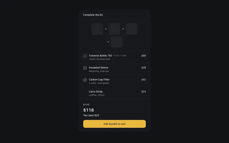
Bundle Builder Panel
A frequently-bought-together panel for React, structural product thumbs joined by plus glyphs, honest visible checkboxes, preformatted bundle pricing and quiet Tailwind savings type.
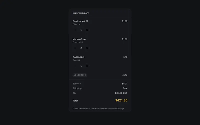
Cart Summary (Drawerless)
An order summary that lives on the page, line items with real stepper buttons, a promo line, and a totals ledger in tabular figures; fully controlled via callbacks, zero state deps.
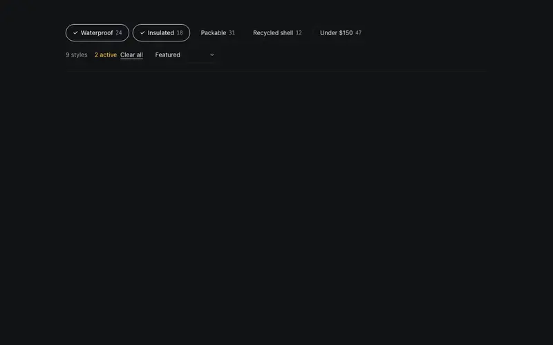
Collection Filter Bar
A controlled filter-and-sort toolbar for React product grids, aria-pressed Tailwind chips with honest counts, a native sort select, a live results tally and one quiet accent.
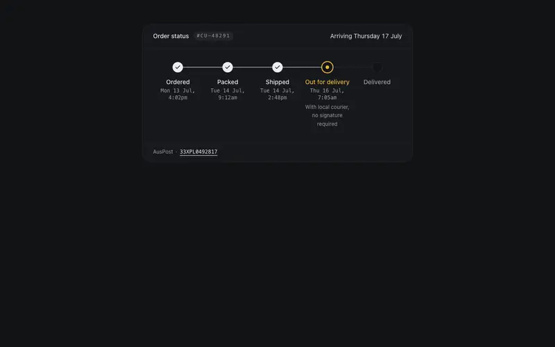
Order Tracking Steps
Order fulfillment status steps for React storefronts, completed, current and upcoming grammar with aria-current, mono carrier timestamps, and an honest Tailwind-set ETA line.
Review Summary Panel
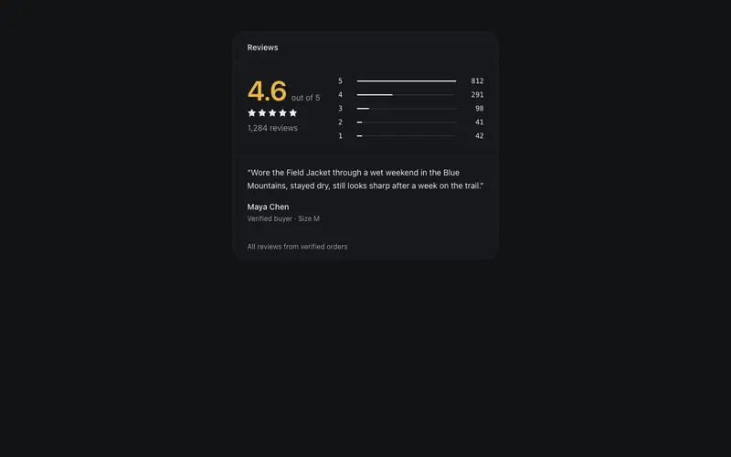
A React reviews summary, average rating hero numeral, data-true star histogram bars in Tailwind hairlines, token-neutral stars with no gold clutter, and one verified highlight quote.
Shipping Promise Strip
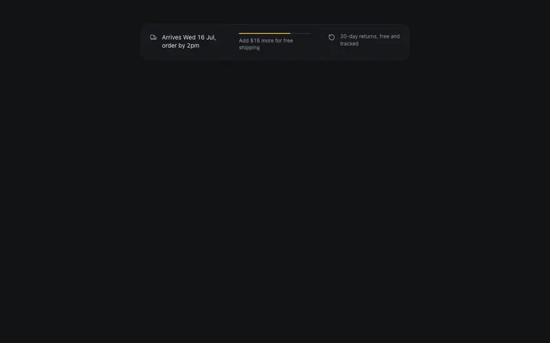
The conversion trust strip without the carnival, a preformatted delivery estimate, a data-true free-shipping progress hairline as the single accent, and a quiet returns note.
Frequently asked questions
How do I install the Product Tile component?
Register the @cleverui registry in your components.json ("@cleverui": "https://cleverops.com.au/r/{name}.json"), then run `npx shadcn@latest add @cleverui/product-tile`. The shadcn CLI copies the source into your project, you own the code from that point. You can also copy the source directly from this page.
What dependencies does Product Tile require?
Product Tile uses motion on top of React and Tailwind CSS. You don't need to install it manually, the shadcn CLI resolves and installs npm dependencies automatically when you add the component.
Can I theme Product Tile to match my brand?
Yes. The component is styled entirely with Tailwind utilities over standard design tokens (primary, background, muted, border), so it inherits your existing shadcn/ui theme automatically. Change your CSS variables and the component follows, no source edits needed for palette, radius, or fonts.
Want this built for you?
CleverUI is built by the Clever Ops web team. If you'd rather ship a hand-coded, fast, custom website than assemble one, we build them for Australian businesses every week.
Explore web development services